This is the 70th in a series of posts on the Nikon D850. You should be able to find all the posts about that camera in the Category List on the right sidebar, below the Articles widget. There’s a drop-down menu there that you can use to get to all the posts in this series; just look for “D850”.
Yesterday, I showed graphs relating to the Nikon D850’s noise and how that relates to the ISO setting in the camera. In my first post today, I posted visual takes on the noise differences from ISO 64 through 320. Inthe next post, I did the same thing for ISOs 400 through 3200. In the one just before this one, I extended the series to ISOs 400 through 6400. As expected, the D850 looked pretty ISOless above ISO 400. In each of the three sets of images, the exposure was the same, and I compensated for the “underexposure” at lower ISO settings by boosting Exposure in Lightroom.
In all of the above tests, I avoided spanning the point in the ISO setting on the camera where the conversion gain changes, from ISO 320 to ISO 400. Now I’m going to show you pairs of images made with those two ISO settings, with the exposure being increased by one-third stop for the ISO 320 images. Can the increased signal-to-noise ratio (SNR) away from the deepest shadows from the more generous ISO 320 exposure compensate for the increased read noise in those dark shadows?
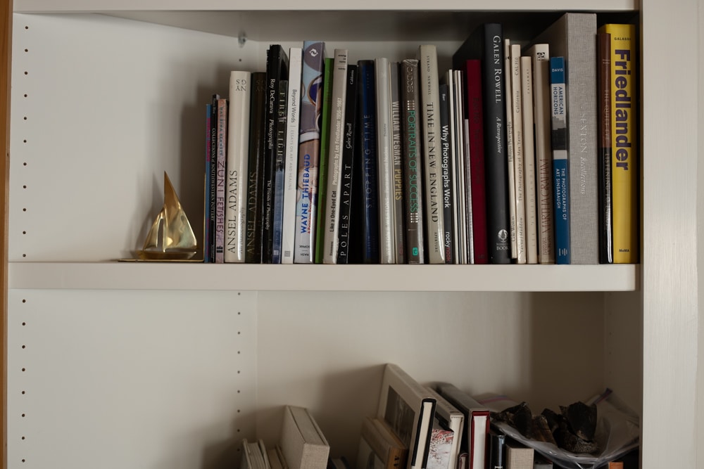
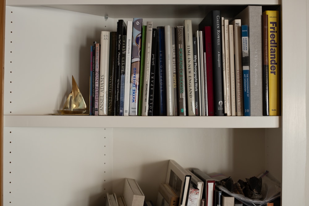
I made two images of my standard subject for this test all with the same shutter speed, using an Otus 55/1.4 set to f/4. I processed them all in Lightroom with default settings except for a custom white balance that assured that the WB wouldn’t change from image to image. Here are the full-frame images.


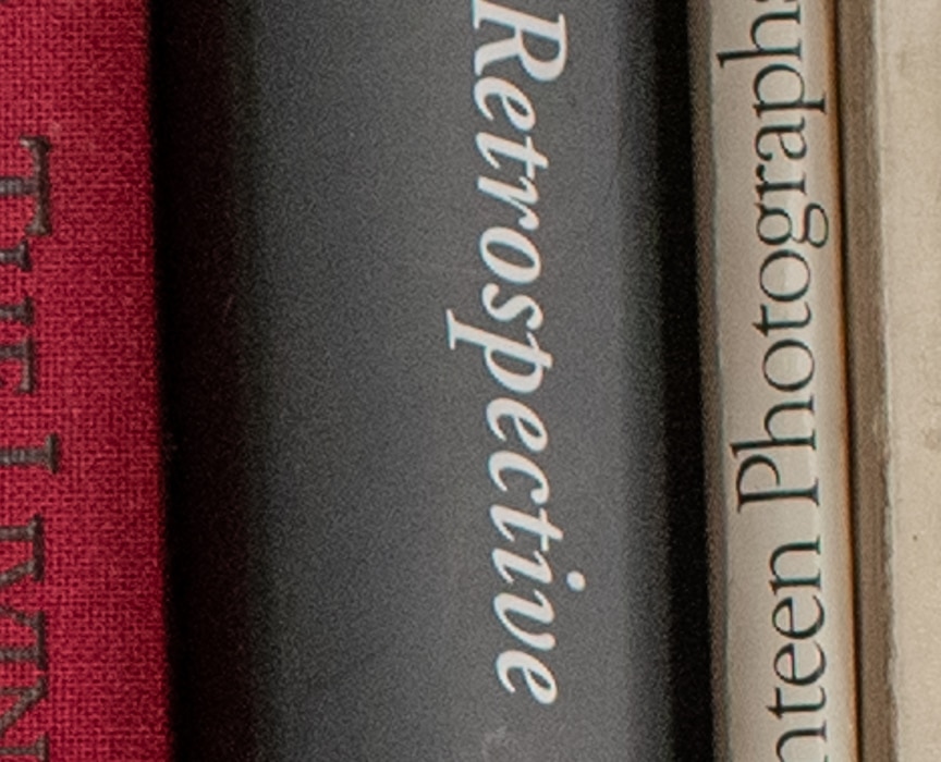
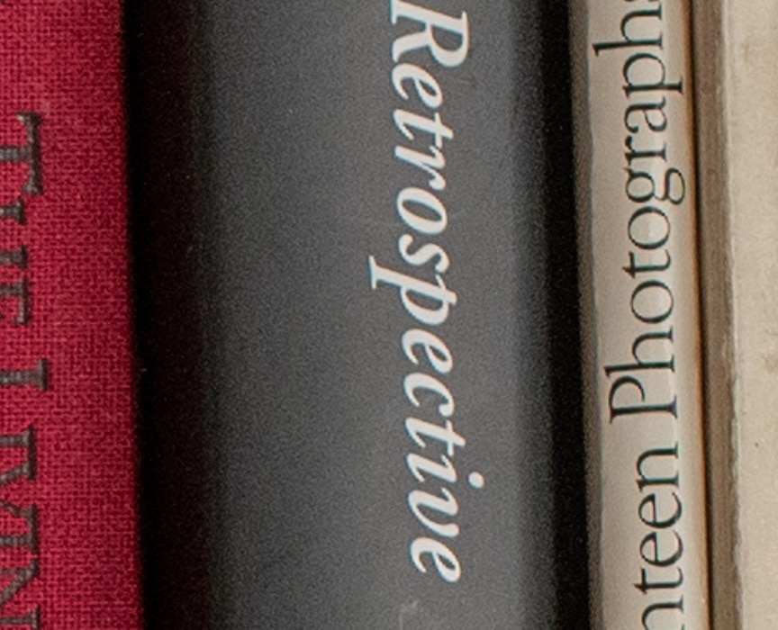
I boosted Lightroom’s the shadow slider in Lightroom to +100. I looked at the noise in each image. Here are some crops, magnified to about 200%.


I find the noise differences immaterial. I think that, so long as you’re not going to push the shadows really hard in postproduction, there is no practical reason to try to avoid ISO 320 in the D850, in spite of what the numbers say.
Great analyses in the iso posts! One comment… I think your analysis would have more punch if you used a before/after slider for some of the comparisons, so that you could wipe back and forth in the same window.