This is the fifth in a series of posts about the Nikon 70-200 mm f/2.8 S lens for Nikon Z cameras. The series starts here.
So far, I’ve tested the 70-200 mm f/2.8S lens against the E version using a foliage for a subject. THis morning I made a series of shots intended to test the two lenses against each other with a more demanding target, a Siemens Star. Unfortunately, the test proved to be more about comparing the way the camera auto-focuses with the lens, rather than a test of the lens itself.
Here’s the test protocol:
- Focal length 200 mm
- Subject distance: 41 meters
- ISO 64
- Manual exposure, ETTR in live histogram.
- Subject in the center and the upper right corner.
- AF-S pinpoint focusing, so as not to have to deal with the terrible Z7 focus by wire algorithm.
- Three shots at each setting, focusing anew for each shot, picking the best. This method calibrates out focus curvature.
- Developed in Lightroom
- Sharpening set to amount 20, radius 1, detail 0, which is quite a bit less than Lr’s default sharpening.
- Daylight white balance
- Adobe Color Profile
- Minor exposure adjustments, with same adjustment applied to all images from both lenses, so corner darkening is unaffected.
- Chromatic aberration correction turned off.
- Everything else at default settings
We’ll look at some tight crops.
If you’ve seen these here before, just jump to the images. If not, I need to spend some time telling you how to interpret them. They’re at roughly 250% magnification, enlarged to 700 pixels high on export from Lightroom. If you just want a rough idea of the differences, just look at the images as displayed in-line in the posts. However, if you wish to compare these images in detail, you should view these images by clicking on them to see the source files, then set your browser for 100% zooming. Even better, download them and make Photoshop stacks.
No matter what you do, these crops are all going to look horrible. I’m blowing them up so much so that they will represent the original file after JPEG’s discrete cosine transform has had its way with them. If you want to get a good idea of what the images would look like printed, get far away from your monitor. No, farther than that. Put a bunch of the images up on the screen and back up until the best one starts to look good. Then look at the others. There’s another reason why these images won’t look like the best thing the camera/lens combination can deliver. They’re demosaiced with Lightroom. Lightroom is not awful, but for a particular image, there are usually better raw processors. I use Lr because it’s a de facto standard, because I know it well, and because it’s got good tools for dealing with groups of images.
Here’s how to use these highly-magnified crops. The dimensions of the Z7 sensor is 8256×5504 pixels. If we make a full-frame print from the Z7 on a printer with 360 pixels per inch native driver-level resolution, like the Epson inkjet printers, we’ll end up with a 26.4×17.6 inch print. The 317×246 pixel crop you’re looking at will end up 0.8×0.68 inches. Let’s imagine that you or your viewers are critical, and will look at the 27×18 inch print from about 18 inches (conventional wisdom is that the distance would be a little greater than that, or 28 inches (the diagonal), but you did buy a high-resolution camera for a reason, didn’t you?).
The next step is dependent on your monitor pitch, which you may or may not know. Turns out, you don’t have to know it. Just take the 250% crops and view then at 1:1. How high are they? Get out your ruler and measure, or just guess. Let’s say they are 6 inches high. 6 inches is about 7 times 0.8, so in order to view the crops the way they’d look from 18 inches on the print is to view them from 7 times as far away, or 10.5 feet.
Everything here scales proportionately. If the image on your screen is bigger than 6 inches, increase your viewing distance by the ratio of your image height to 6 inches. If you think your viewers are going to almost get their nose to that print and look at it from six inches, divide that 10.5 feet by 3, and look at the image on the monitor from three and a half feet away.
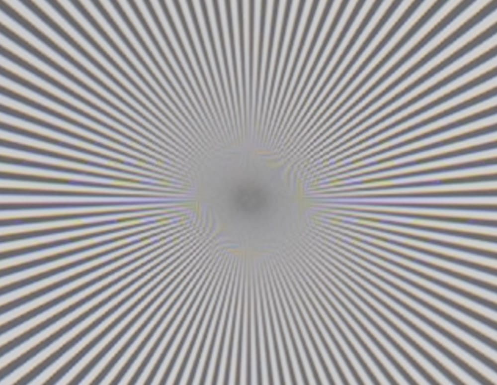
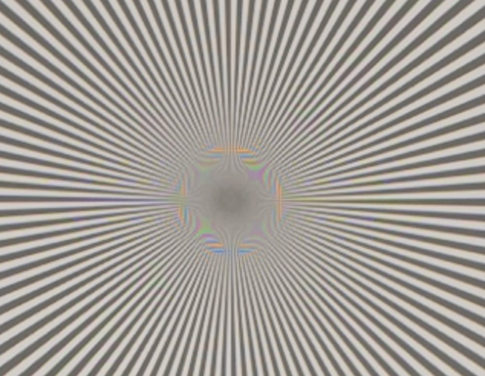
The S limage is out of focus. Not terribly so, since there is still some aliasing, but enough to invalidate this test as a comparison of the lenses. The pinpoint AF system on the Z7 seems to have more trouble with this subject with the S lens than with the E lens. This was true in all three images from each lens. We are looking at something systematic here, not just a random good image for the E lens.
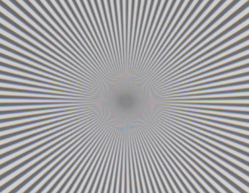
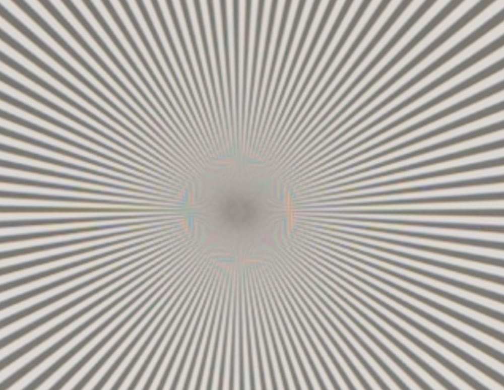
Now the E lens doesn’t look quite as good.
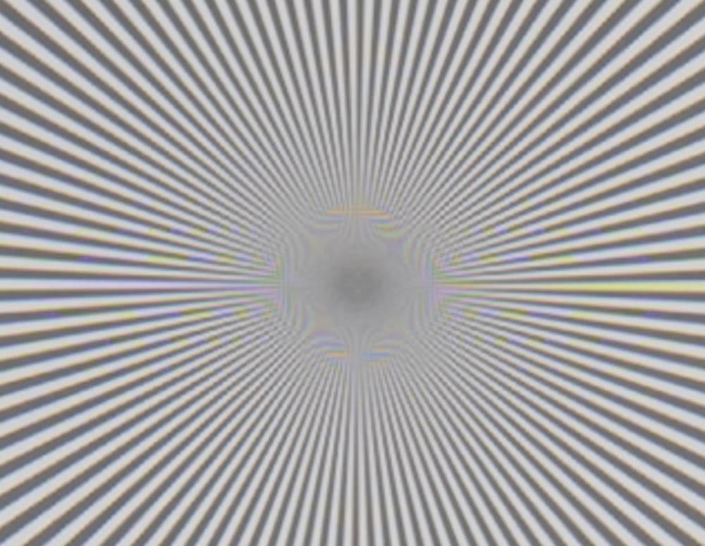
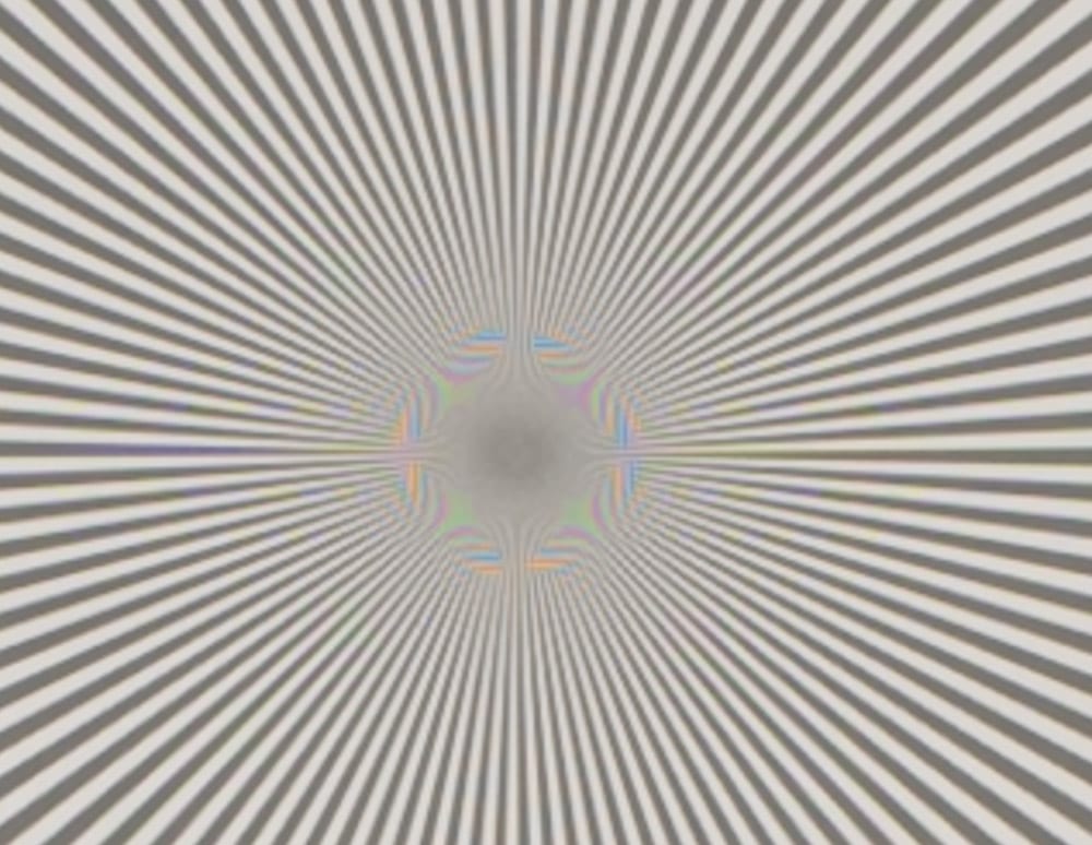
More high-frequency contrast with the E lens.
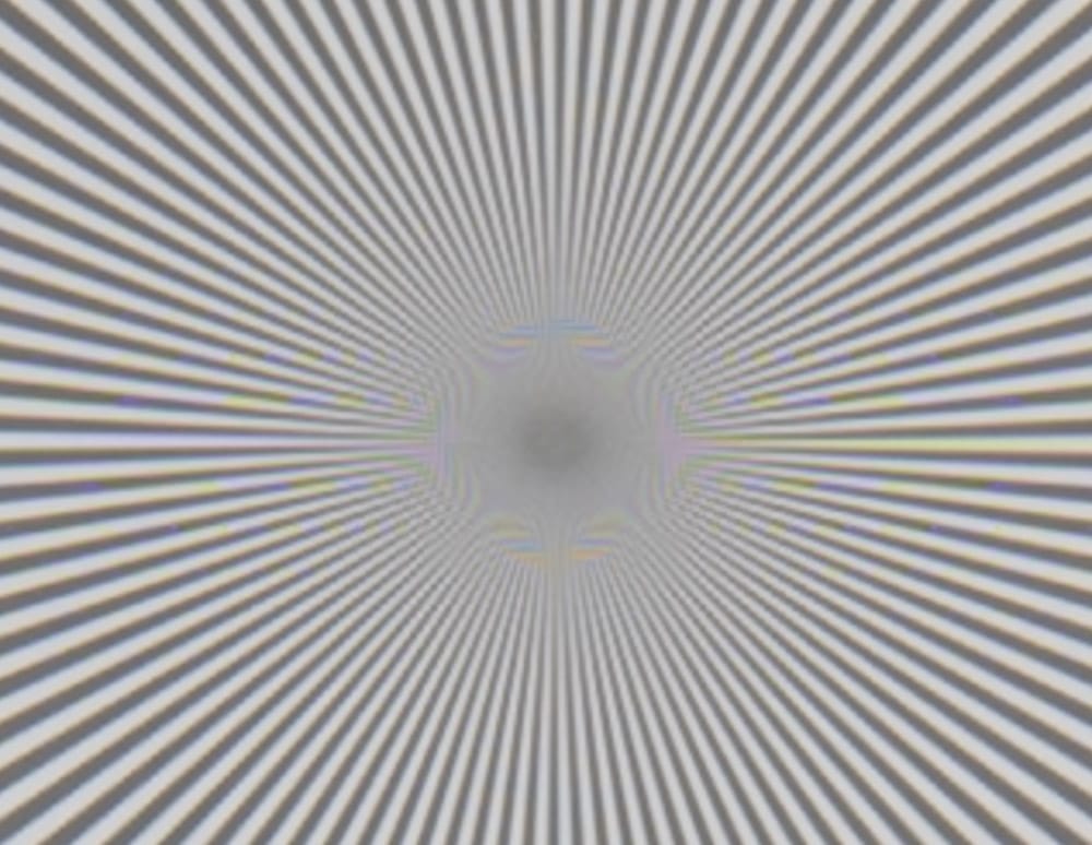
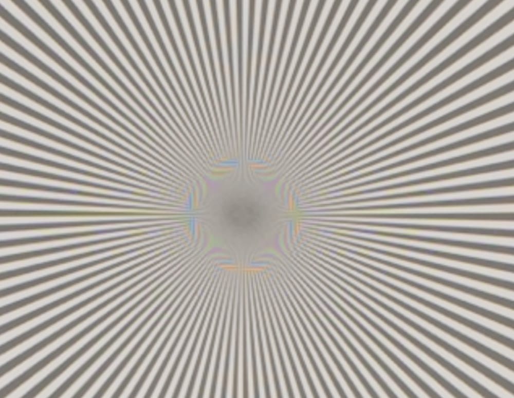
The E is a bit better.
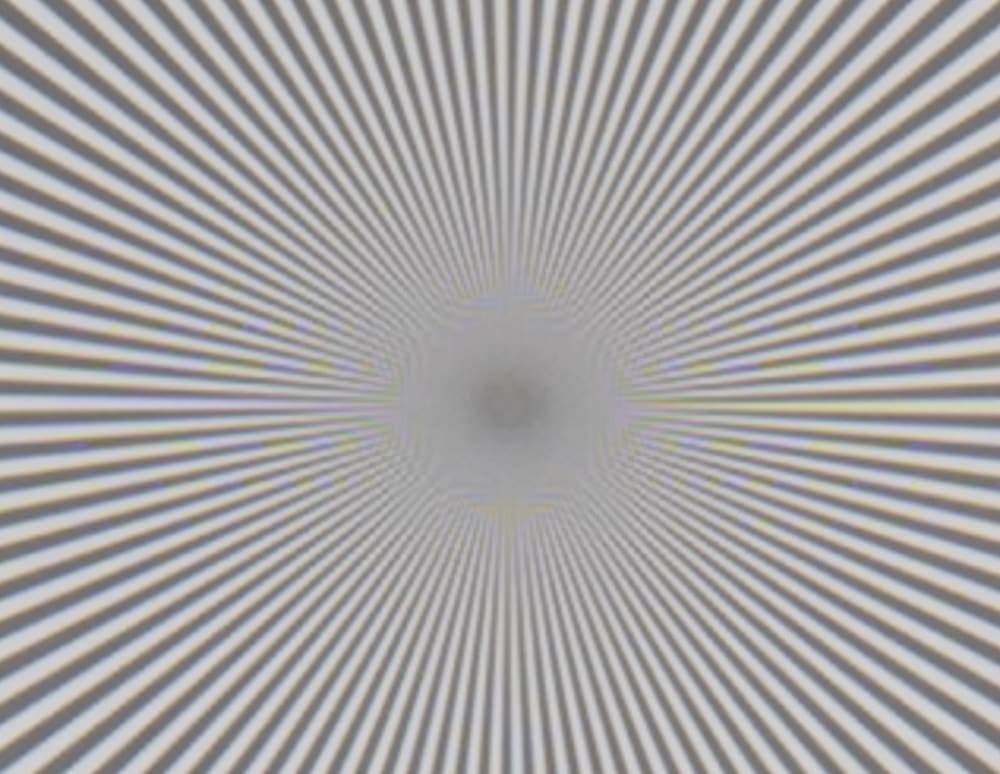
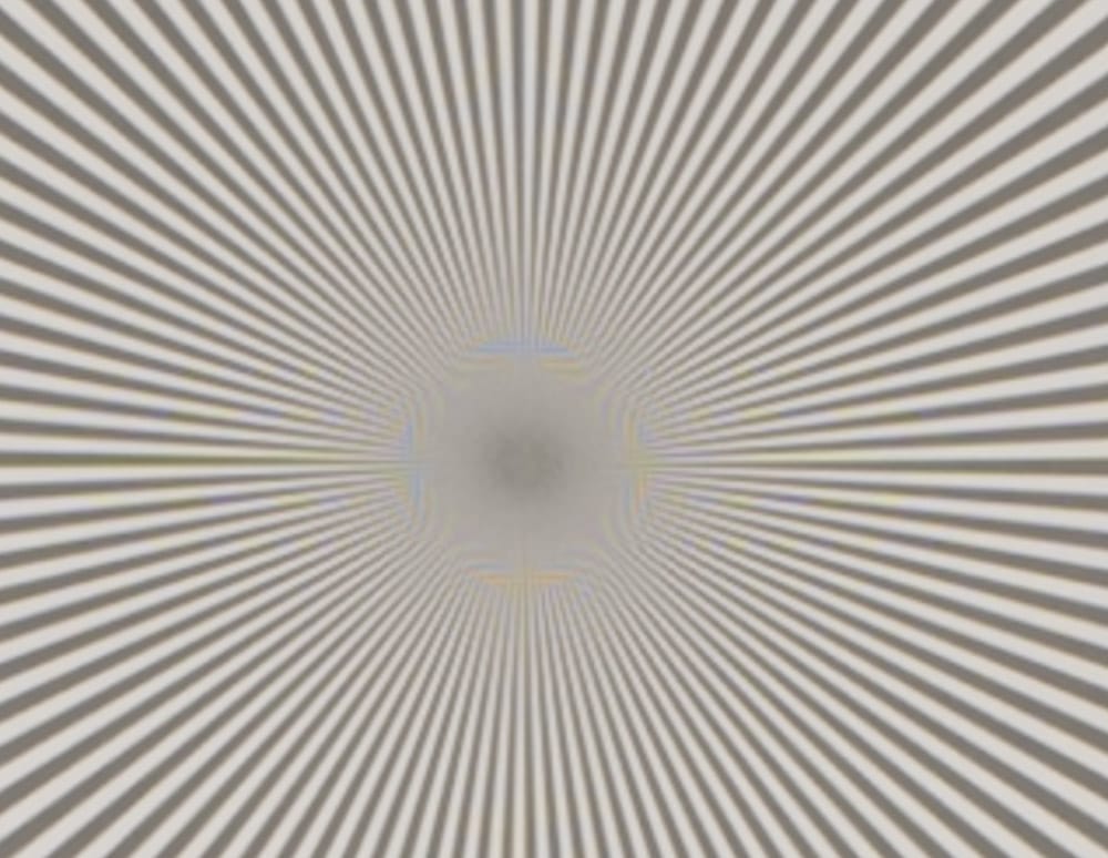
The S lens image is more out of focus. Not that far, though, since it still shows some aliasing.
In the corner:
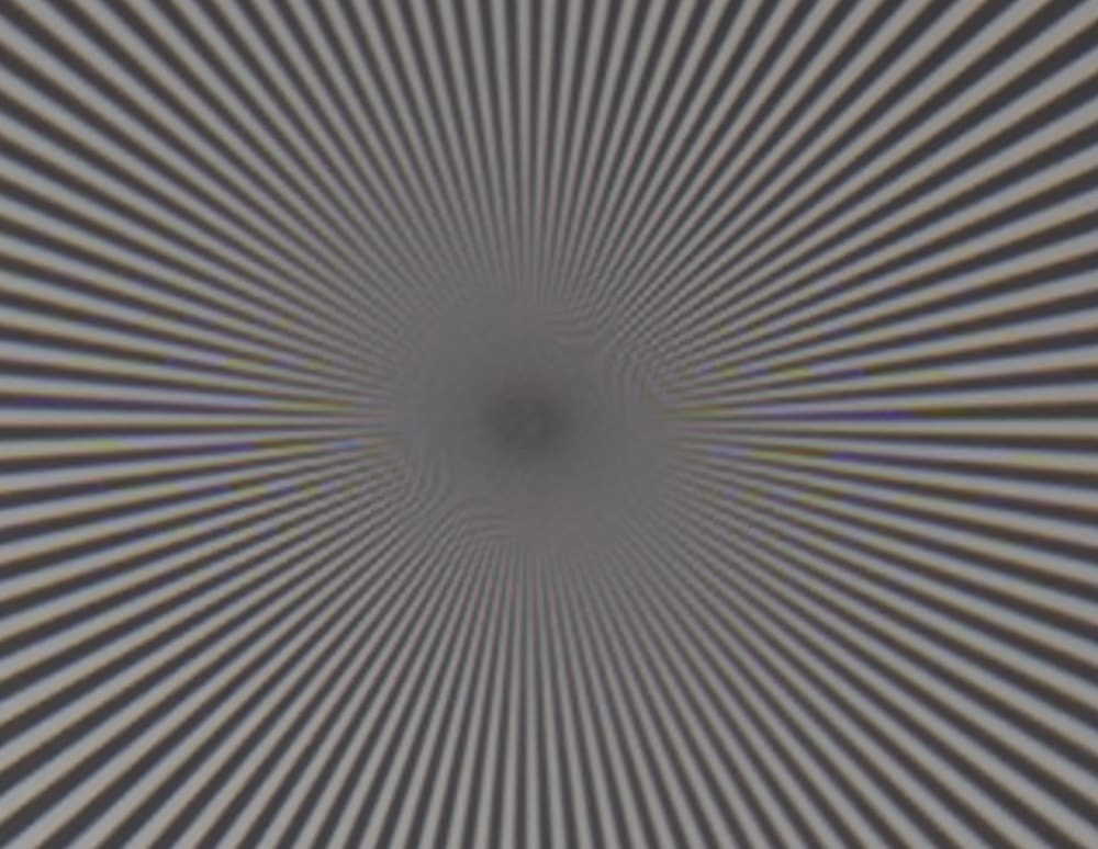
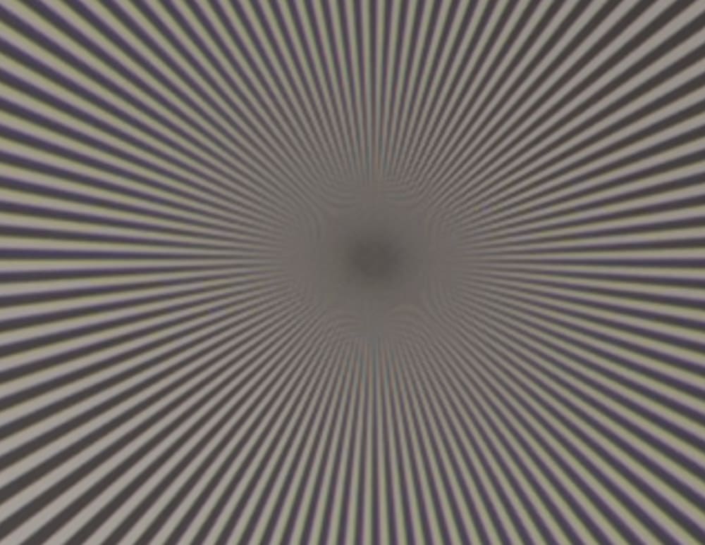
There is a lot of corner light falloff in both cases. The E lens appears to have roughly equal sagittial and radial aberrations. That’s not true of the S lens.
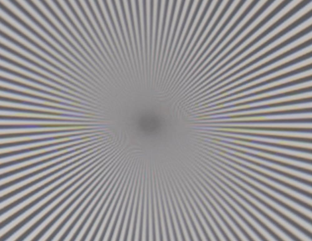
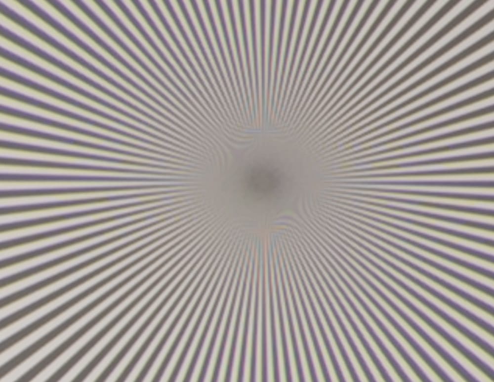
I suspect the S image is out of critical focus.
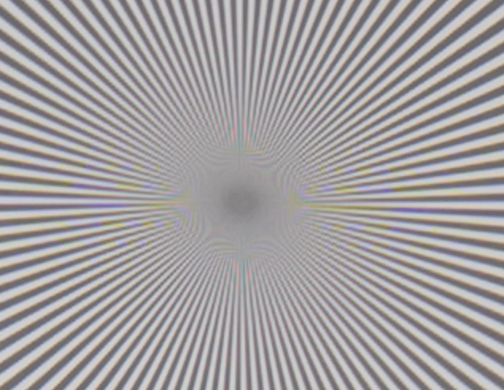
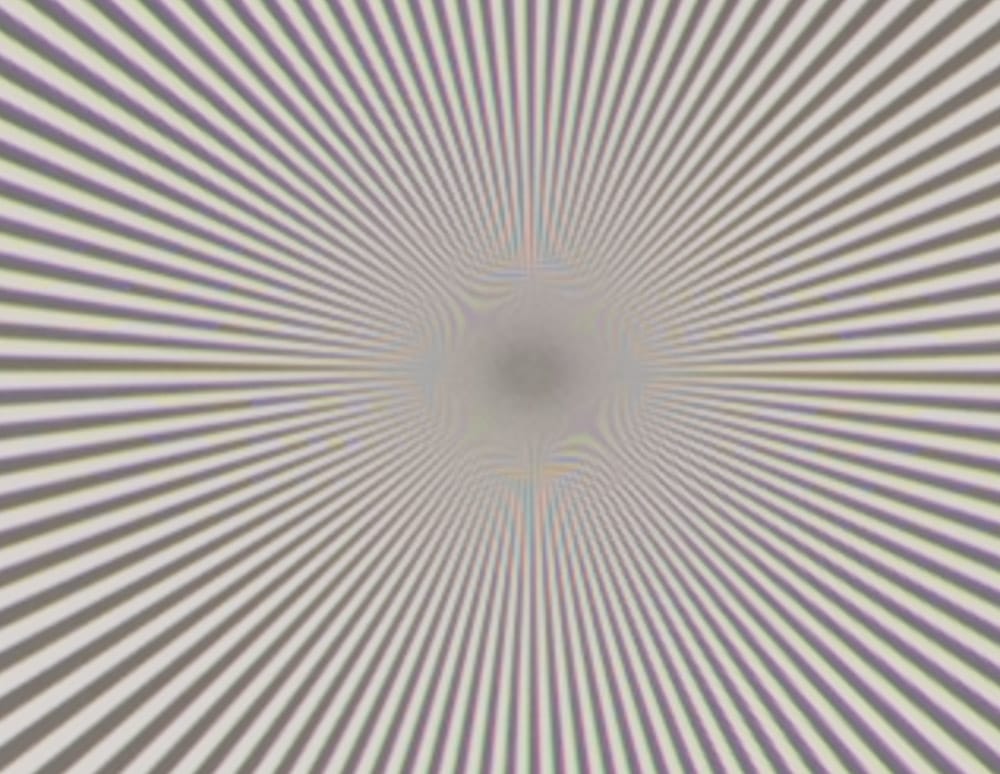
These look about the same, although the E image has slightly more high-frequency contrast.
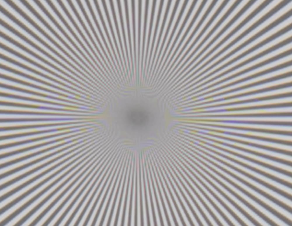
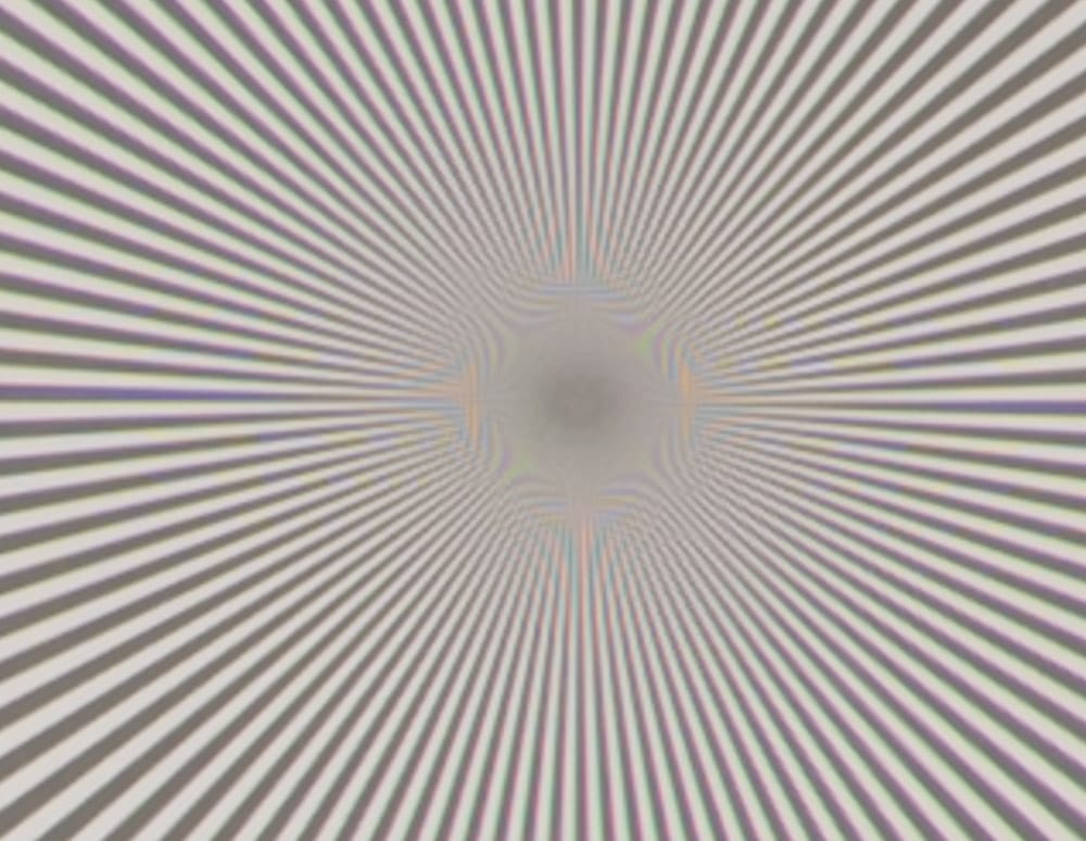
Similar.
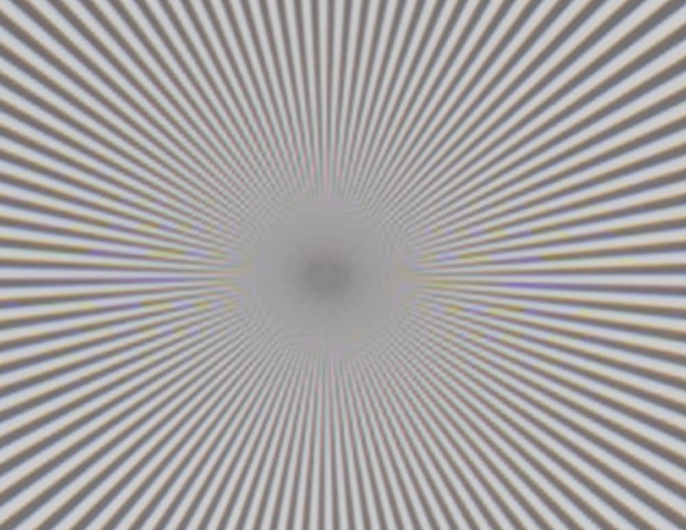
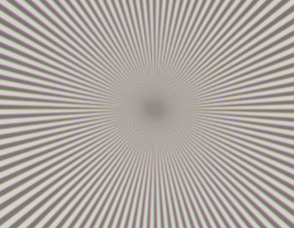
Very similar, and both obviously affected by diffraction.
I’m going to have to go back and redo this test using manual focusing. That’s going to be no fun at all. In the case of the S lens, I’m going to have to put up with the Z7’s brain-damaged focus by wire algorithm. In the case of both lenses, I’ll have to deal with the way-too-twitchy focus rings. I don’t think that Nikon thinks anybody is going to focus these lenes manually, at least for critical work.
Jim, you may need to dust of your focusing rail for that test.
🙁 Erik 🙁
Its interesting but I guess not shocking that we haven’t seen the same jump in image quality as we have with mirrorless normal and wide zooms when compared to their SLR predecessors.