This is the 26th in a series of posts on color reproduction. The series starts here.
In discussions on DPR about analyzing Macbeth chart photographs, someone whose opinion I respect raised the issue of repeatability of the results. I thought I’d start with the basics, and made a series of 16 photographs of the chart using the same camera position, same lens, and same lighting.
The camera was the Sony a7RII. The lens the Sony 90mm f/2.8 FE macro. The lighting was two Westcott LED panels on full, with the color temperature set to 5000K. The simulated reference was lit with D50 light.
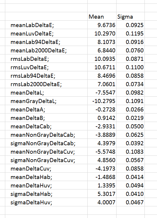
I developed in Lr with Adobe Standard profile, and all controls at thier default settings except that I white balanced to the third gray patch from the left. I computed the mean and standard deviation (sigma) of a bunch of aggregate color measures.
The results seem to be quite tightly clustered.
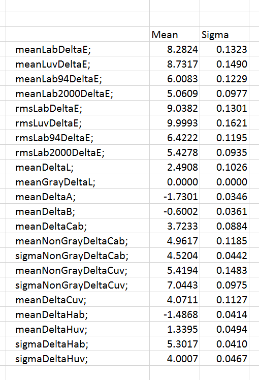
I set the analysis program to compensate for exposure variations, considering only the six gray patches:
If you take a look at the MeanGrayDeltaL row, you can see that the exposure compensation worked well by the standard of what was supposed to be optimized. And the rest of the stats? Still pretty tight, but the compensation didn’t make it any tighter. It looks like it made the spread slightly worse. That’s a surprise, but with stats this tight, odd things can happen.


Leave a Reply