• site home
  • blog home
  • galleries
  • contact
  • underwater
  • the bleeding edge

the last word

Photography meets digital computer technology. Photography wins -- most of the time.

You are here: Home / The Last Word / A new web site — using Photocrati for the blogs

A new web site — using Photocrati for the blogs

September 24, 2016 JimK Leave a Comment

This is a continuation of a series of posts about reworking my website into one that is entirely WordPress based. The series starts here:

A new web site – general requirements

I messed around with the Twenty Fourteen template, and decided that it would be easier to get the same look and feel for the blog sites and for the main gallery site if I used the same template for each. Since I seem to be deciding on Photocrati, I set up this site and my other site, The Bleeding Edge, using Photocrati. If you navigate on over there, you’ll see that it’s close, nut not identical. I’m pretty sure I can fix that once I figure out why the site name is displaying on the right side of the browser window, rather than  in the center as it doesn with this blog.

I used the recommended 960 pixel width, which is wider than my previous blogs. I created a 960-pixel-wide banner image for the top, with a black area at the top over which the blog title, description, and top-level menu bar float. I tightened up on the line spacing.

I looked at the site on a cell phone, and, with the sidebar pushed to the bottom where many users will never see it (you can see this in action if you resize your browser widow down far enought to trigger the sidebar’s change in position), it’s hard to find your way around. In order to fix that, I decided to make the first page the user sees a summary of all the recent blog posts, rather than the full text. That does two things. First, it makes it more likely that the user will see the sidebar (can you still call it a sidebar when it’s at the bottom?), since the list of summaries is shorter than the full text. Second, if users are looking for something recent, they won’t have to go to the sidebar at all; a tap on the header of the summary brings up the whole post.

There’s only one vexing problem on this blog now. I use trackbacks to the initial post in a series to allow users to easy go to all the posts in that series. All they have to do is scroll down to the bottom of the post, and, below the comments area, they’ll see links to all of the posts in the series, and their titles. Unfortunately, the standard way that Photocrati presents the trackbacks makes it hard to read the titles:

trackbacks


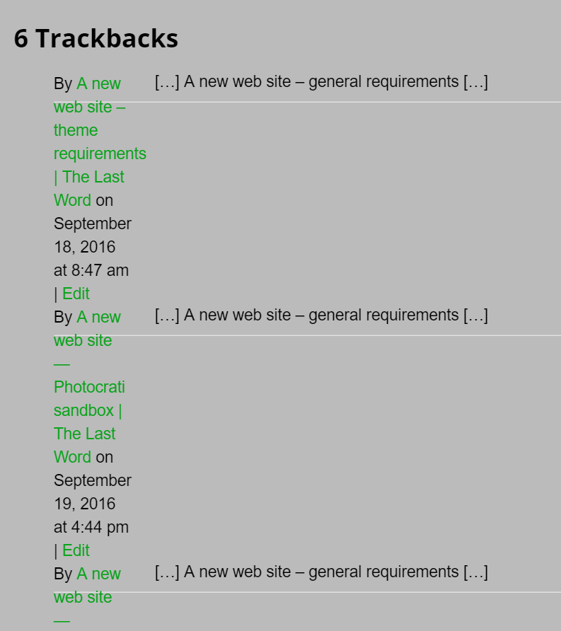
I’d like the information that’s in the narrow column on the left to be full width, and the first line from the site suppressed entirely, or placed below the link/title. I’m sure that’s possible with a little CSS code, but I don’t know enough to write that code right now.

There are a few niggles. I don’t like the way that Photocrati formats the calendar in the sidebar anywhere near as well as Twenty Fourteen’s handling of it. But that’s small stuff. I do like the fact that Photocrati is far more configurable than Twenty Fourteen ever thought about being. Twenty Fourteen is kinda like a Mac. If you like the way it comes set up, it’s really great and simple. But if you want to change things past a certain point, it takes a lot of skill. Remember resedit?

The Last Word

← A new web site — blog template decision A new web site — implementing with Photocrati →

Leave a Reply Cancel reply

Your email address will not be published. Required fields are marked *

May 2025
S M T W T F S
 123
45678910
11121314151617
18192021222324
25262728293031
« Apr    

Articles

  • About
    • Patents and papers about color
    • Who am I?
  • How to…
    • Backing up photographic images
    • How to change email providers
    • How to shoot slanted edge images for me
  • Lens screening testing
    • Equipment and Software
    • Examples
      • Bad and OK 200-600 at 600
      • Excellent 180-400 zoom
      • Fair 14-30mm zoom
      • Good 100-200 mm MF zoom
      • Good 100-400 zoom
      • Good 100mm lens on P1 P45+
      • Good 120mm MF lens
      • Good 18mm FF lens
      • Good 24-105 mm FF lens
      • Good 24-70 FF zoom
      • Good 35 mm FF lens
      • Good 35-70 MF lens
      • Good 60 mm lens on IQ3-100
      • Good 63 mm MF lens
      • Good 65 mm FF lens
      • Good 85 mm FF lens
      • Good and bad 25mm FF lenses
      • Good zoom at 24 mm
      • Marginal 18mm lens
      • Marginal 35mm FF lens
      • Mildly problematic 55 mm FF lens
      • OK 16-35mm zoom
      • OK 60mm lens on P1 P45+
      • OK Sony 600mm f/4
      • Pretty good 16-35 FF zoom
      • Pretty good 90mm FF lens
      • Problematic 400 mm FF lens
      • Tilted 20 mm f/1.8 FF lens
      • Tilted 30 mm MF lens
      • Tilted 50 mm FF lens
      • Two 15mm FF lenses
    • Found a problem – now what?
    • Goals for this test
    • Minimum target distances
      • MFT
      • APS-C
      • Full frame
      • Small medium format
    • Printable Siemens Star targets
    • Target size on sensor
      • MFT
      • APS-C
      • Full frame
      • Small medium format
    • Test instructions — postproduction
    • Test instructions — reading the images
    • Test instructions – capture
    • Theory of the test
    • What’s wrong with conventional lens screening?
  • Previsualization heresy
  • Privacy Policy
  • Recommended photographic web sites
  • Using in-camera histograms for ETTR
    • Acknowledgments
    • Why ETTR?
    • Normal in-camera histograms
    • Image processing for in-camera histograms
    • Making the in-camera histogram closely represent the raw histogram
    • Shortcuts to UniWB
    • Preparing for monitor-based UniWB
    • A one-step UniWB procedure
    • The math behind the one-step method
    • Iteration using Newton’s Method

Category List

Recent Comments

  • JimK on How Sensor Noise Scales with Exposure Time
  • Štěpán Kaňa on Calculating reach for wildlife photography
  • Štěpán Kaňa on How Sensor Noise Scales with Exposure Time
  • JimK on Calculating reach for wildlife photography
  • Geofrey on Calculating reach for wildlife photography
  • JimK on Calculating reach for wildlife photography
  • Geofrey on Calculating reach for wildlife photography
  • Javier Sanchez on The 16-Bit Fallacy: Why More Isn’t Always Better in Medium Format Cameras
  • Mike MacDonald on Your photograph looks like a painting?
  • Mike MacDonald on Your photograph looks like a painting?

Archives

Copyright © 2025 · Daily Dish Pro On Genesis Framework · WordPress · Log in

Unless otherwise noted, all images copyright Jim Kasson.