This is the 58th in a series of posts on the Fujifilm GFX-50S. The series starts here.
A reader asked me to test a couple of Leica M-mount wide lenses on the GFX. I didn’t have very high hopes, which is why I haven’t tried them up to now, but I decided to start with the one that I thought has the best shot: the 16-18-21 mm f/4 Tri-Elmar ASPH (aka the WATE). It has a retrofocal design that’s probably necessitated by the fact that it’s a zoom lens that’s not marketed that way, so the extreme ray angles of some of the other Leica M-mount wides is avoided.
Here’s the scene at 16 mm:
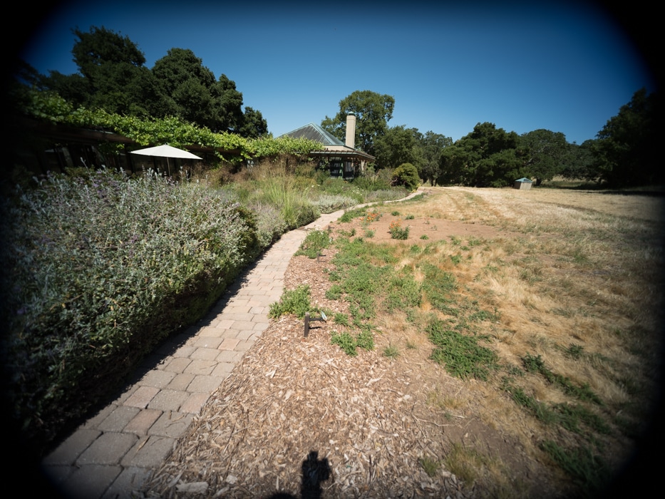


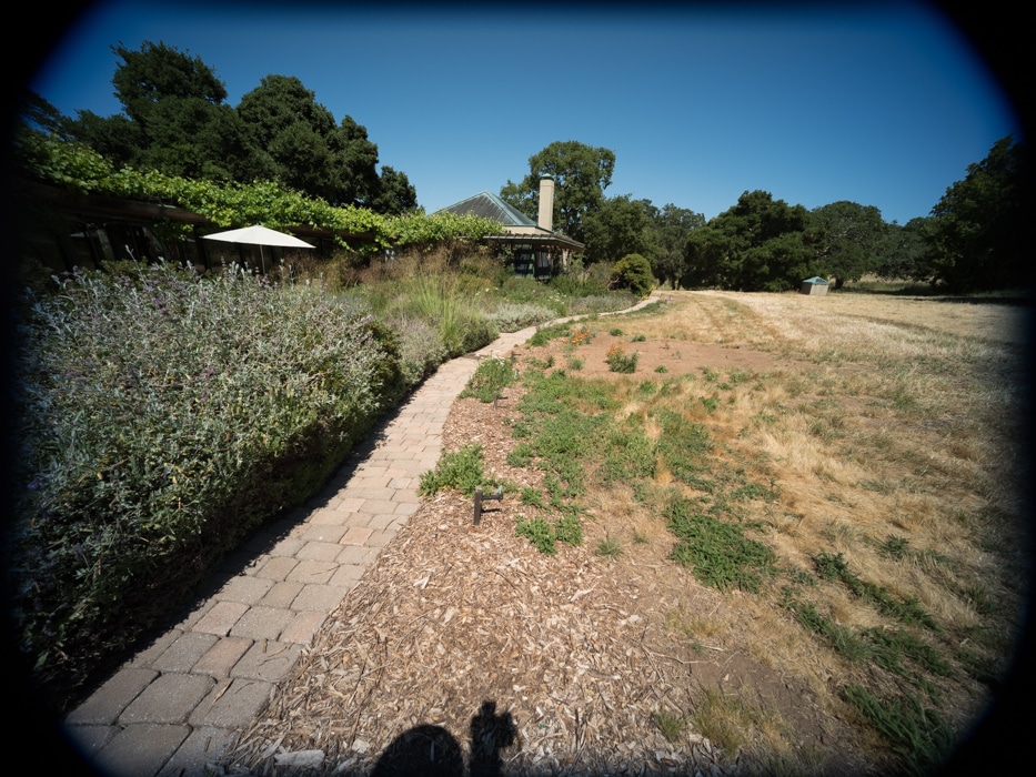
There a lot of falloff, even stopped down. There is a sudden falloff at the very top and the no-so-very sides. I left the hood on the lens. Removing it may make things better, but makes the very expensive lens prone to damage, since without the hood, the front element sticks out, and there’s no lens cap that Leica makes that works in that condition. In addition, the very act of removing and replacing the hood is a dangerous one with respect to damaging the front element. I would never use the lens without the hood, so I left it on.
There are no color casts that I see. I think this is because of the GFX’s small-aperture microlenses. I suspect that they reduce crosstalk, although you’d think that if that were the case Fuji would talk it up as a benefit.
It looks like 1:1 crops, with a bit off the top and bottom, would be fairly easy. Four to five crops would probably work with some effort in post. Full frame images are out of the question.
I’m going to show you some very tight crops; here’s how to use them. The dimensions of the GFX sensor are 8256×6192 pixels. If we make a full-frame print from the GFX on a printer with 360 pixels per inch native driver-level resolution, like the Epson inkjet printers, we’ll end up with a 23×17 inch (58×44 cm) print. The 318×246 pixel crop you’re looking at will end up 0.8333×0.6833 inches (2.12×1.74 cm). Let’s imagine that you or your viewers are critical, and will look at the 22×17 inch print from about 18 inches (conventional wisdom is that the distance would be a little greater than that, or 28 inches (the diagonal), but you did buy a high-resolution camera for a reason, didn’t you?).
The next step is dependent on your monitor pitch, which you may or may not know. Turns out, you don’t have to know it. Just take the 253% crops and view then at 1:1. How high are they? Get out your ruler and measure, or just guess. Let’s say they are 6 inches high. 6 inches is about 7 times 0.8333, so in order to view the crops the way they’d look from 18 inches on the print is to view them from 7 times as far away, or 10.5 feet.
Everything here scales proportionately. If the image on your screen is bigger than 6 inches, increase your viewing distance by the ratio of your image height to 6 inches. If you think your viewers are going to almost get their nose to that print and look at it from six inches, divide that 10.5 feet by 3, and look at the image on the monitor from three and a half feet away.
On a 30 inch 4K display, a 1:1 presentation of these crops will be about 4 inches, so to simulate the effect of viewing the print from 18 inches, you’ll want to back up to about seven feet. A couple of feet for a 6 inch print viewing distance. On a 17 inch laptop 4K display, a 1:1 presentation of these crops will be about 2 inches, so to simulate the effect of viewing the print from 18 inches, you’ll want to back up to about three and a half feet. A foot for a 6 inch print viewing distance.
In the upper-center:
This is pretty good, but it is not super-sharp. The WATE performs about the same on the a7RII wide open.

Better.
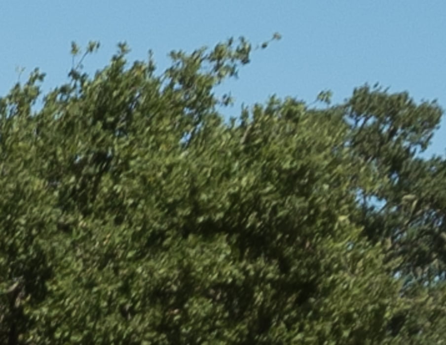
Quite good. There are single-pixel details visible.
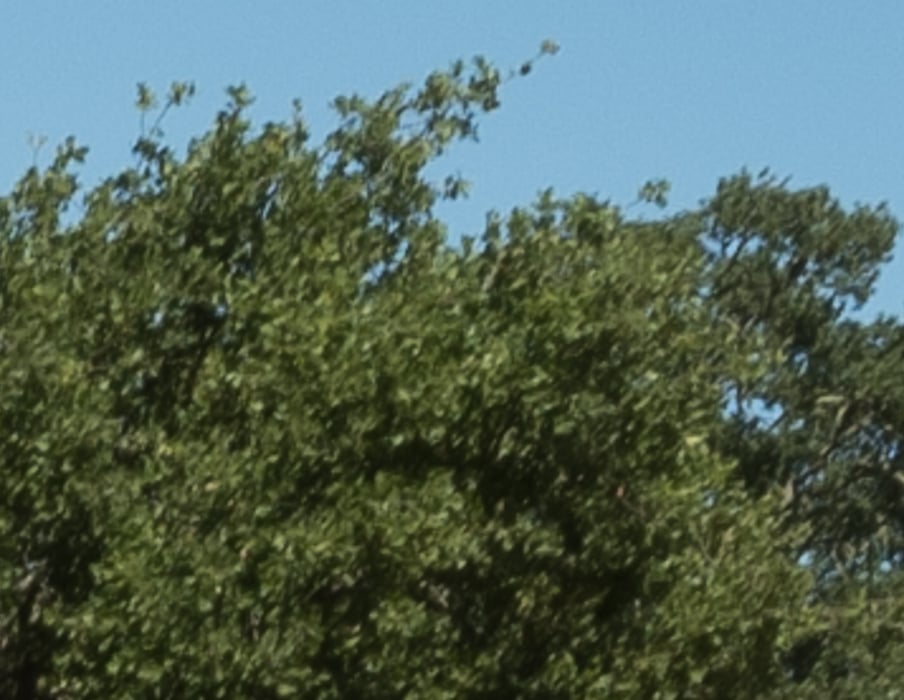
Softening up a bit, but not as much as on the a7RII, since the format size is larger.
Far enough off-axis to approximate extreme the upper left corner of a 9:10 crop (halfway between a 4:5 and a 1:1 crop), with the images brightened to partially compensate for the falloff:
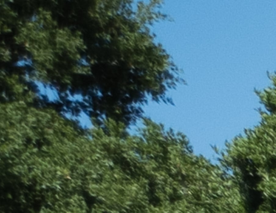
Could be worse.
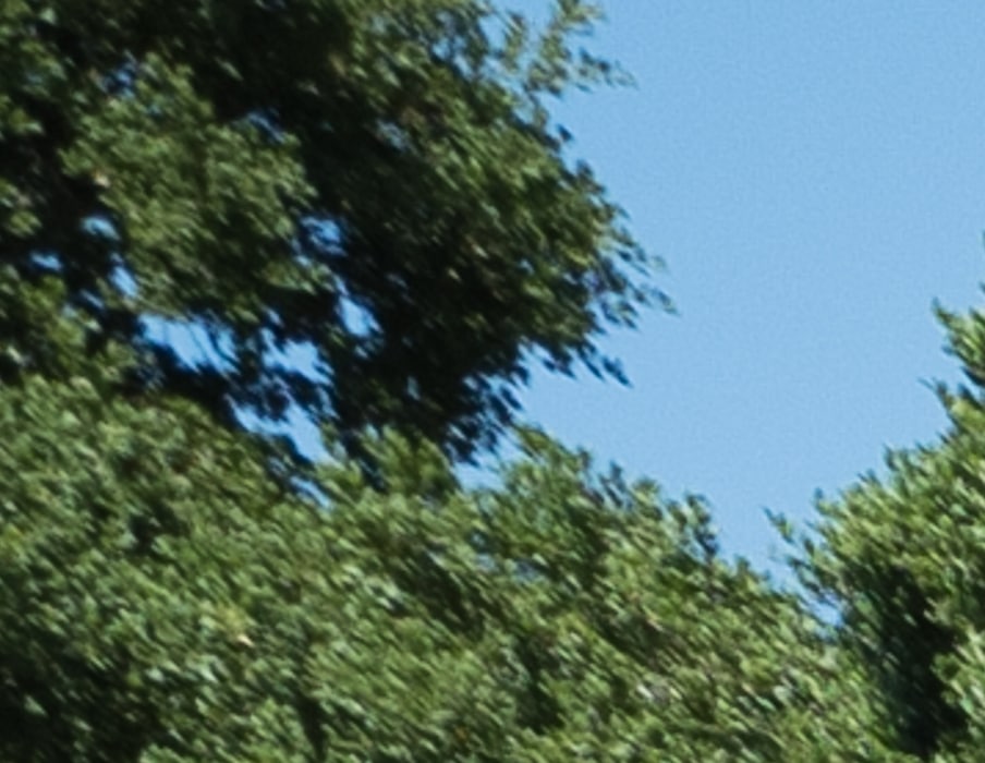
Pretty darned good.
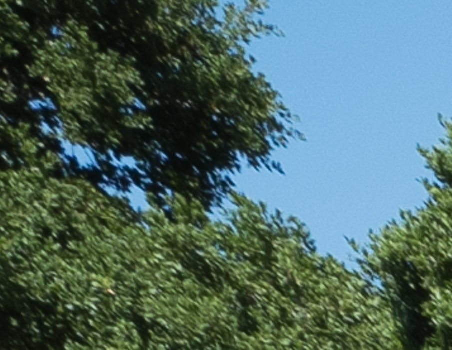
Very good.
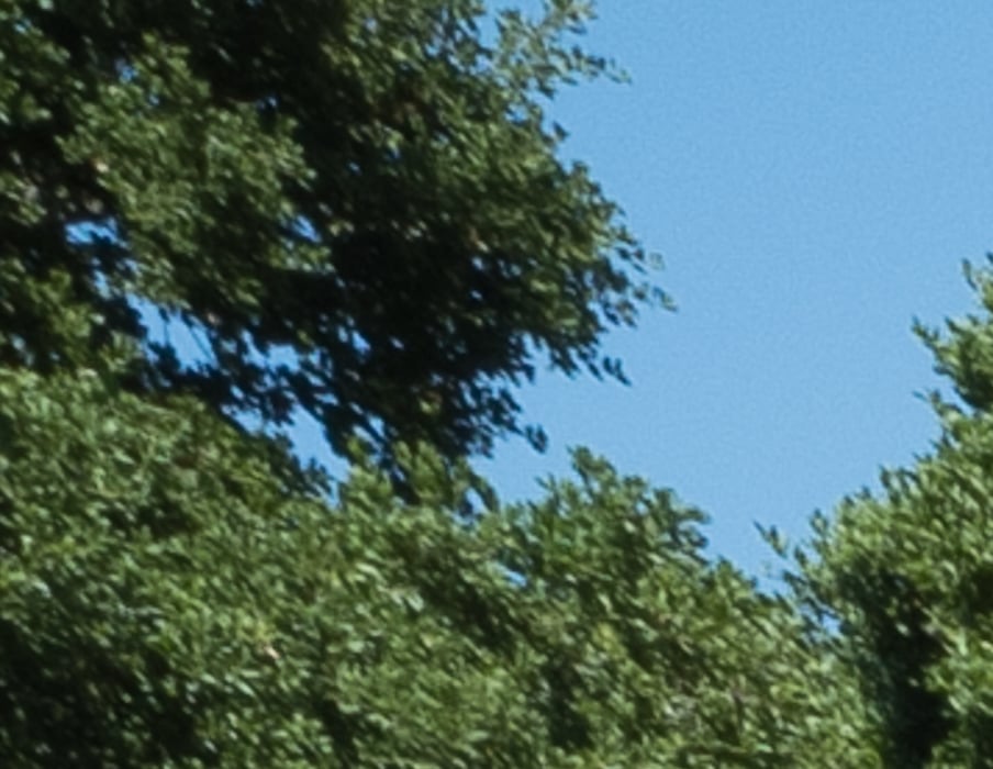
Not bad.
Now we’ll look at 21 mm.


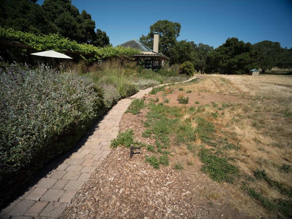

There is much less falloff. There is no color casting that I can see, but this isn’t the perfect target for that.
In the upper center:
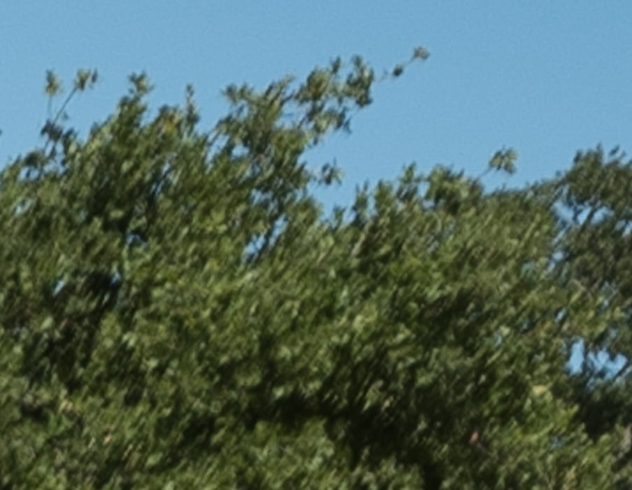
OK. On second thought, better than that.
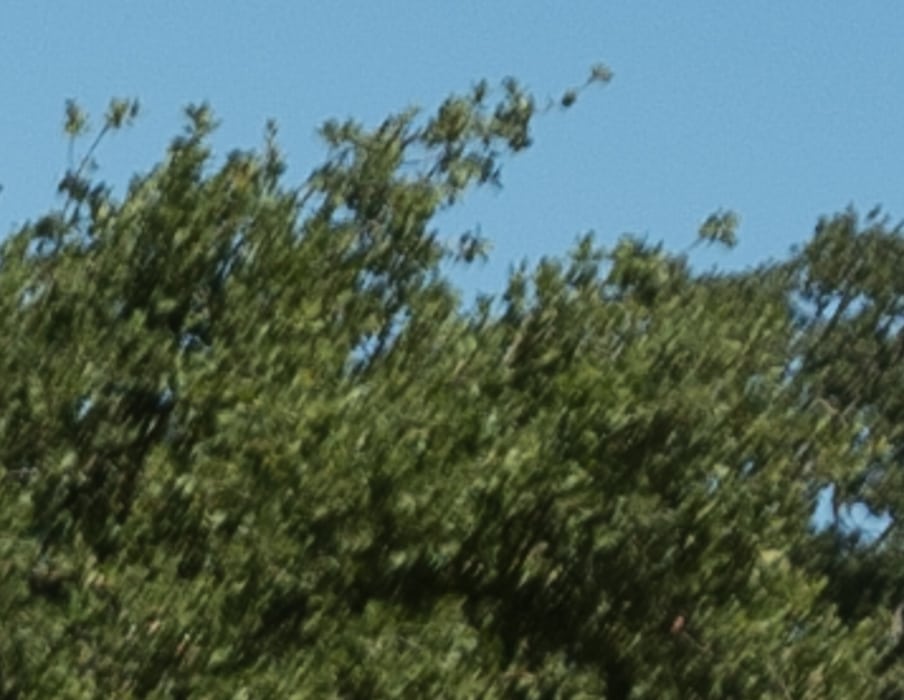
Fine.
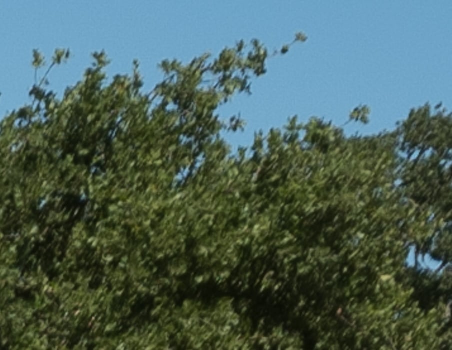
Very good.
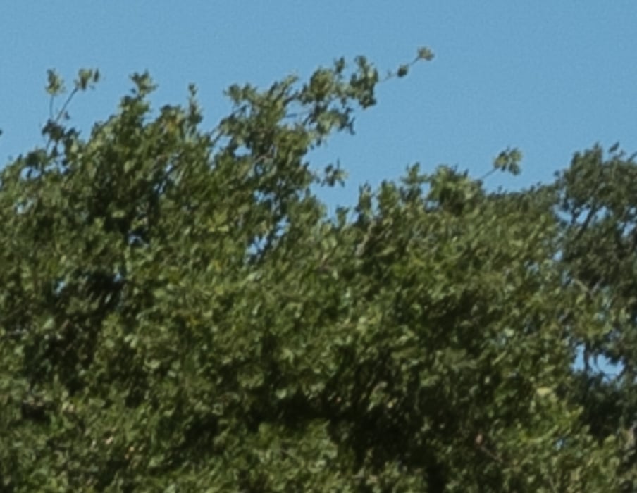
Fine.
In the upper left corner of a point as far off axis as halfway between the upper left corners of a 1:1 and a 4:5 crop:
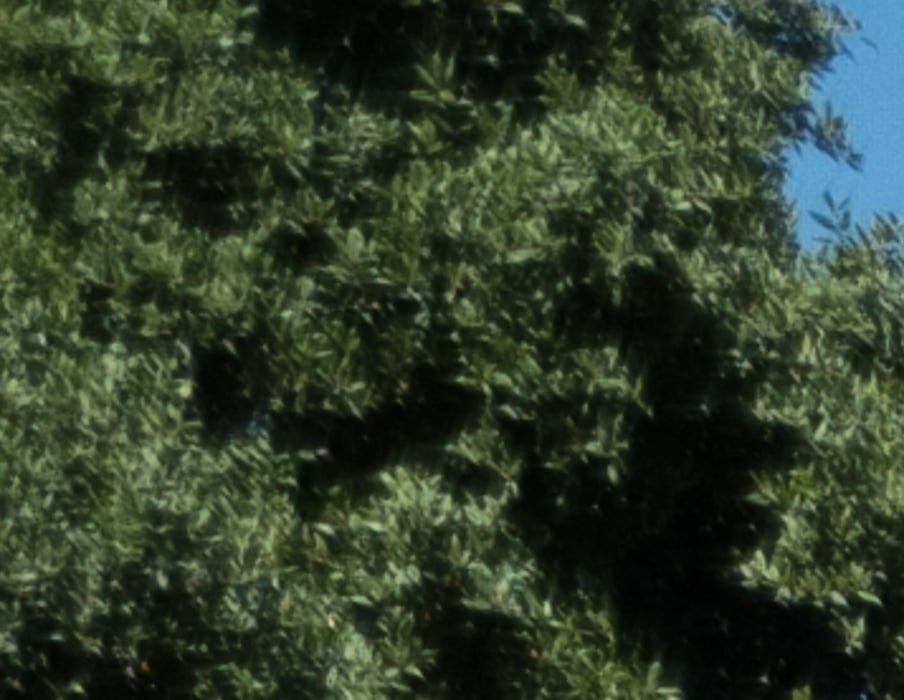
Good. Not great.

That’s fine.

Excellent. Picking up some contrast.
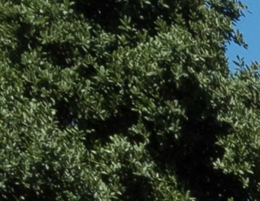
Still very good.
For a zoom lens, the performance that the WATE offers is exceptional, and I think it’s quite usable at 21 mm on the GFX. At 16 mm, the coverage leaves a lot to be desired. Maybe some brave souls will try it without the hood.
In the next post, I’ll compare the WATE at 18 mm with the 18 m,m f/3.8 Super-Elmar-M ASPH.
[…] The Last Word – Leica WATE on Fujifilm GFX 50S @ 16 & 21 mm […]