This is a continuation of my testing of the two new 20 mm f/1.8 lenses from Sony and Nikon. These fit E-mount and Z-mount cameras respectively, and are part of a push by Nikon for a big place in the full frame mirrorless camera (MILC) market, and a defense by Sony of its historical dominance of that market.
Today I’ll show you a lot of images — 10, to be precise — of some foliage that I often uses for lens testing. The distance to the camera is 47 meters, which is basically infinity for a 20 mm lens.
Testing note: I had to retake the Sony corner pictures. I used AF-S for all of the shots in the initial set. When I looked at the crops, I saw that the Sony corner ones weren’t properly focused, even though the camera gave every indication that it was happy with the focus. So I reshot the Sony corner pictures using manual focusing. The Sony focus-by-wire (FBW) tech has gone from pretty awful in the NEX-x days, to quite good today in the a7RIV. Then I noticed the Nikon onces weren’t quite as sharp as the Sony ones, which was different than the Siemens Star testing indicated. I said a few choice words, then reshoot the Nikon series using its abysmal — at least as bad as the NEX-5 — FBW. The results were not dramatically better, so I’ll show you both the best of the three AF-S shots, and best of the three MF shots at each aperture for the Z7. All of this reshooting means the light changed between shots, and you can’t judge corner fall-off from the crops.
Here’s the scene, with each camera, with the lenses wide open.
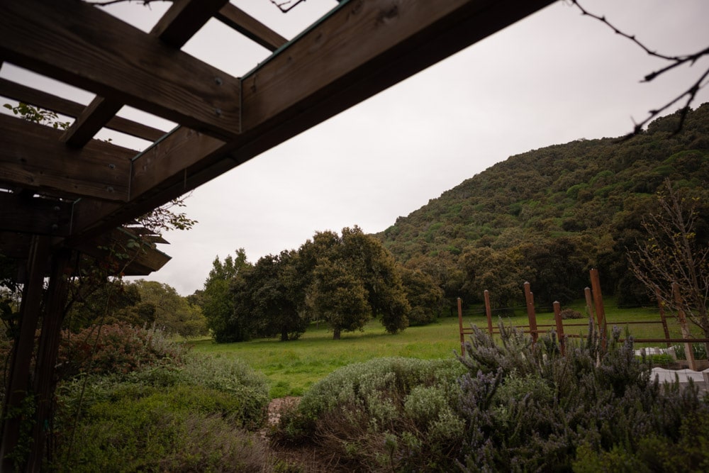
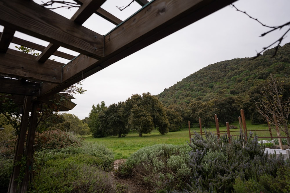
The greater off-axis light falloff of the Nikon lens is pretty obvious.
Capture conditions were:
- Heaviest RRS legs
- Arca Swiss C1
- 2 second self-timer
- EFCS
- ISO 64 for the Z7, and 100 for the a7RIV
- ETTR exposure for both cameras
- AF-S, small spot (not Pinpoint, in the case of the Z7), except for the Sony corner shots (see above)
- Three shots for each variation, picking the sharpest
Images developed in Lightroom, with default settings except:
- WB set to 6500/0 for Nikon, 6500/+10 for Sony
- Exposure 0
- Whites -35
- Shadows +35
- Adobe Color Profile
- Sharpening 20, radius 1, detail 0
- Pick the best of three images at each test condition
I did not try to defeat Lightroom’s silent distortion correction.
We’ll look at some tight crops.
If you’ve seen these here before, just jump to the images. If not, I need to spend some time telling you how to interpret them. They’re at roughly 250% magnification, enlarged to 700 pixels high on export from Lightroom. If you just want a rough idea of the differences, just look at the images as displayed in-line in the posts. However, if you wish to compare these images in detail, you should view these images by clicking on them to see the source files, then set your browser for 100% zooming. Even better, download them and make Photoshop stacks.
No matter what you do, these crops are all going to look horrible. I’m blowing them up so much so that they will represent the original file after JPEG’s discrete cosine transform has had its way with them. If you want to get a good idea of what the images would look like printed, get far away from your monitor. No, farther than that. Put a bunch of the images up on the screen and back up until the best one starts to look good. Then look at the others. There’s another reason why these images won’t look like the best thing the camera/lens combination can deliver. They’re demosaiced with Lightroom. Lightroom is not awful, but for a particular image, there are usually better raw processors. I use Lr because it’s a de facto standard, because I know it well, and because it’s got good tools for dealing with groups of images.
Here’s how to use these highly-magnified crops. The dimensions of the Z7 sensor is 8256×5504 pixels. If we make a full-frame print from the Z7 on a printer with 360 pixels per inch native driver-level resolution, like the Epson inkjet printers, we’ll end up with a 26.4×17.6 inch print. The 289×224 pixel crop you’re looking at will end up 0.8×0.68 inches. The Sony crops are a bit bigger since it is a higher-resolution sensor. Let’s imagine that you or your viewers are critical, and will look at the 27×18 inch print from about 18 inches (conventional wisdom is that the distance would be a little greater than that, or 28 inches (the diagonal), but you did buy a high-resolution camera for a reason, didn’t you?).
The next step is dependent on your monitor pitch, which you may or may not know. Turns out, you don’t have to know it. Just take the 250% crops and view then at 1:1. How high are they? Get out your ruler and measure, or just guess. Let’s say they are 6 inches high. 6 inches is about 7 times 0.8, so in order to view the crops the way they’d look from 18 inches on the print is to view them from 7 times as far away, or 10.5 feet.
Everything here scales proportionately. If the image on your screen is bigger than 6 inches, increase your viewing distance by the ratio of your image height to 6 inches. If you think your viewers are going to almost get their nose to that print and look at it from six inches, divide that 10.5 feet by 3, and look at the image on the monitor from three and a half feet away.
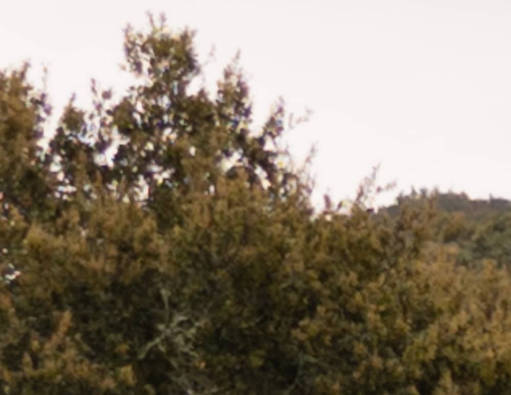
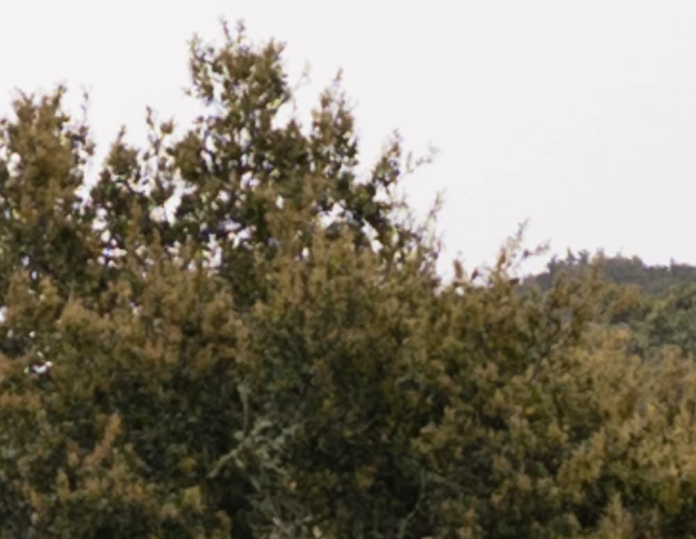
The Sony is somewhat sharper, but don’t forget that it has a higher-resolution sensor.

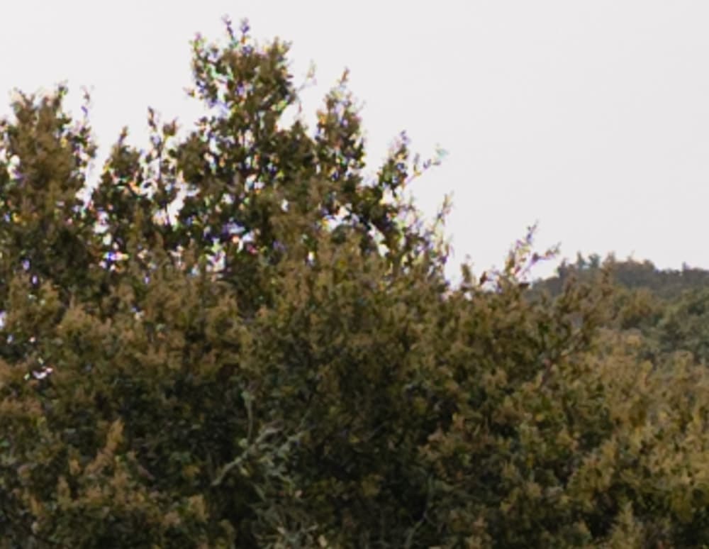
Sony still sharper, but both lenses are sharp enough for there to be visible aliasing.
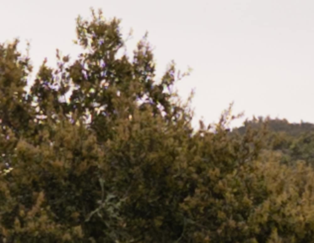

Sony is still looking better.


Both lense are starting to soften.


Diffraction, the great equalizer, takes over.
In the lower right corner, manually focused:
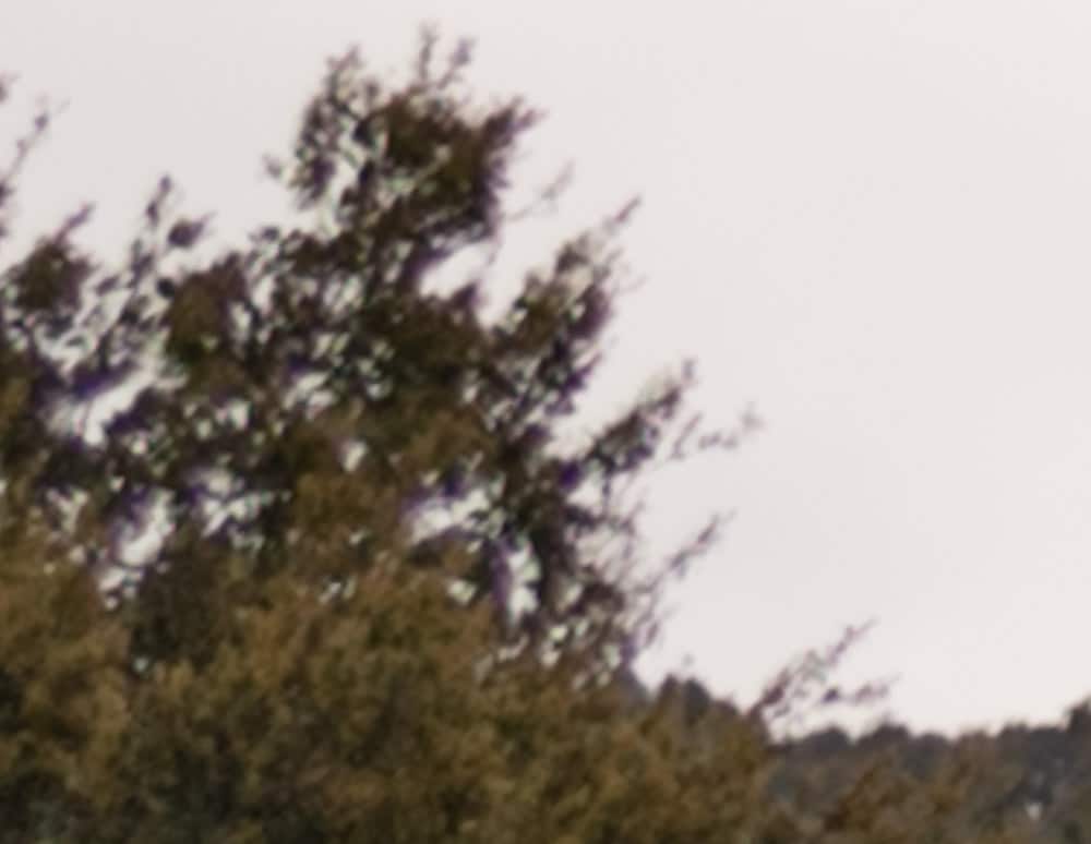
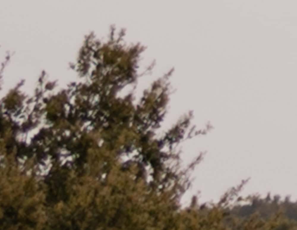
Maybe AF-S isn’t that bad.
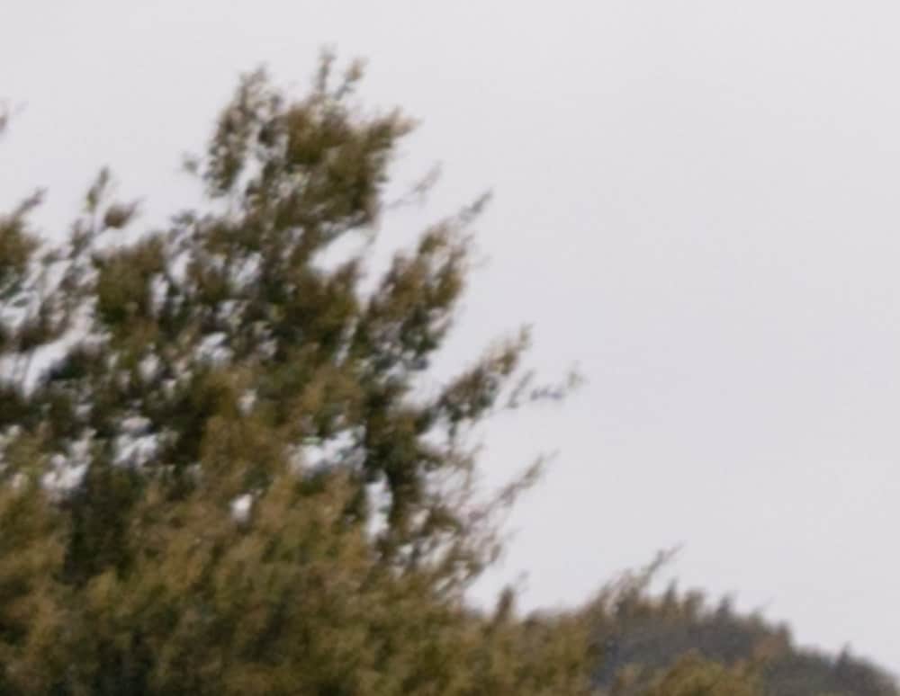
The Sony looks a hair sharper. The difficulty of FBW manual focusing on the Z7 may figure into that.
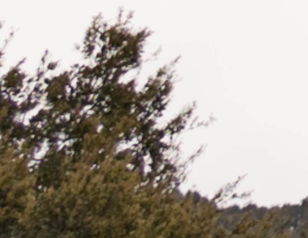
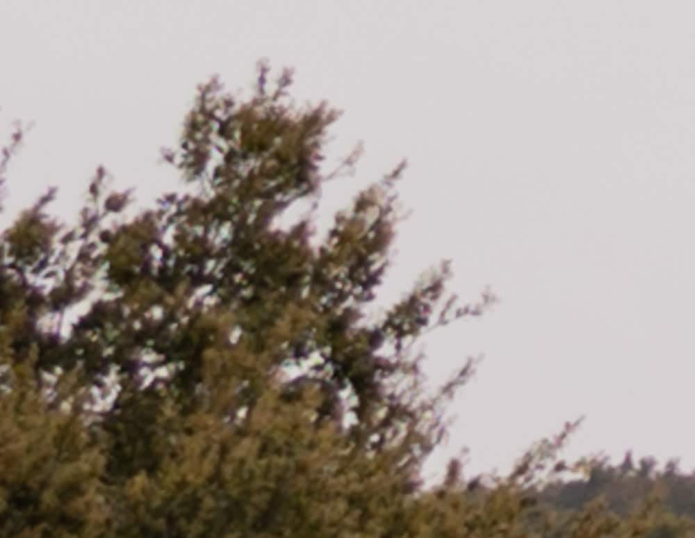
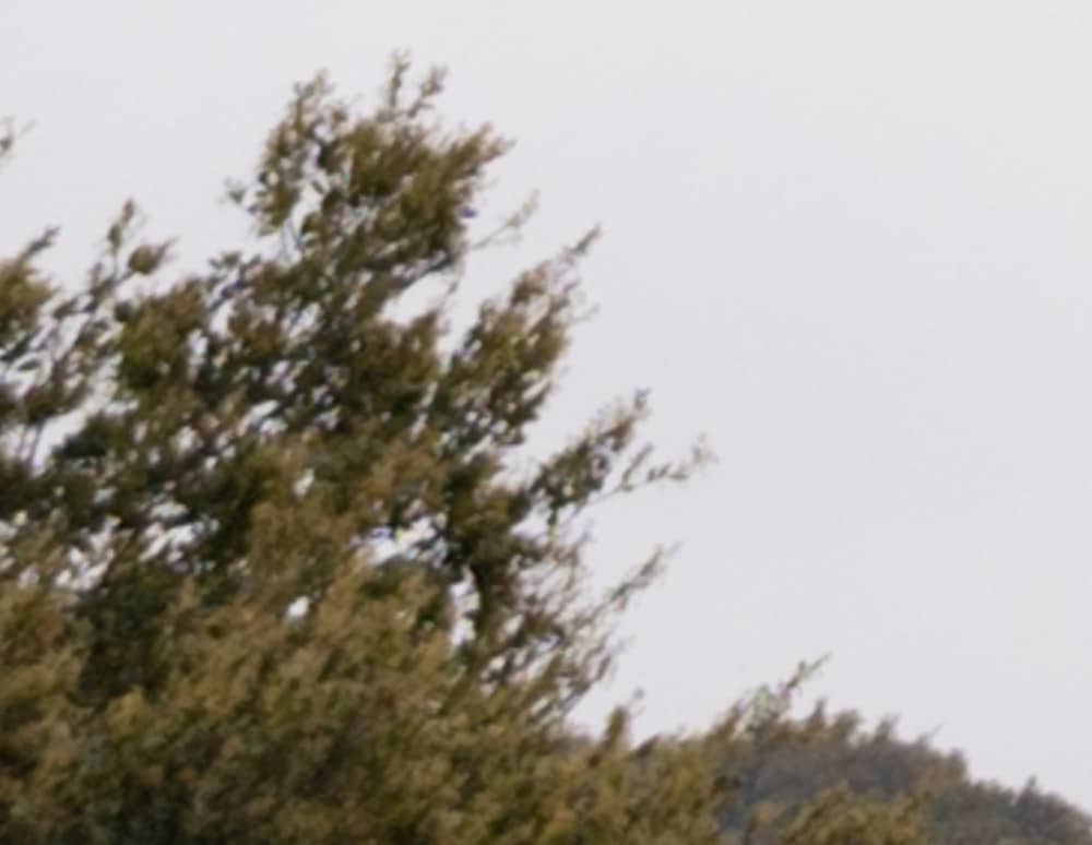
Again, the Sony looks sharper.
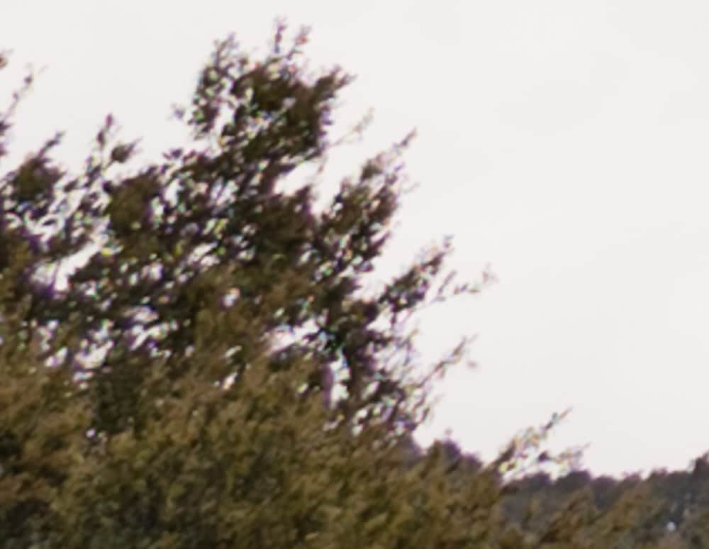

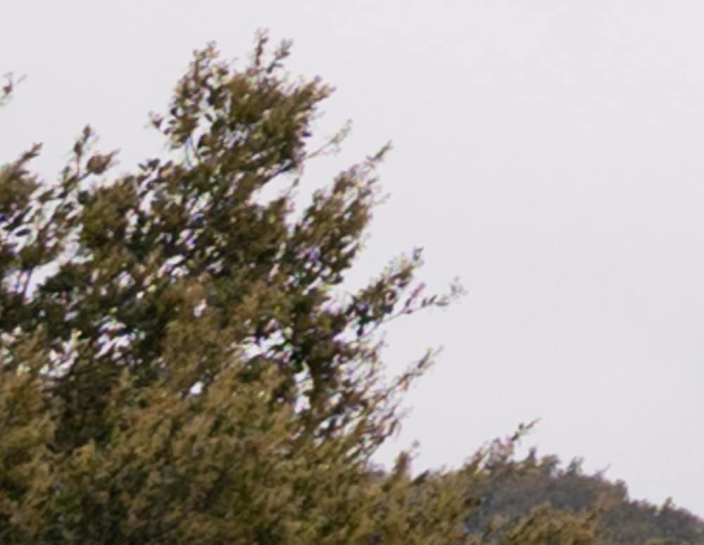
Advantage, Sony.
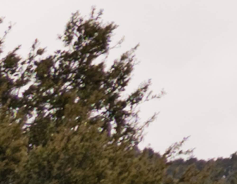

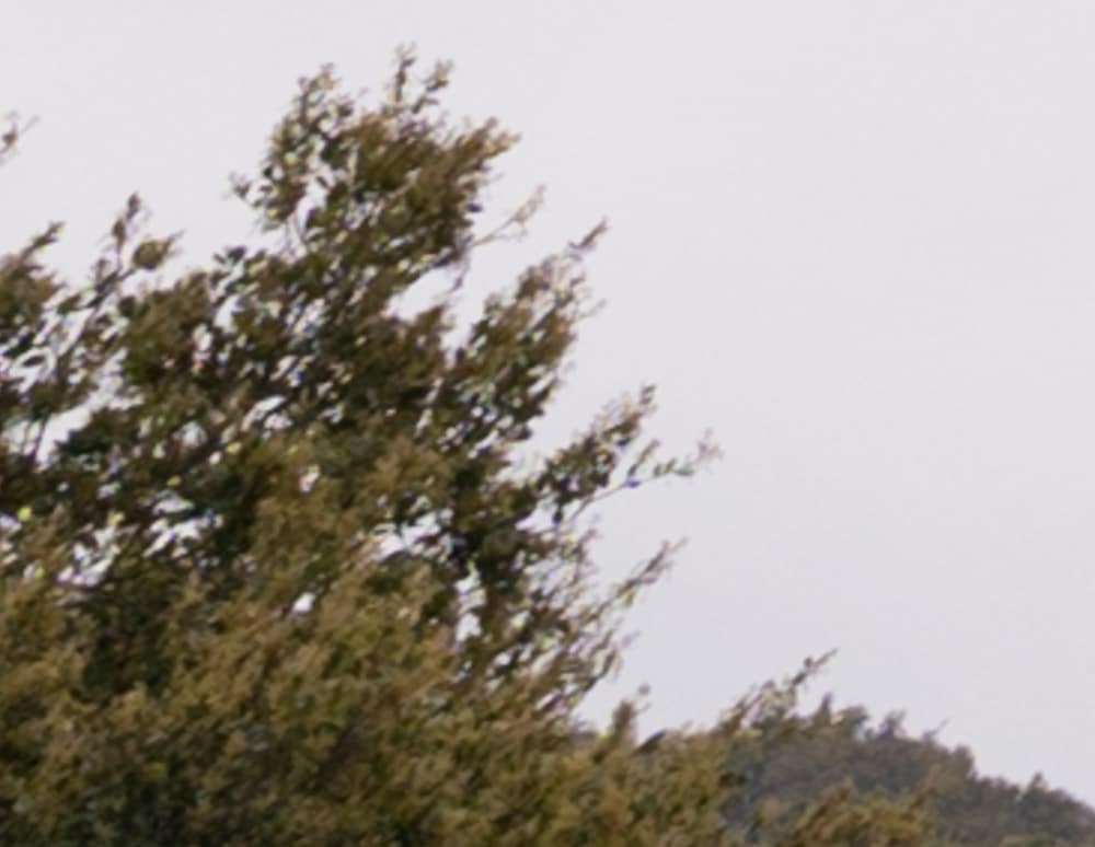
Sony also looks better here.
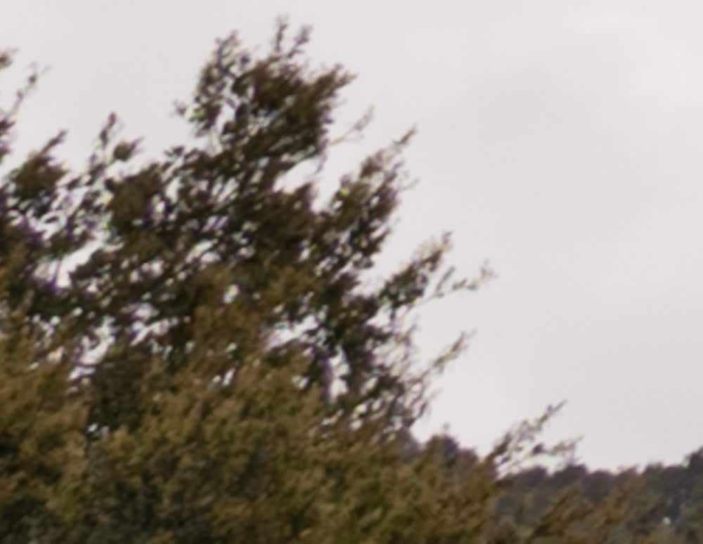
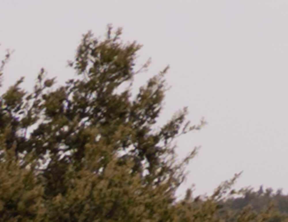
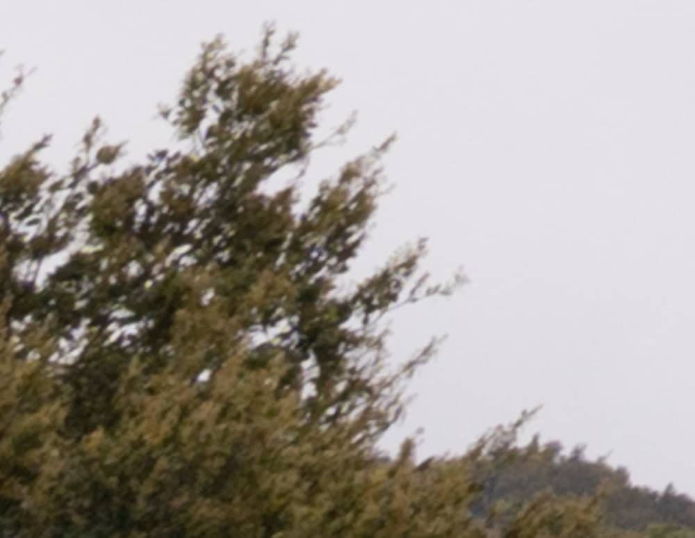
Pretty close. Since the a7RIV has a higher-resolution sensor than the Z7, some of its performance here says more about the camera than the lens.
Leave a Reply