Many people have noticed an artificial, unnatural “crunchiness” in images made with the Foveon sensor. Whether you think that’s a good thing or a bad thing is subjective. Many of the Foveonisti think it’s great. I think it’s ugly.
Where does this wonderful — to some — or yucky — to others — characteristic come from? In my mind, there are two likely sources: aliasing and postproduction.
If I were to conduct my usual kind of testing here, I’d run right out a buy several Foveon sensor cameras, learn to use the Sigma raw developer, and conduct a proper test. I’m not sufficiently interested in the topic to go to that much expense and trouble.
But I do have enough interest to evaluate some images made by others.
I started out with the DPR Studio Scene.
I downloaded JPEG developed images from the following cameras:
- DP1 Merrill
- DP2 Quattro
- FP L (Not a Foveon sensor — this one has a Bayer color filter array (CFA))
- SD Quattro H
All is not apples to apples here. The two Quattro sensors are not the all-color-planes-coaxial devices that Carver Mead envisioned.
I looked at the high-contrast slanted edge in the Studio Scene with Imatest.
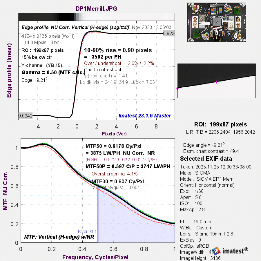
This image shows very (and to me horrifying) contrast at the Nyquist frequency and above. The Nyquist frequency, above which information will be aliased, is the light blue vertical line in the left-right center of the chart. All the frequencies above it (the area shaded in light blue) will be aliased. There is also a big hump at 0.2 cycles per pixel that will likely create a crunch appearance.
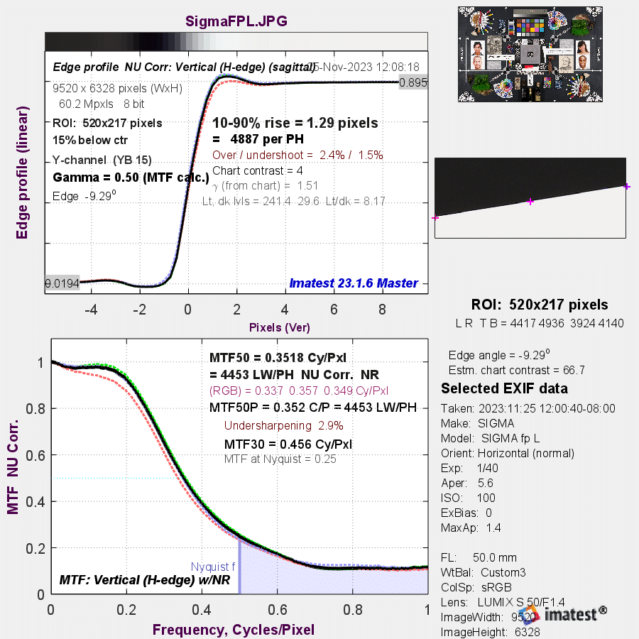
The Bayer CFA FP L shows both issues, but to a much lesser degree.
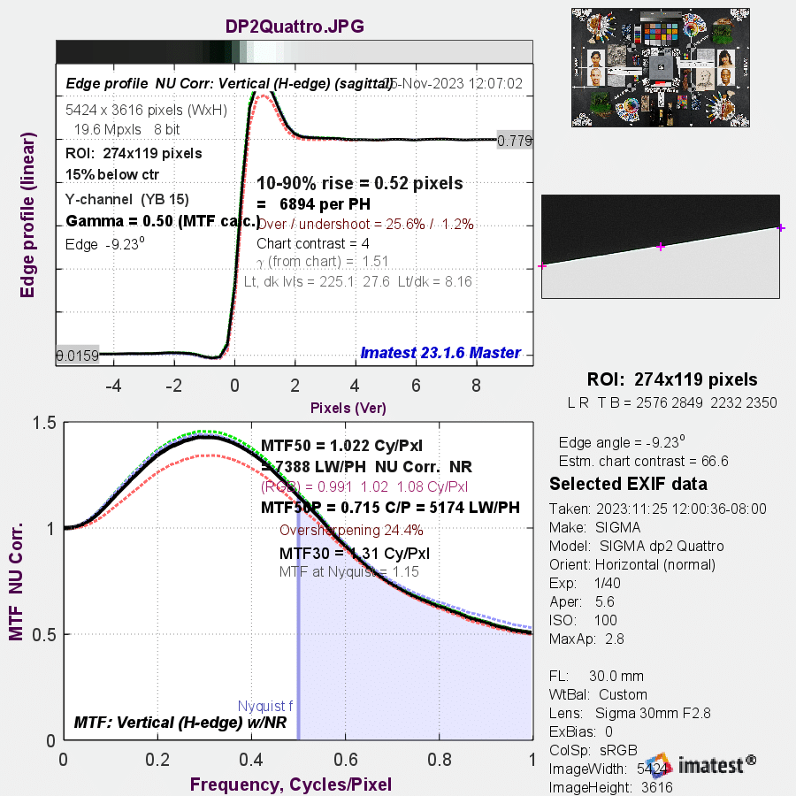
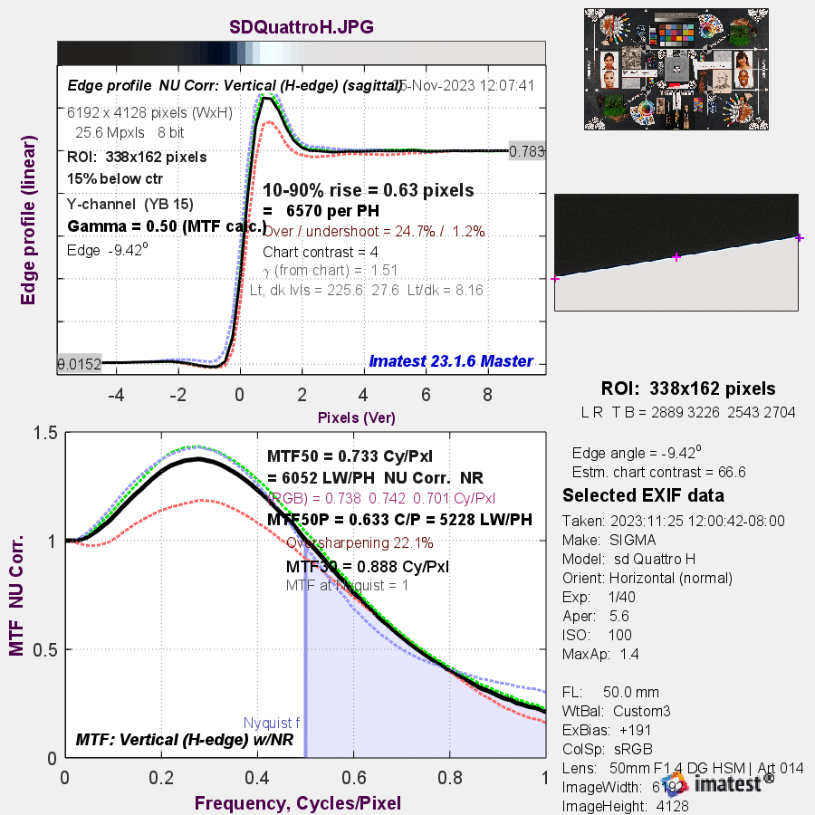
Both Quattro images are afflicted with both a lot of energy above Nyquist and big bumps in the MTF curve resulting from postproduction.
We don’t know the processing options that DPR chose for these. They have a tendency to stick to default settings, so we may be looking at the default postproduction here.
As a sanity check, let’s look at the DPR JPEG processing of the Studio Scene with the GFX 100.
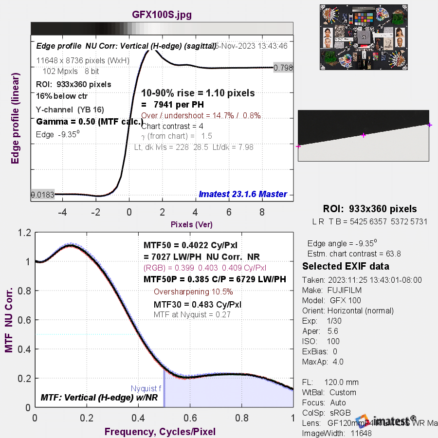
It has a similar bump in the MTF curve at about 0.15 cycles per pixel, and the aliasing is at about the level of the FP L. The biggest difference between the Foveon and Bayer-CFA sensors appears to be in the amount of aliasing.
A reader downloaded the DP1 Merrill raw file of the Studio Scene and developed it with default processing except sharpening set to -1.5 and chroma NR set to min and max.
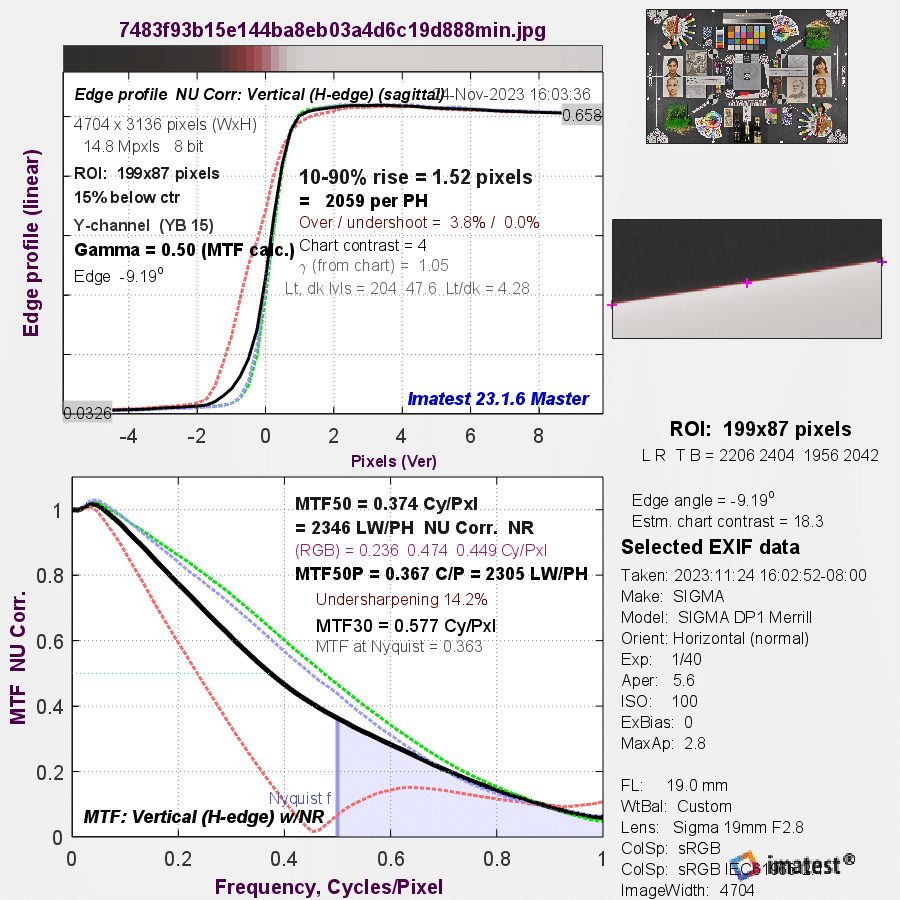

In both cases there is extreme softening of the red plane. The Chroma NR setting seems to have no effect on the frequency response.
This is so different from the DP 1 result above that it makes me think a different raw developer could have been used.
I am still confused about the crunchiness, but I am confused at a higher level. I think aliasing is a component, but postproduction also plays a role. The Sigma raw developer allows resampling the images to higher resolution before exporting, and those images appear to me to be much crunchier than the images exported at native resolution.
JaapD says
Thanks for sharing this interesting experiment Jim. Let me start mentioning that I have no business with Sigma, I’m an X-Trans user.
When looking through my electronic engineering spectacles I find the Foveon edge profile absolutely stunning. I don’t have a problem with the minor Foveon hump as well as with the relatively high MTF @ Nyquist. We’ve had similar cases a few decades ago with low pixel qty Bayer sensors as well as with monochrome sensors, in combination with sharp optics. The solution there and then was either accept the sharpness (and fold-back distortion) or apply an optical low pass filter. From technical viewpoint the latter one was preferable, however expensive.
Regarding ‘ugly’; I find the larger humps in the various graphs ugly, especially from the Bayer sensor. These humps do not come from the optics nor sensor. I suspect the post processing, where else could it come from? This tells ‘me’ that a Bayer sensor is incapable in itself to create a sharp image and it always needs some form of sharpening through post processing.
I think a more honest comparison would be desirable if I may say so; by turning all post-sharpening to zero. Reasoning behind this is that then differences in Foveon / Bayer technology may become clear. Also, in both cases one can still apply post-sharpening to individual taste.
In the end things may be a matter of individual taste, I can understand that. Do you prefer an initially by the optics and sensor created sharp image, requiring minor or no post-sharpening or do you prefer a soft image to start with, having less Nyquist artifacts, and add mandatory post-sharpening?
Cheers,
JaapD