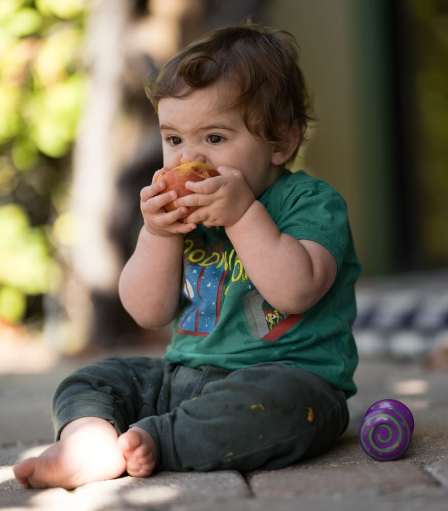
In the last post, I showed you two images developed in Lightroom with different color profiles and presets. I got a few comments about the white balance. In the previous post, I set the white balance by eye for the Adobe color image, and left it at the same place for the others, with the exception of the custom open shade profile that I created using Lumariver, which, since it was developed for light with a blue cast to it, was way too yellow. I brought that back towards the color balance of the Adobe Color image by eye.
That wasn’t very satisfying, on either an intellectual or an esthetic level. The high road would be including a gray card in the image, and white balancing all the images to the card. I couldn’t so that without finding a model, setting up, and shooting new images, so I came up with a compromise. I found a nearly-neutral area in the image with about the luminance of an 18% gray card, white balanced to it, and gave the image one Lightroom click bluer in color temperature to compensate for the slightly blue cast of the area I was white balancing to.
While I was at it, I added a bunch of profiles, including some Cobalt film simulations and the Adobe/Fuji Astia and Provia ones. I tried a lot mode profiles, and I’m not showing you the ones that I thought were really terrible.
Here’s what resulted.
I’ll start out with the three profiles with some pretentions with respect to accuracy.


Now the treatments that are designed with only pleasing color in mind.


And the two presets:


Leave a Reply