In the last post, I showed that, at least in the default general-purpose settings, Lumiriver Profile Designer did not do a particularly good job of producing the same color from raw files from three different cameras, even though with the reproduction defaults (except for 2.5 dimension LUTs) it did pretty well with at least one pair of cameras.
Now I’ll look at a canned profile that most of you probably know. It’s Adobe Color Profile (ACP), which was introduced a few months ago as the new default Adobe profile for most cameras. ACP replaces Adobe Standard Profile (ASP) in its default status, but ASP is still around. ACP tends to be a bit more chromatic than ASP. I’ve tested both ASP and ACP across cameras before, and have not found them to do a good job of calibrating out camera differences, but I thought it would be useful to rerun those tests with the same raw files that I’ve used for the last few posts, so that we can make comparisons among ACP and the two Lumariver defaults, reproduction and general-purpose. In addition, I’ll look at camera-to-camera consistency — or, in this case, lack of it — which I hadn’t done in the past.
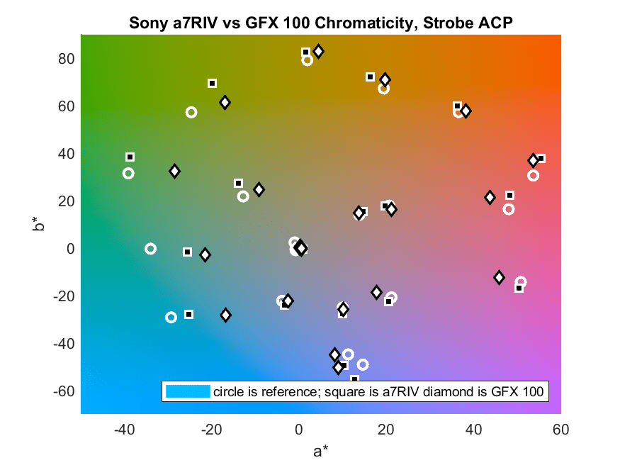
The cameras were, as before, the Fujifilm GFX 100, the Nikon Z7, and the Sony a7RIV. Lighting was from a pair of Godox AD600Pro strobes. Here are the pairwise chromaticity comparisons.
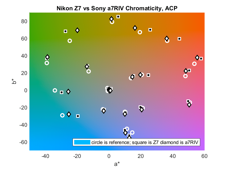
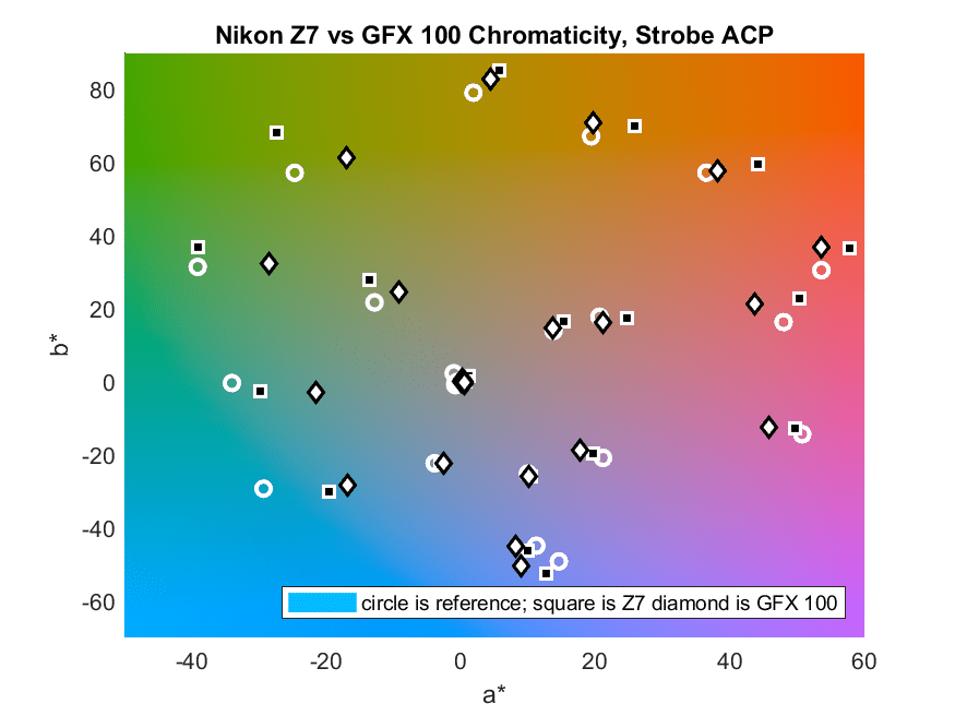
As with the Lumarive general-purpose default plots, there is seemingly no pattern. Look at the green patch in the graph immediately above. The Z7 is very close to the right value, with about the right chroma, and just a little hue angle shift. The GFX 100 is far less chromatic. How much of that is the result of the intrinsic differences among the color filter arrays (CFAs) of the cameras? Let’s take a look at the reproduction results for the Z7 and the GFX 100:
That tells us that it’s possible to get those cameras to get fairly close when looking at the green patch.
OK, let’s look at the stats for the cameras vs the reference (measured with an i1Pro 1D spectrophotometer):
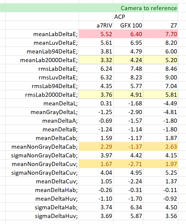
I’ll put a description of the row titles at the end of this post. Let’s look at the first yellow row, the average Delta-E 2000. The GFX 100, which was the worst in the Lumariver reproduction case, is now in the middle. It was also in the middle with the Lumariver general-purpose case.
Comparing the cameras to each other, and ignoring the reference:
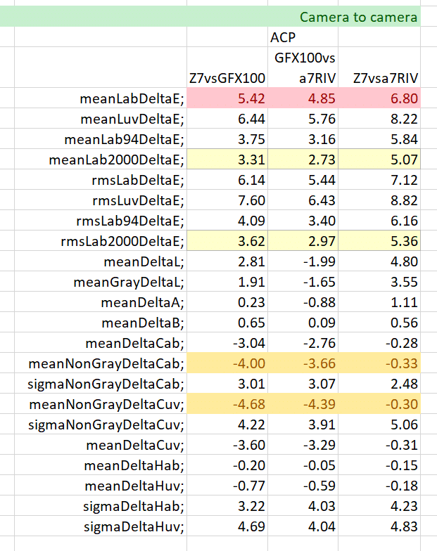
In general, the cameras are not materially closer to each other than they were to the reference. Basically, there is no discernable “look” that transcends the cameras that generated the raw files.
This is mildly depressing. The fact that the reproduction profiles very fairly tightly bunched — the worst aggregate camera-camera spread was better than the best one here — indicated that calibration of the camera was reasonably effective. You would think that applying a look to already tight spreads would widen tham, but it appears to do so.
Jim,
This stuff is a bit interesting.
Ideally (?), we would have a good basic conversion and having a look on top of it. The Adobe DNG specification certainly implies that, but it seems that Adobe themselves work outside that ‘natural path’ prepared by themselves.
Sometime a while ago, I tried to use some ‘Velvia’ emulation from Adobe and redeploy on some other camera. It resulted in weird colors, but not really Velvia colors.
Just to say, you perhaps opened a real can of worms. But, as I used to say, if you don’t like worms, turn no stones!
Best regards
Erik
Hi Jim,
I thought the Adobe Color rendering was meant to be more pleasing then accurate? I personally use the profiles from Huelight for my GFX and Sony cameras and they give very nice results.
BR
Chris
That’s true of all the Adobe color profiles. In general, ASP is the most accurate, and ACP is the 2nd most accurate. The Adobe tone curve, which is nonlinear, is an indication that accuracy is not the be-all and end-all for them.
However, if the cameras were calibratable, and Adobe calibrated them perfectly, every camera would produce the same (intentionally wrong, but intended to be more pleasing) colors from the same scene.
Hello Jim,
I’m not suprised you’re not getting very accurate colors with Lumariver Profile Designer default settings. Those are ‘general purpose profile’ settings. They’re absolutely not aiming at ‘dead-accurate’ colors.
Default settings introduce significant gamut compression (default is ‘Strong – Adobe RGB’).
According to the developper this is because:
“One may think that today raw converters would deal with gamut compression in real-time inside the software without involving the profile. While this probably is a good idea it’s not how it’s done today — raw converters still expect that the camera profile provides some static gamut compression to deal with high saturation colors. ”
My personal experience tends to support what he says. I did not do a scientific comparison of alll RAW converter though… 😉
Gamut compression affect vivid colors and not only colors outside of ‘target’ gamut (Adobe RGB by default).
Hence, I’m not surprised by the chromacity deviations in the most vivid colors, especially in the blues (which look way outside of Adobe RGB of your Lab graph).
Additionally, LUT correction with default settings:
– does not correct lightness
– limits chromacity correction
Intent is to keep an extra-smooth rendering. Indeed, the more non-linear correction you introduce, the more you’re likely to get ‘nasty things’ in gradients, color transitions, etc.
Should you want more accuracy you can :
– enable lightness correction and in that case the software apply a ‘relaxing’ algorithm to find a balance between accuracy and smoothness
– if you want, fine tune the tolerancies and the ‘bends’ you tolerate in the LUT.
For those who want ‘dead-accurate’ colors, then ‘reproduction profile’ is for you. But that’s usually not a good solution – at all – for general photography.
And for those ‘who sit in-between’, you can fine tune the settings.
Manual is very clear. 🙂
While I disagree with some of the particulars of your comment, I agree with the thrust of it. However, I think it misses the main point of the post.
Hello Jim,
Oh, my comment was really specific to your comment about Lumariver results, not your whole article (which is very interesting by the way 🙂 ).
That said, what are the particulars of my post you disagree with ?
Alway pleased to learn. 🙂
First off, none of the CC24 colors are outside of Adobe RGB. Only one is outside of sRGB, and not by very much.
Second, the reproduction profiles are far from “dead accurate”, even when the evaluation set is the same as the training set, which, with only 24 patches, seriously stacks the deck. There are some posts on that.
The most popular raw developer, Lightroom/ACR, performs almost all its calculations in a linear color space with ProPHoto RGB primaries.
That’s a start.
Jim
Thanks for your reply Jim.
Like I saif, always pleased to learn. 🙂
You’re right about out of gamut colors.
I should put more attention on the scales. 😉
I had absolutely no idea about how ACR works internally.
What I can say from my ‘dumb-end-user’ perspsective is that if I create a profil without gamut compression, I get quite different results from different results with most vivid colors from on RAW converter to another.
I thought it was due to the way they handled gamut compression, as Lumariver developer mentioned in the manual. But maybe it’s not…
(And I would be glad to get the explanation in that case. 🙂 )