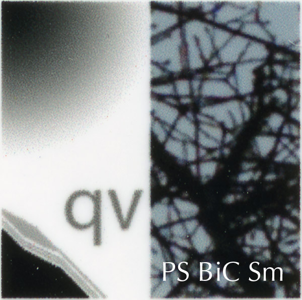
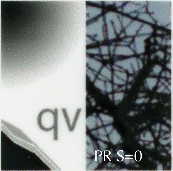
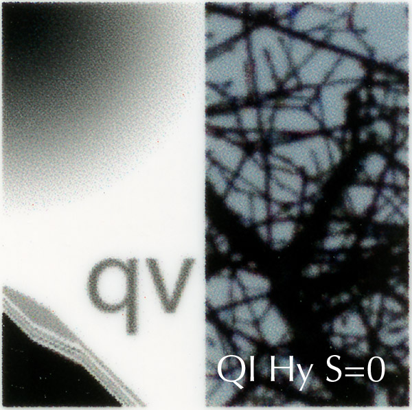
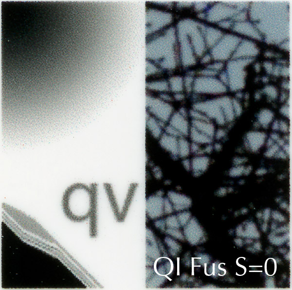
The next set of images is res’ed up from 330 ppi to 360 ppi. With some resampling techniques, notably and egregiously nearest neighbor, resampling with resolutions that are close together yields obvious objectionable artifacts.
As before, the results are followed by an analysis.
Photoshop Bicubic Smoother (above)
Perfect Resize (above)
Qimage Hybrid (above)
Qimage Fusion (above)
There is noticeable patterning in the radial gradient for all of the techniques except bicubic. The patterning is not objectionable, and in almost all photographic images, would be obscured by small variations in the image itself.
The letters are smoother in the Perfect Resize image then in either of the Qimage ones. Actually, the PR letters look a lot like the bicubic ones. I think choosing between them as a matter of personal preference.
PR and bicubic have trouble separating the diagonal lines. The two QI images are better in this regard, but suffer from some departures from the true middle gray tonality in the source image.
Some mottling is apparent in the sky in all images, with by cubic producing the best results, followed closely by PR, and then by the two QImage results. There’s not much to choose between the sharpness of the branches in any of the results.
This test produces the smallest set of variations among the various resampling algorithms. When you resizing up just a little bit, it looks like it doesn’t matter too much which algorithm you use.


Leave a Reply