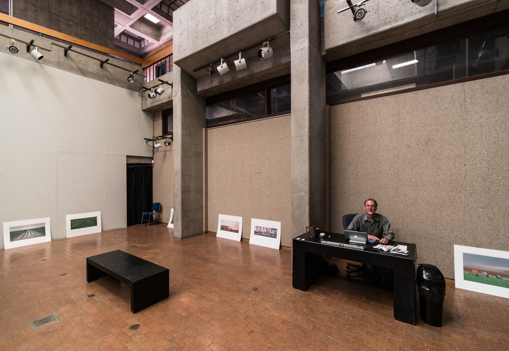
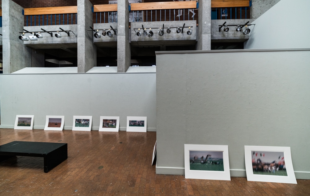
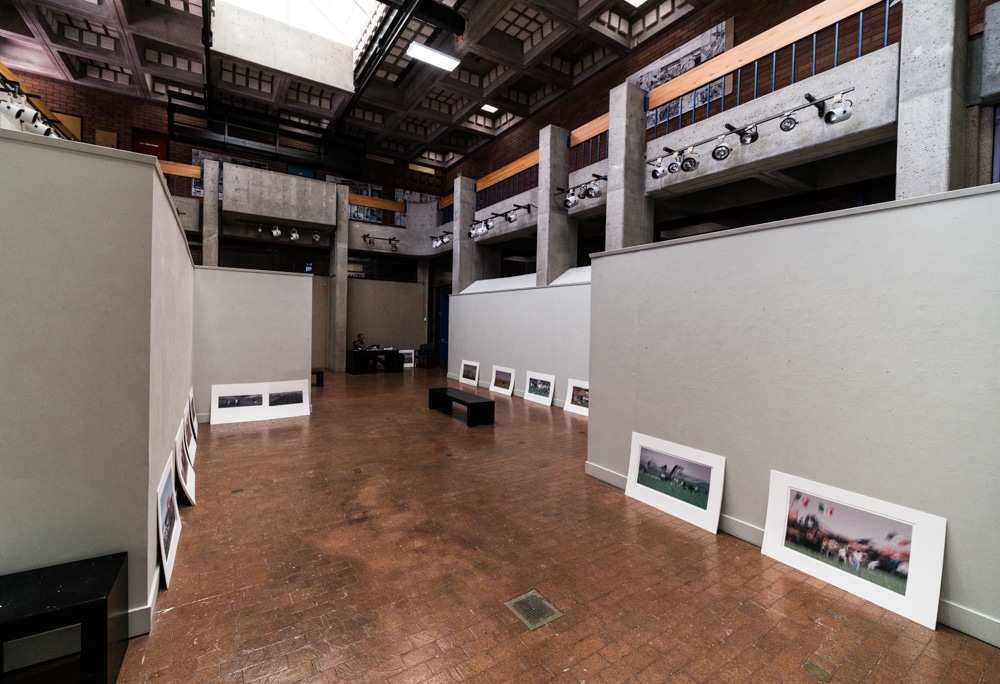
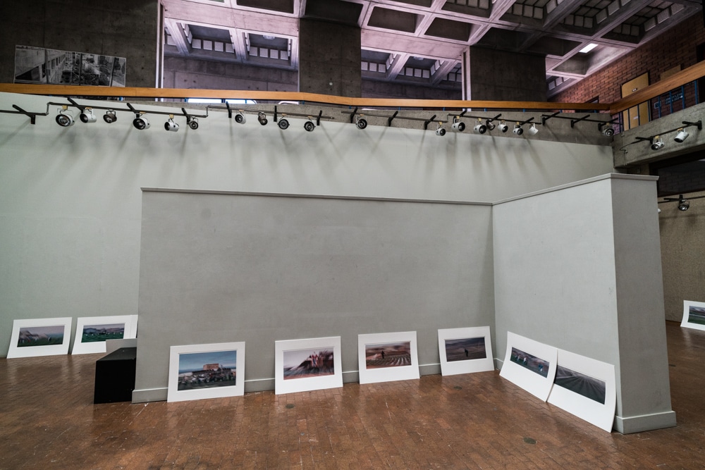
Gary Smith, the Director of the Hartnell Art Gallery, asked me to come over and see what he’d done with the sorting and pre-hanging of the Pastures of Plenty reprise exhibition, which I’m calling This Green Growing Land, which is what I now call the whole series.

I love this space. As you can see, there’s a lot of headroom. There is a big skylight that gives a nice soft feel even when the gallery lights are on. It’s also big, with lots of room to back up from the work.
I hadn’t seen these prints in 14 years. I was surprised at how dark they were. I print them lighter now. There were five or six images in the original show that I no longer feel good about. Fortunately, it seemed like the show would hang better with fewer prints, so we ditched them all.
When I showed up, Gary had already done a great job arranging the work. I requested only a few changes. I also liked his proposed font for the title banner.
Because of the mixture of natural and artificial light in the gallery, the color balance changes depending on where you are. This is kind of a problem in making images like those above but is not one when you’re viewing the actual work, since adaptation seems to fix it all — isn’t human vision wonderful?
I would have liked to get some of the farm workers images that came after the first show into this one, but it seems there are already plenty of images, and I’m not sure I could have gotten new ones printed and matted in time. So it’s going to be strictly a reprise.


Leave a Reply