If you’ve ever spent time with a good astronomical telescope and a short-focal-length eyepiece, you know that Airy disks don’t look like the ones I graphed in the preceding post. The rings (bumps in cross-section) around the central haystack are much more prominent.
What gives? Am I lying to you? Is my math wrong?
Here’s what’s going on. The vertical axis of the graphs that I showed you yesterday are linear. But the eye doesn’t see things that way; it looks at luminous intensity more like the cube root of a linear representation.
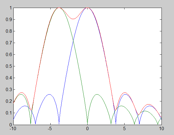
When I replot the two Airy disks at the Rayleigh limit, this time with the vertical axis being the cube root of linear intensity, here’s what it looks like:
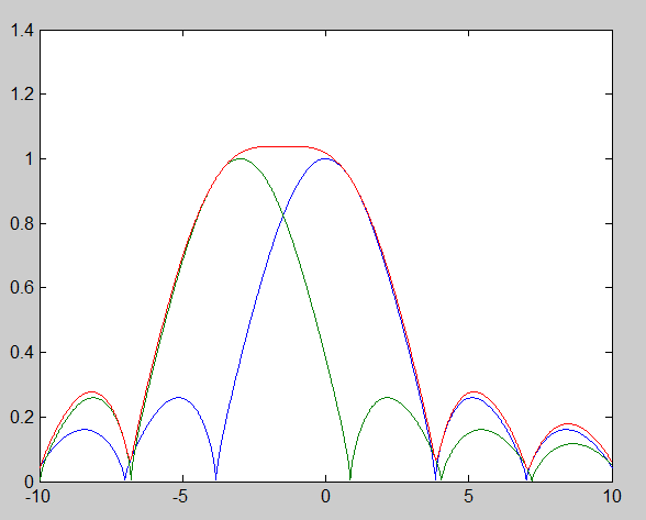
The two disks at the Sparrow limit, similarly plotted, look like this:
That’s more like it, huh?
I’m indebted to Chico Marx for the title of this post. The line is from Duck Soup.


Leave a Reply