This is part 8 of a test of the Sony 12-24 mm f/4 FE lens. The test starts here.
A couple of TLAs (three-letter acronyms) up there, huh? OOF you probably know; it stands for out of focus. PSF means point spread function, and is a bit more obscure. It’s what the camera does with a tiny point of light. For these experiments, my point source was a AAA LED flashlight about 15 feet away from the lens, which was focused as close at it would go.
At 24mm and f/4, I moved the camera around so that the light fell at various places in the frame:
The distortion is of the pincushion variety, and is quite different when the lens is focused as close as it will go and when it was focused much further away, as it was in the earlier distortion testing. It will be an interesting project to come up with a lens profile for this lens. You can see that not all the little blobs are round, and some have color tinges. Let’s look at the center one, then move one blog to the left until we get to the edge of the images, then drop down to the extreme corner below there.
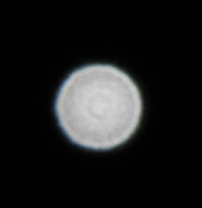
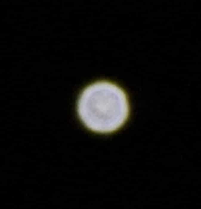
Here’s the center. It’s got “onion rings” which usually indicates some aspherical molded elements. You’re actually looking at machining marks in the mold! Not a lot of color fringing, which is good. That bright ring around the edge is a sign of lack of smoothness in the bokeh.
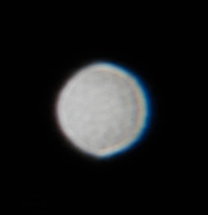
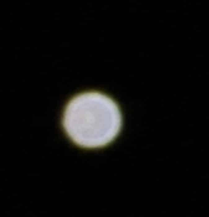
A little to the left, and we’ve got some obscuring of the diaphragm giving a mild football shape, and anisotropic color fringing.
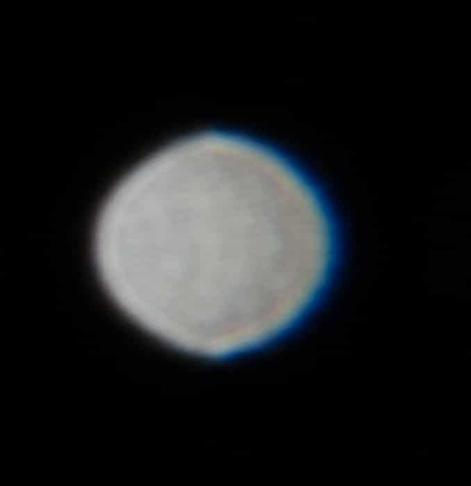
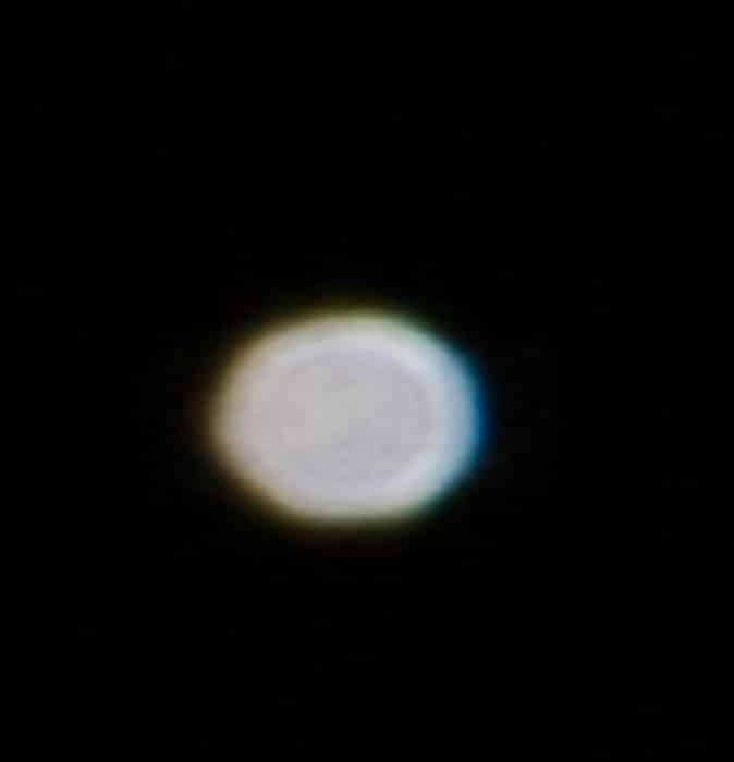
A little more, and both those things get worse.
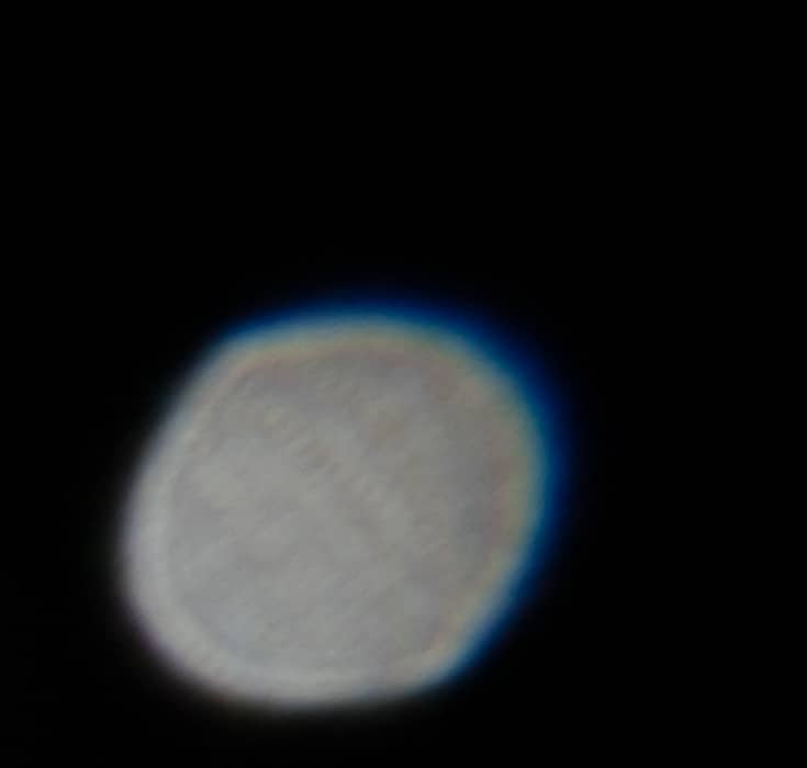
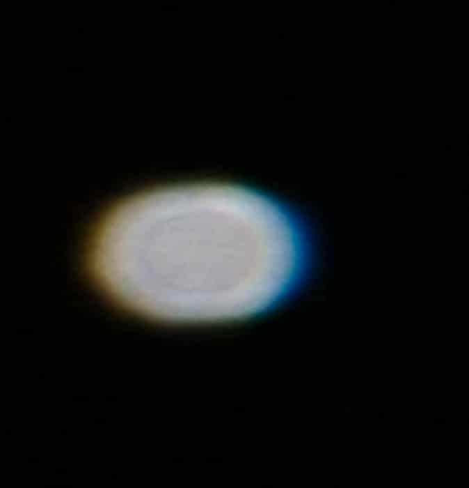
All the way to the left, and the left side of the blob is growing.
In the bottom left corner, it looks pretty strange.
If this were a prime lens, I’d ding it for this behavior. Since it’s a zoom, and a UWA one at that, I’ll give it a pass.
At 12 mm, I wasn’t able to get to the corner:
More pincushion distortion.
Let’s take a closer look at the center blob:
It looks pretty good. Maybe the diaphragm is not getting completely out of the way.
One blob to the left:
That looks good, too, except for the bright ring.
Now we’ve got the bulging, and the color fringing that’s different on the inside and outside.
At the far left:
Not very good looking, is it?
One row down from there:
These PSFs are not impressive. But it’s a zoom, right? And at least it’s centered.



Leave a Reply