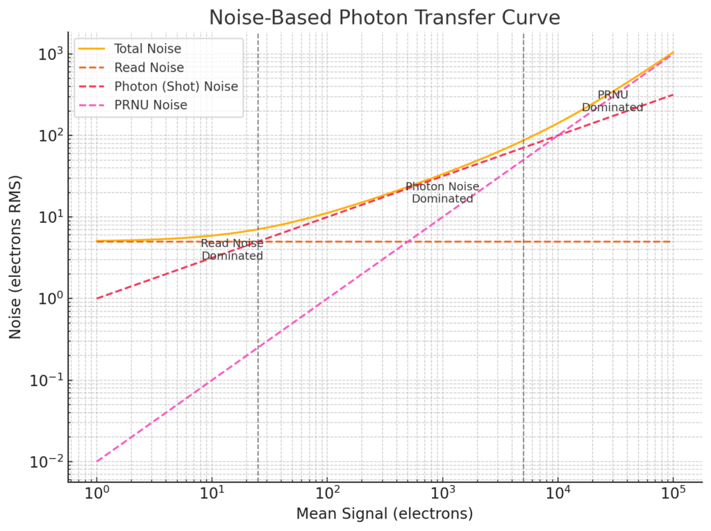
The Photon Transfer Curve (PTC), popularized by James Janesick in Photon Transfer, is a powerful tool for characterizing image sensors. It relates mean signal level to signal variance, capturing the behavior of multiple noise sources across the full dynamic range.
The Basic Idea
Plot the variance of the pixel output against the mean signal level — typically on a log-log scale — from a sequence of uniformly illuminated exposures at increasing brightness.
- X-axis: Mean signal (electrons or DN)
- Y-axis: Signal variance (electrons² or DN²)
This plot reveals distinct noise regimes, each dominated by different sources:
Three Key Regions on the PTC
Read Noise–Dominated Region (low signal)
- Variance is approximately constant.
- Reflects read noise: amplifier, ADC, kTC, thermal.
- Slope of less than unity on a log-log plot.
Photon Noise–Dominated Region (mid signal)
Variance increases linearly with signal.
- Follows: variance = mean
- Slope of 1 on log-log plot (since log(variance) = log(mean)).
PRNU-Dominated Region (high signal)
- Variance increases quadratically with signal.
- Follows: variance = σ_PRNU² × mean²
- Slope of 2 on log-log plot.
The Model Equation
The total signal variance σ²_total as a function of mean signal S can be modeled as:
σ²(S) = σ_read² + S + (σ_PRNU × S)²
= σ_read² + S + σ_PRNU² × S²
Where:
- σ_read is the RMS read noise (in electrons)
- S is the mean signal in electrons
- σ_PRNU is the fractional PRNU (e.g., 0.01 for 1%)
Each term dominates at a different mean signal level.
How to Measure a PTC
Capture flat-field pairs at increasing exposure levels.
For each pair:
- Compute the mean signal in a central ROI.
- Compute the variance of the pixel differences, divided by 2.
- Plot variance vs. mean.
Use dark frames or very short exposures to estimate read noise, and long bright exposures to estimate PRNU.
Why PTCs Matter
- Offer a visual, quantitative summary of sensor performance.
- Help isolate noise sources for modeling or calibration.
- Allow conversion gain (e⁻/DN) to be measured from the slope in the photon-noise region.
- Essential for validating linearity, dynamic range, and flat-fielding performance.
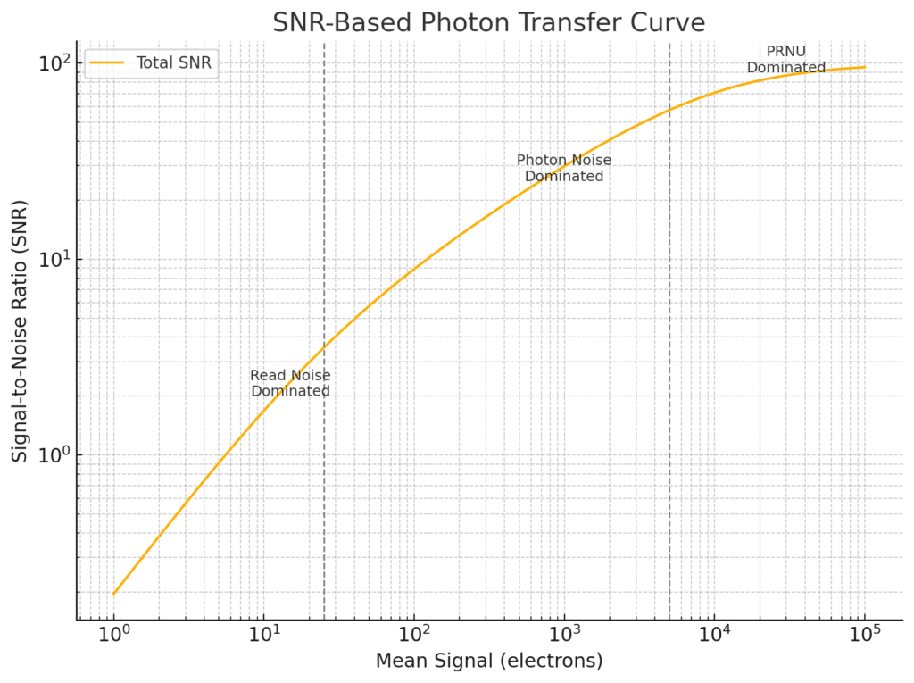
You can also present PTC data as plots of signal to noise ratio versus mean signal level.
Plotting SNR vs. Mean Signal
An alternative and, at least to me, more intuitive form of the Photon Transfer Curve plots the Signal-to-Noise Ratio (SNR) against the mean signal level.
X-axis: Mean signal (in electrons)
Y-axis: SNR = mean / standard deviation
This plot directly illustrates how well a signal stands out from noise across the sensor’s dynamic range.
Expected SNR Behavior
Using the same model for total variance:
σ²_total = σ_read² + S + σ_PRNU² × S²
The SNR is:
SNR(S) = S / sqrt(σ_read² + S + σ_PRNU² × S²)
This expression transitions through three regimes:
- Read Noise–Limited (Low Signal)
SNR ≈ S / σ_read
Linear growth with signal.
- Photon Shot Noise–Limited (Mid Signal)
SNR ≈ sqrt(S)
Square root growth — this is the fundamental quantum limit.
- PRNU-Limited (High Signal)
SNR ≈ 1 / σ_PRNU
SNR saturates — increasing exposure yields no benefit once PRNU dominates.
This asymptotic ceiling represents the maximum attainable SNR without correcting for PRNU.
Advantages of the SNR Variant
- More directly aligned with perceptual quality and dynamic range.
- Shows clearly where further exposure stops yielding SNR benefit.
- Useful for comparing different sensors or signal processing pipelines.
The Photon Transfer Curve is a bridge between theory and measurement. By identifying the regimes where different noise sources dominate, it enables sensor designers and users to understand, calibrate, and optimize their imaging systems.


Leave a Reply