There are two important aspects to bokeh. It seems most people, when they hear the word, think immediately of the look of parts of the scene that are for out of focus. That’s a good thing to think about when buying, selecting, or using a lens, but the, ahem, focus, of today’s post is going to be on another aspect of bokeh: the characteristics of the lens in reddering subjects that are nearly in focus. The way the lens handles the change from sharply in focus to definitely out of focus is important in the look that the camera and lens give to three-dimensional subjects closer than landscape distances.
The MTF Mapper returns information about the line spread function (LSF), which can be thought of as the radial component of the point spread function (PSF).* The PSF defines the image-forming behavior of the lens. Looking at the PSF yields the same information as looking at the modulation transfer function; the difference is that the PSF is in the space domain, and the MTF is in the frequency domain (thanks to Joseph Fourier, 1768-1830). Sometimes the frequency domain is the way to look at things. Other times, you’re better off staying in the space domain. Trying to assess the rendering qualities of a lens in the space domain seems to work better. For one, it’s pretty easy to do it in a way that allows you to visualize the color effects. For another, do to looking at out of focus distant spectral highlights, we are more or less used to looking at PSFs.
The below image was made at 35mm and f/4.5, using a radial edge near the right side of the image. The vertical direction is the shift of the focal plane with respect to the plane of the sensor. Focus distance runs from top to bottom, with front-focused at the top and back-focused at the bottom. The horizontal axis a heavily-magnified view of distance in the sensor plane in the tangential direction, perpendicular to the edge. The colors are highly approximate; I just assigned the raw channels to their respective sRGB channels.
The reddish tint at the top of the image and the blueish tint at the bottom is an indication of longitudinal chromatic aberration (LoCA). Front-focused objects will be reddish with blue halos.
Now let’s look at the same position, but with a tangential edge, with the horizontal axis radially oriented:
The part of blue banding on the left that is more or less constant is an indication of lateral chromatic aberration (LaCA). The red and green banding on the right is an indication of LoCA that is more prevalent when the lens is back-focused.
If we look in the center of an image made with the same lens at the same focal length, we see something closer to the ideal.

There’s still some LoCA, but, as you’d expect, no LaCA. The center of the blur circle is a different color than the periphery.
Stopping the lens down two-thirds of a stop helps off axis.

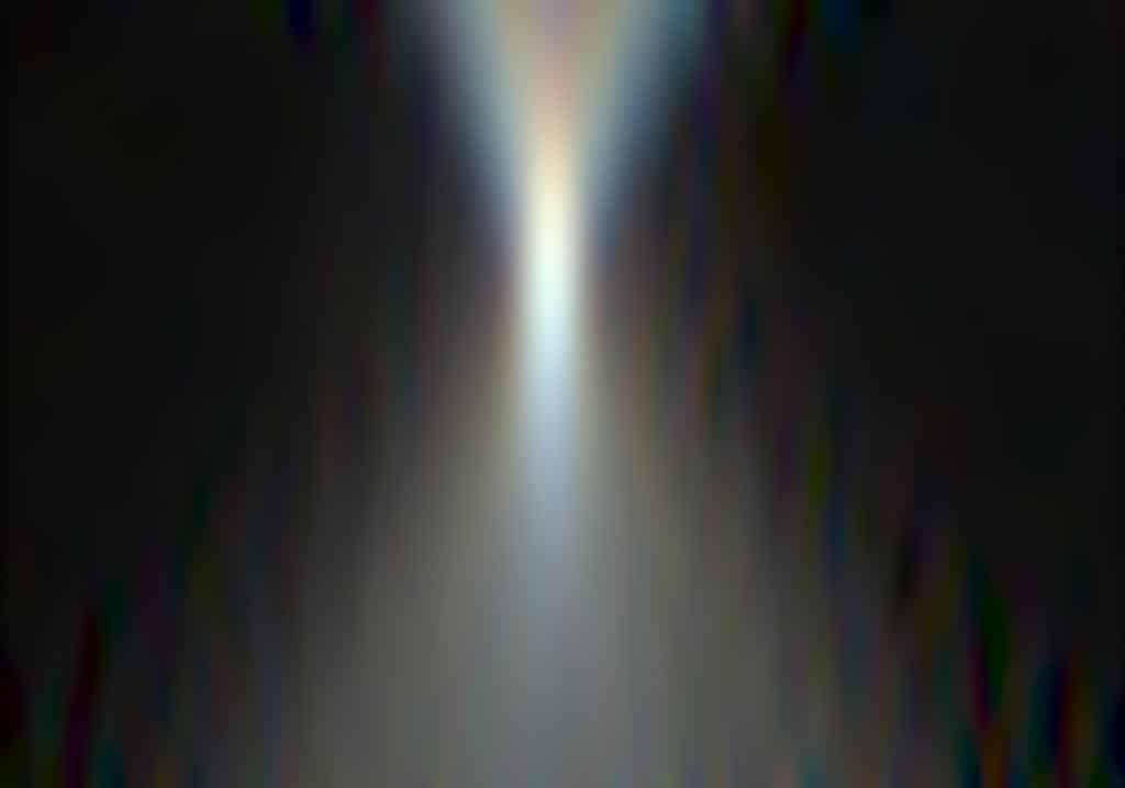
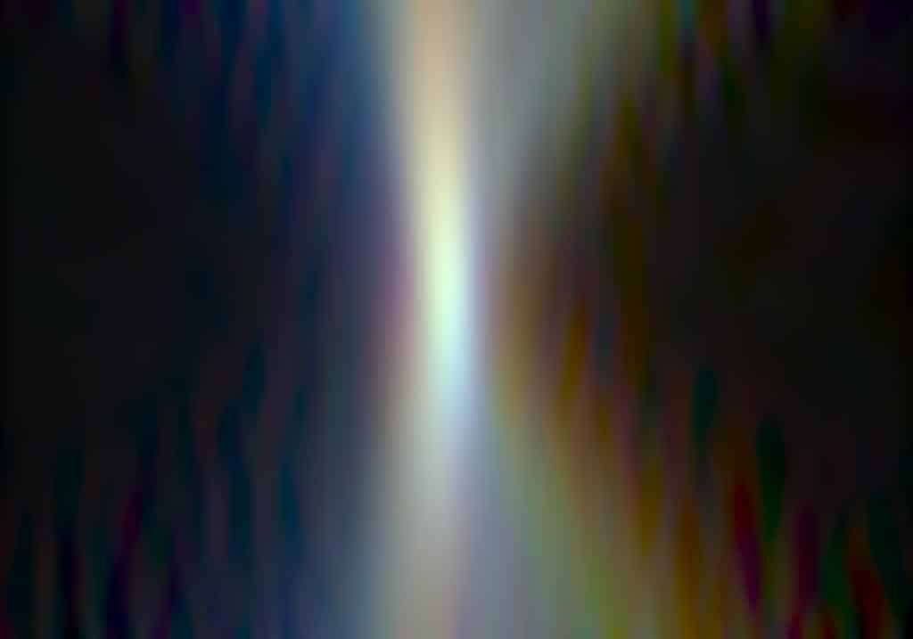
Here’s what happens at f/8:
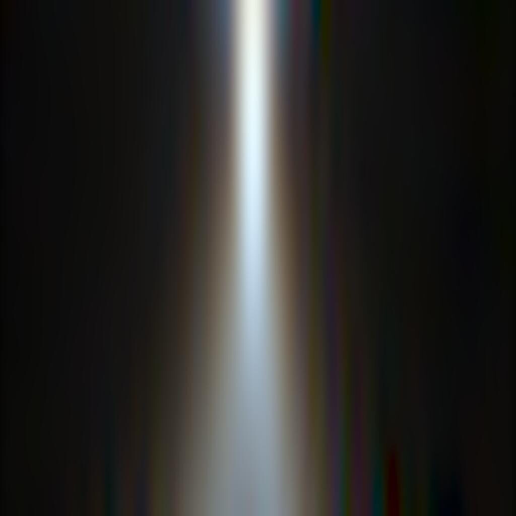
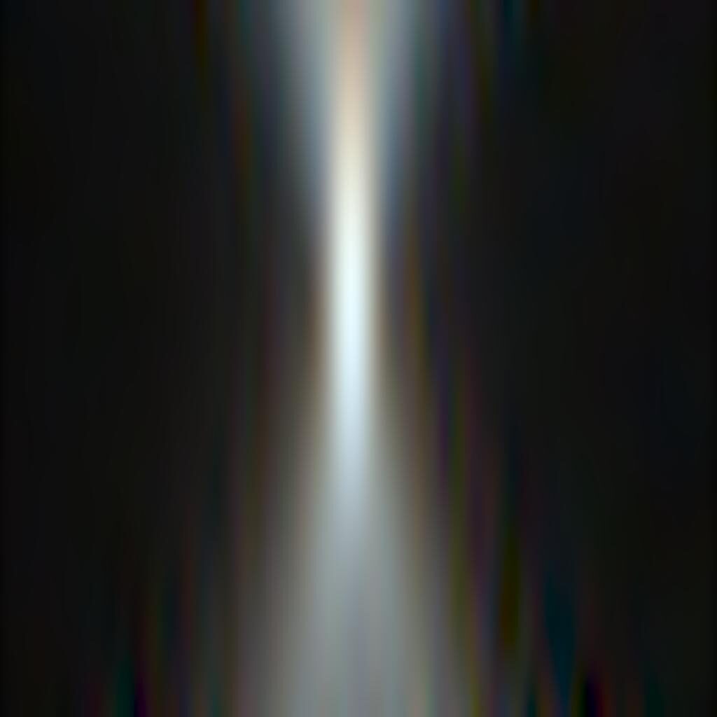
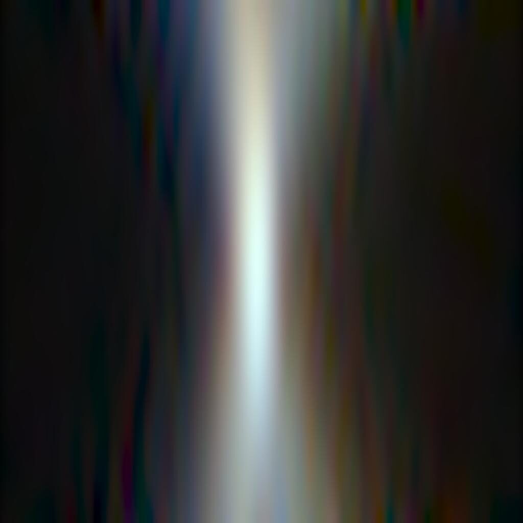
Turning to results with the lens at 45mm.

Blue rings on front-focus objects, and red ones on back-focused objects.

This is similar behavior to what we saw at 35mm, but it’s less pronounced.

As before, the performance with a radial edge is closer to ideal.
Let’s look at the most problematic of the above cases at f/8.
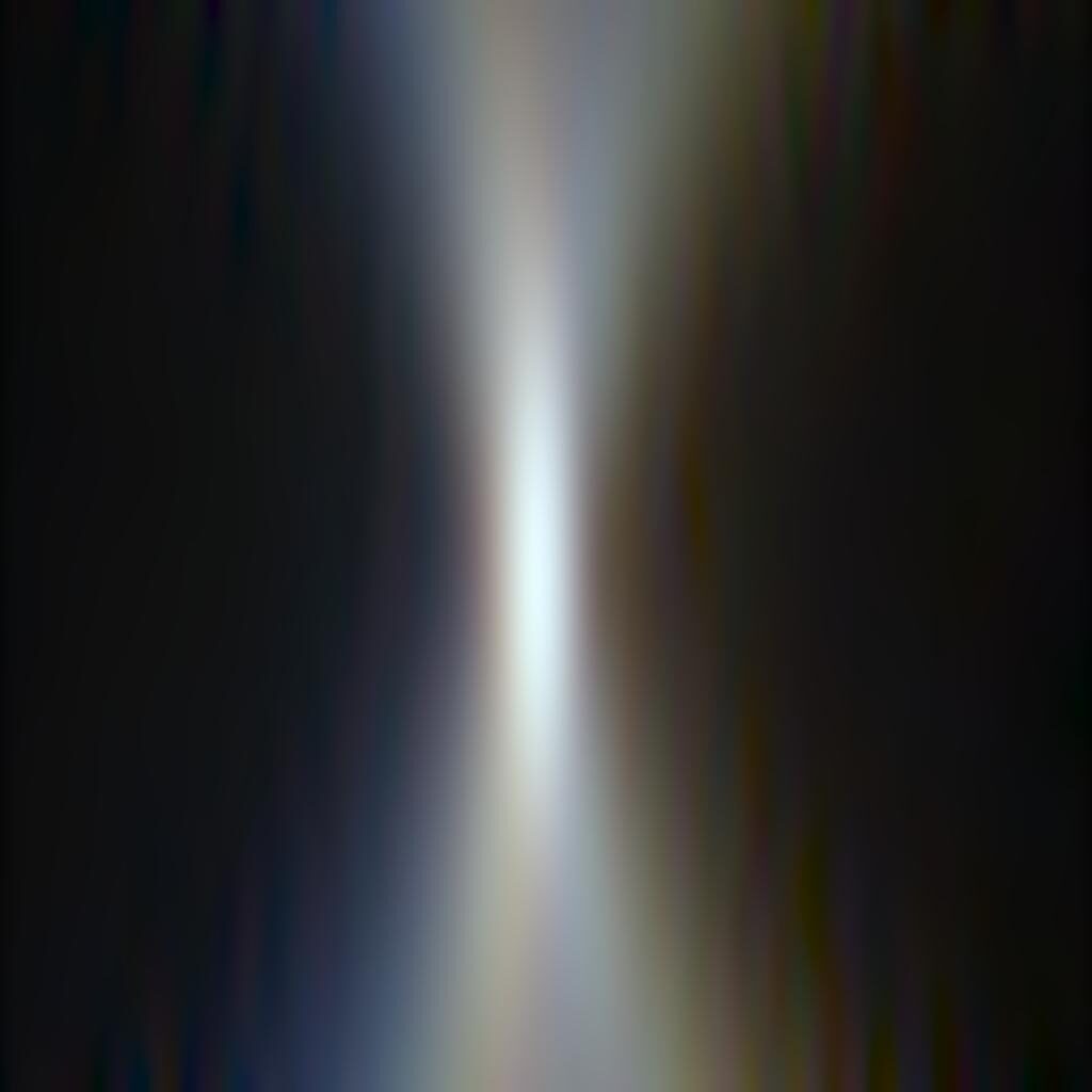
It is much better behaved.
Now at 70 mm.

LoCA is way down.

LaCA is down, too.
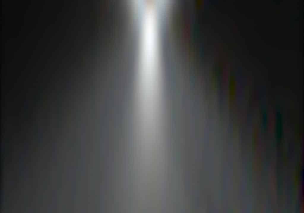
Radial edges look pretty good.


Leave a Reply