The Fujifilm 32-64/4 is a great lens. Up until a few days ago, I said it’s the second-best zoom I’ve ever tested, bested only by the Nikon 180-400/4, which is playing in a different league in both focal length and price. Since there is so much overlap between the ranges of the 32-64 and the new 45-100, and because the 32-64 sets a high bar, it seems natural to test the new kid on the block against the old pro. This is an informal test. I’ll follow up with a Siemens Star test later.
The scene, at 45mm and f/4, with the 45-100/4:
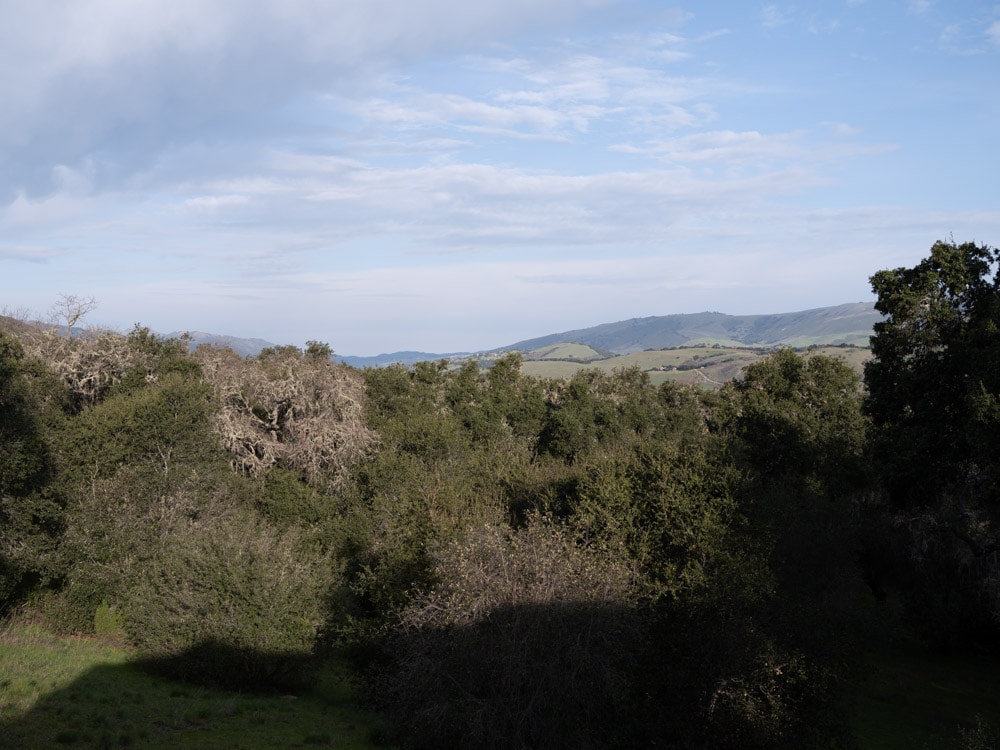
I had to reshoot the series to get this right, because the light changed during the first set. The tree in the center is 96 meters from the camera.
Here’s the test protocol:
- The heaviest RRS legs
- Arca Swiss C1 head
- ISO 100
- Shutter 1/640, electronic
- 2-second self-timer
- f/4, f/5.6, f/8
- AF-S, medium spot size
- Focal length 45 and 64 mm
- 3 sets of shots at each test condition
- Developed in Lightroom
- Picked best shot of each test condition
- Exposure boost of one stop for the f/5.6 images, and two stops for the f/8 ones
- Sharpening amount 20 radius 1, detail 0 (much less sharpening than the default)
- Adobe Color profile
We’ll look at some tight crops.
If you’ve seen these here before, just jump to the images. If not, I need to spend some time telling you how to interpret them. They’re at roughly 250% magnification, enlarged to 700 pixels high on export from Lightroom. If you just want a rough idea of the differences, just look at the images as displayed in-line in the posts. However, if you wish to compare these images in detail, you should view these images by clicking on them to see the source files, then set your browser for 100% zooming. Even better, download them and make Photoshop stacks.
No matter what you do, these crops are all going to look horrible. I’m blowing them up so much so that they will represent the original file after JPEG’s discrete cosine transform has had its way with them. If you want to get a good idea of what the images would look like printed, get far away from your monitor. No, farther than that. Put a bunch of the images up on the screen and back up until the best one starts to look good. Then look at the others. There’s another reason why these images won’t look like the best thing the camera/lens combination can deliver. They’re demosaiced with Lightroom. Lightroom is not awful, but for a particular image, there are usually better raw processors. I use Lr because it’s a de facto standard, because I know it well, and because it’s got good tools for dealing with groups of images.
Here’s how to use these highly-magnified crops. The dimensions of the GFX 100 sensor is 11648×8736 pixels. If we make a full-frame print from the GFX 100 on a printer with 360 pixels per inch native driver-level resolution, like the Epson inkjet printers, we’ll end up with a 32.3×24.3 inch print.The crops are 399×309 since it is a higher-resolution sensor, or a bit over an inch by a bit under an inch on our 32×24 inch print. Let’s imagine that you or your viewers are critical, and will look at the inch print from about 18 inches (conventional wisdom is that the distance would be a little greater than that, or 28 inches (the diagonal, but you did buy a high-resolution camera for a reason, didn’t you?).
The next step is dependent on your monitor pitch, which you may or may not know. Turns out, you don’t have to know it. Just take the 250% crops and view then at 1:1. How high are they? Get out your ruler and measure, or just guess. Let’s say they are 6 inches high. 6 inches is about 7 times the crop height on the paper, so in order to view the crops the way they’d look from 18 inches on the print is to view them from 7 times as far away, or 10.5 feet.
Everything here scales proportionately. If the image on your screen is bigger than 6 inches, increase your viewing distance by the ratio of your image height to 6 inches. If you think your viewers are going to almost get their nose to that print and look at it from six inches, divide that 10.5 feet by 3, and look at the image on the monitor from three and a half feet away.
Ok, here we go. In the center:
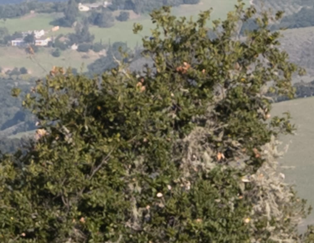
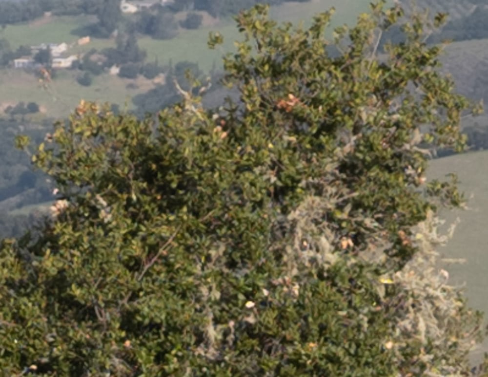
The 32-64 is a bit crisper.
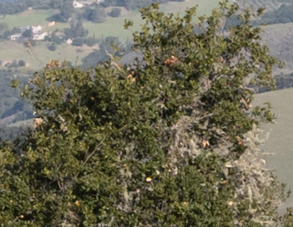

Now it’s even closer.
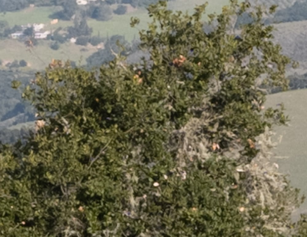
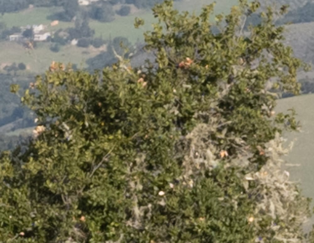
There’s really not much difference in the center at 45 mm. The 32-64 wins by a nose. But 45 mm is the place where the 32-64 does the worst, so let’s look at 64 mm.
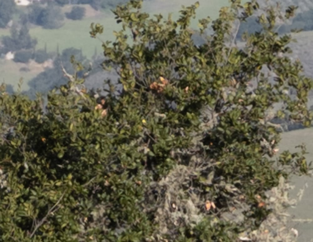
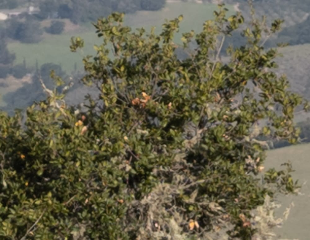
Very close indeed.
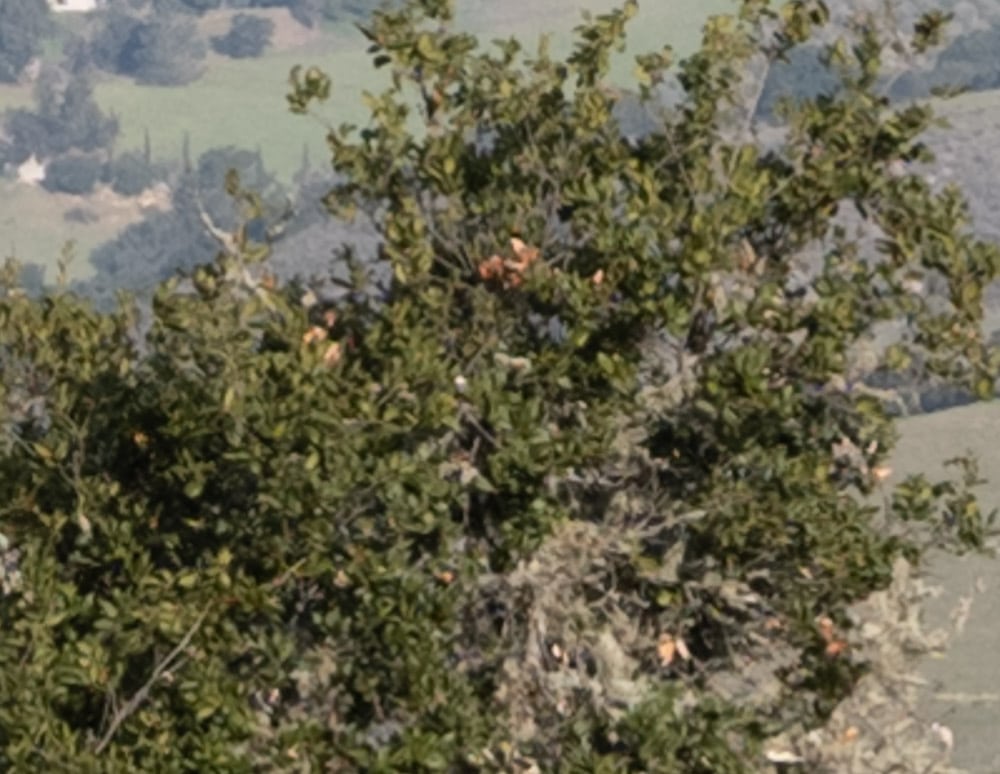
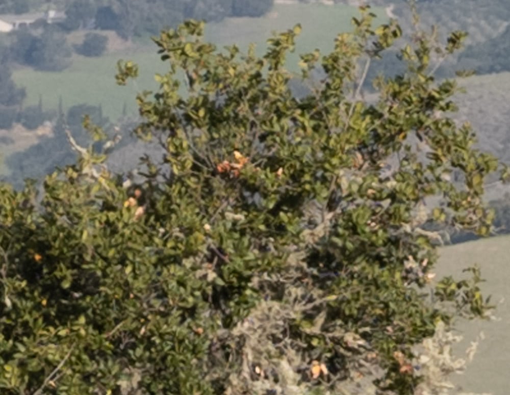
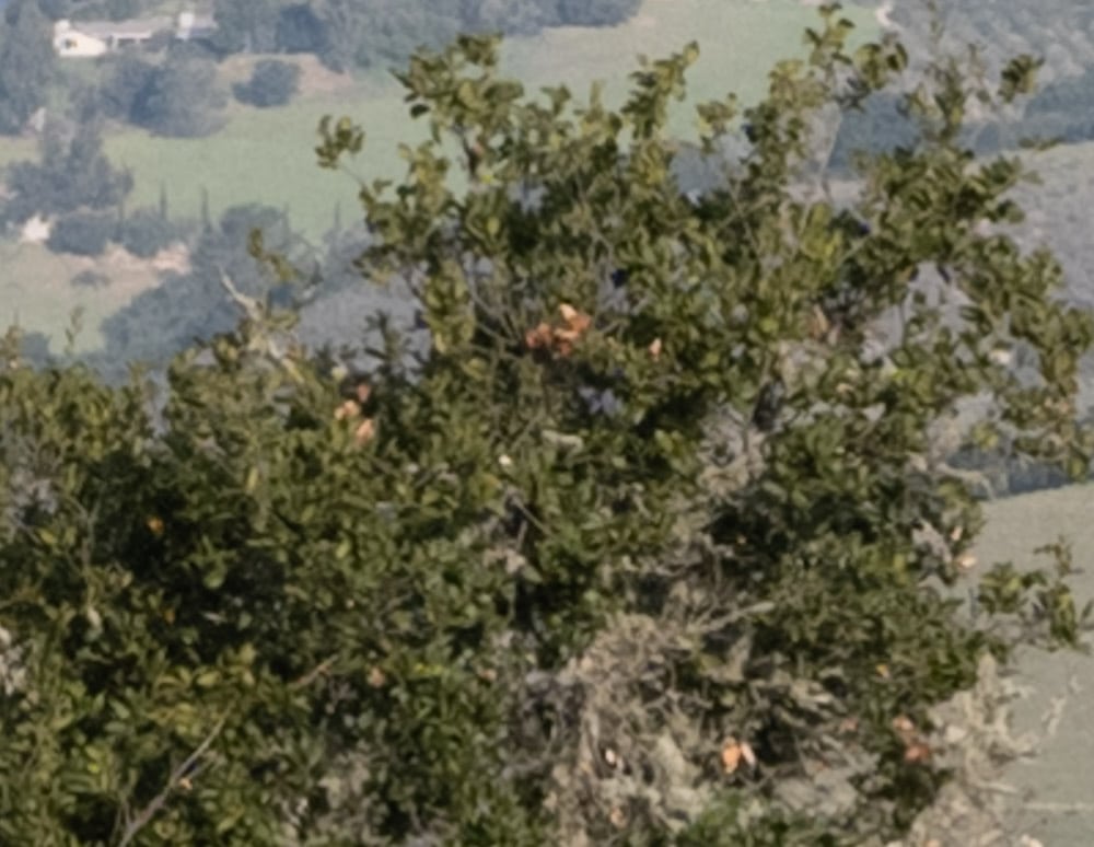

Very close.
In the upper right corner, which is a good corner for my copy of the 45-100:
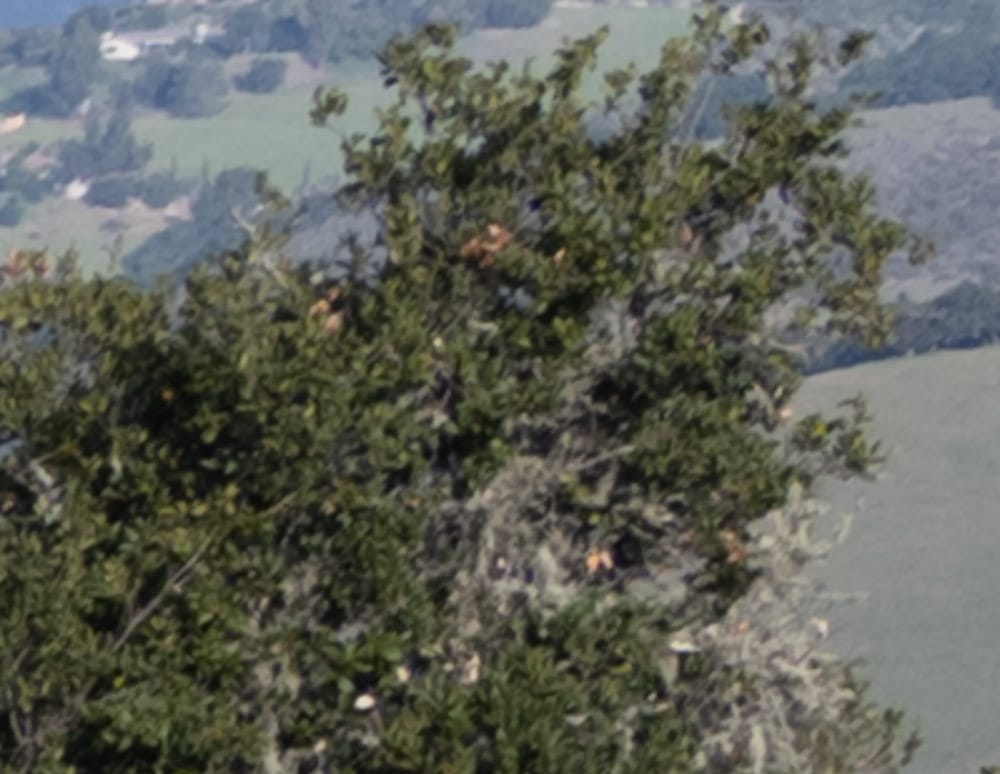
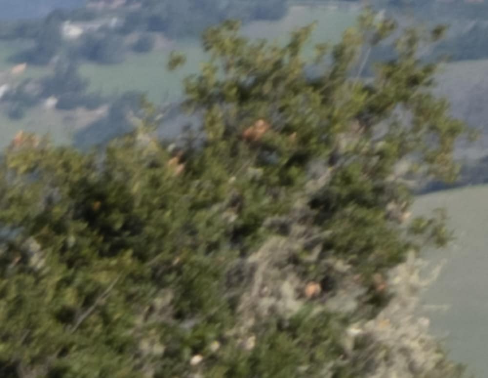
Surprise! The 45-100 is the clear winner here.
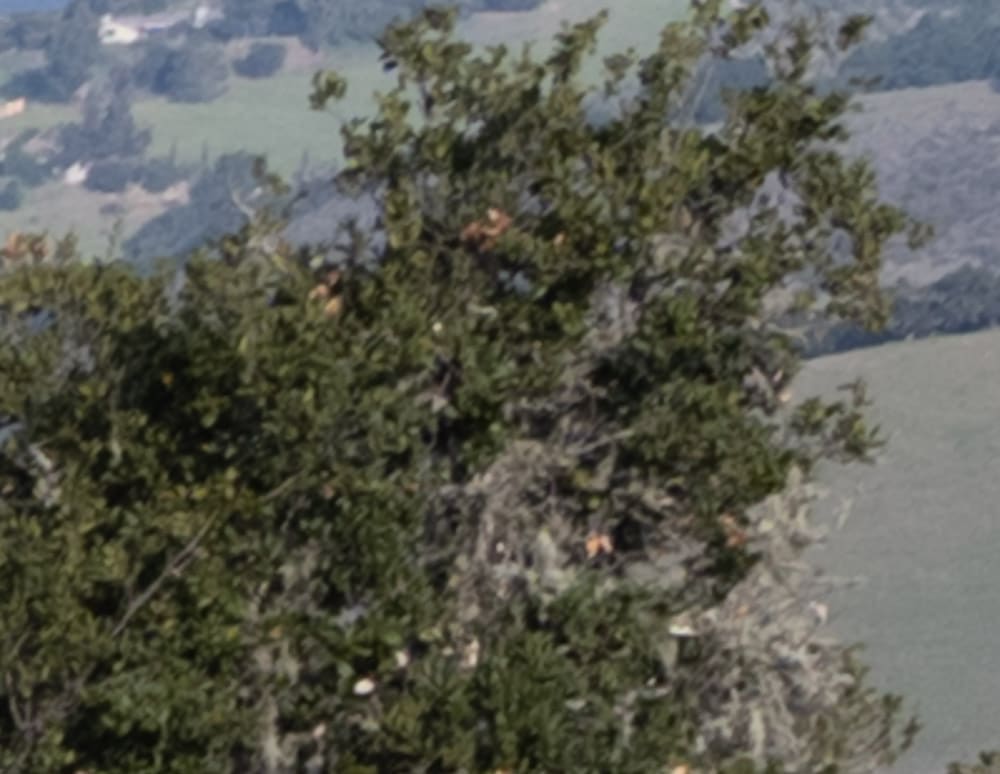

The 45-100 is still papably better.
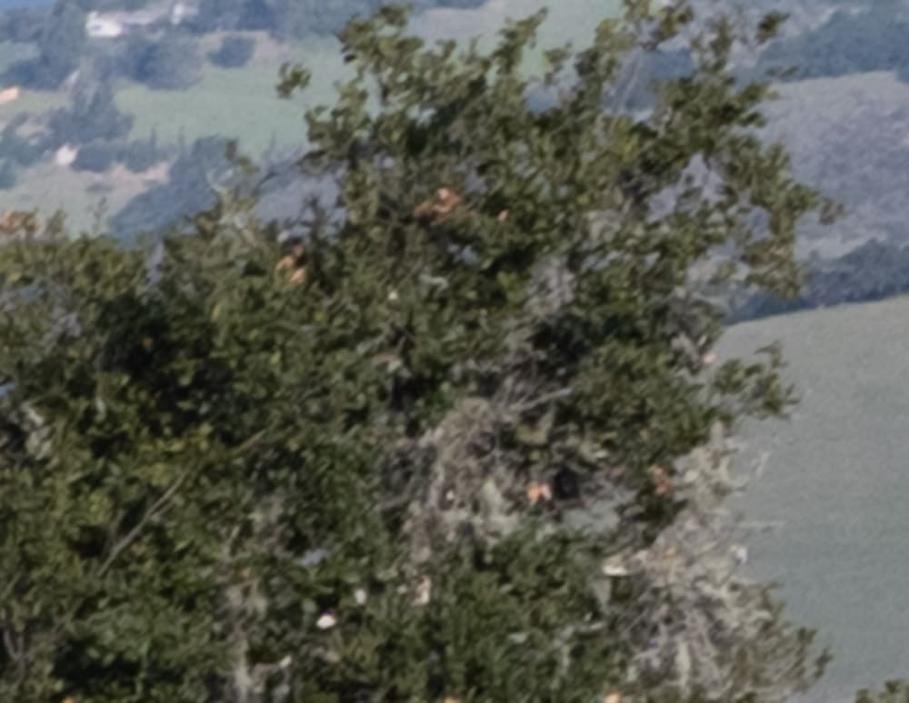
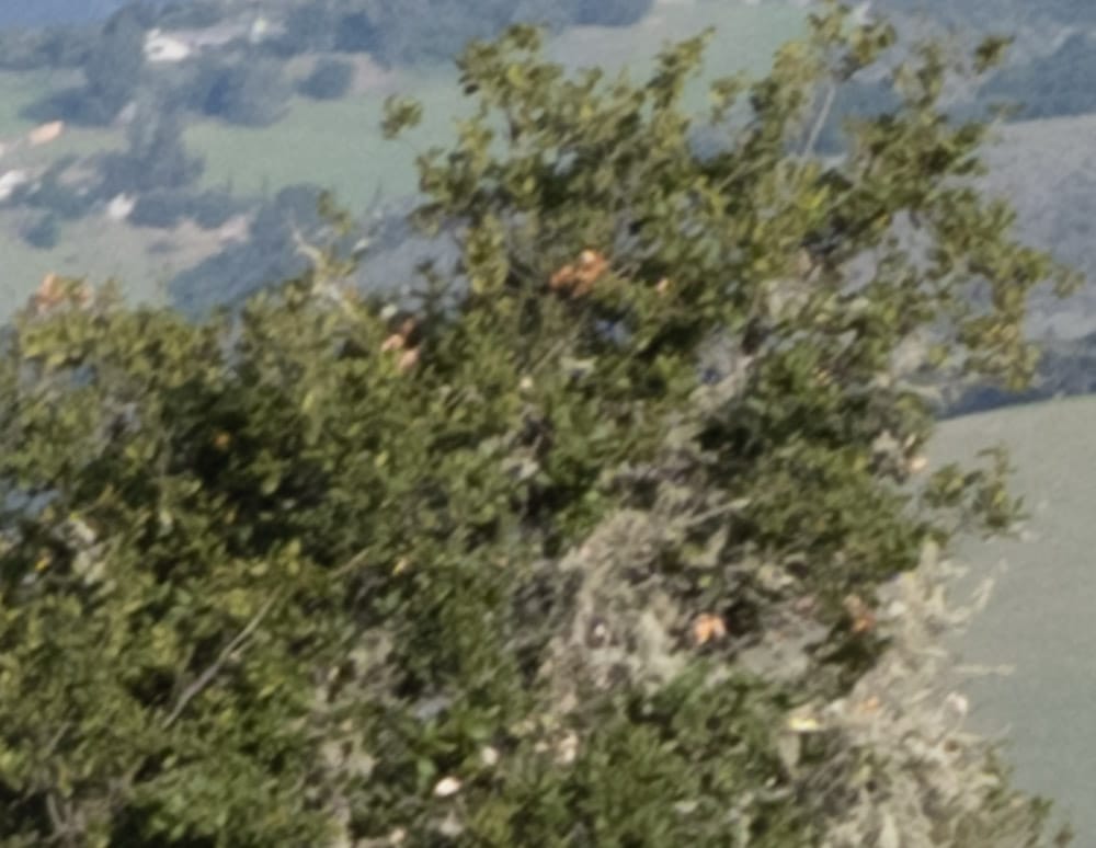
Now they’re about the same.
At 64mm, in the upper right corner:
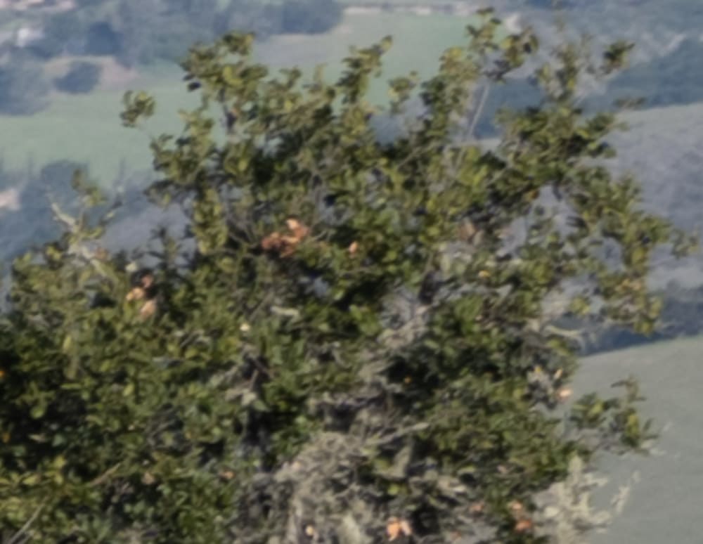
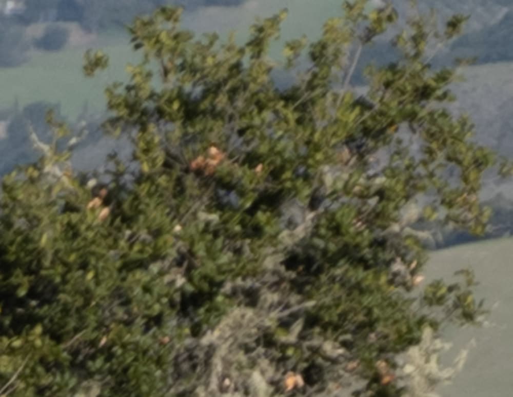
Again, the 45-100 is the winner, but not by nearly so much as at 45 mm.
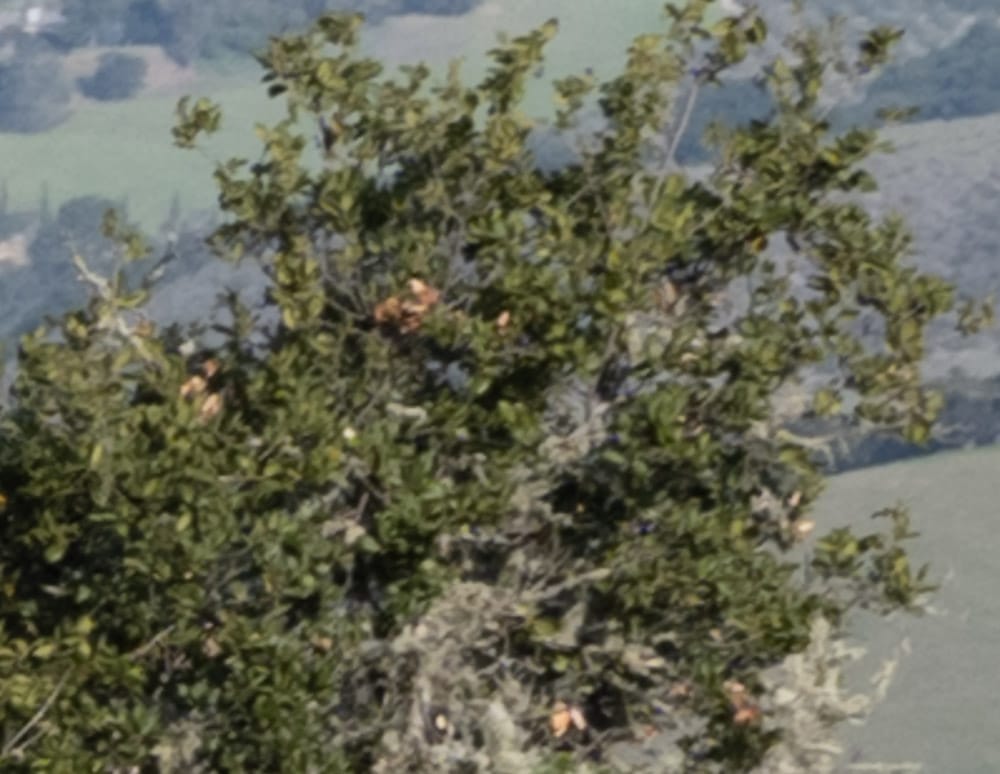

The new zoom excels.
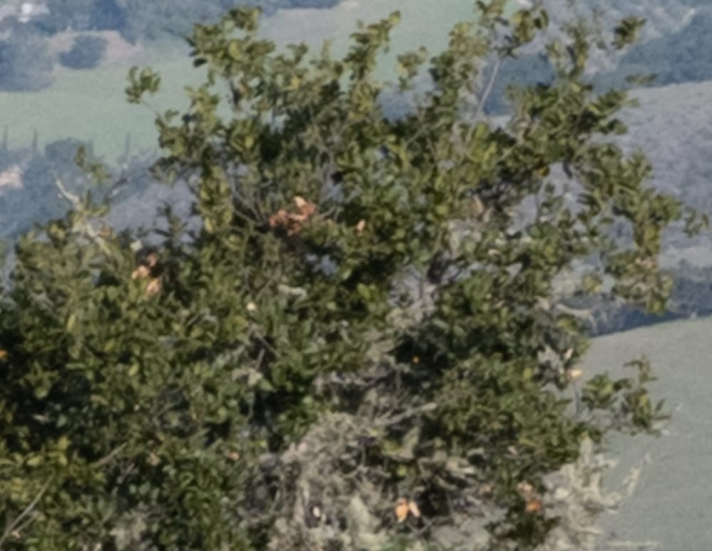

Now it’s a wash.
Color me impressed. I’m guessing the 45-100 has come filed curvature that softened the corners in yesterday’s screening test.
Testing note: there are some things about the GFX 100 that drive me up the wall, and the thumbwheel is near the top of that list. I can roll it to the right without triggering the focus magnifier, but turning it the other way is a big problem for me. I guess I could defeat the focus magnification, but I really like to invoke it with the wheel. The GFX 50S wheel was great. Why did Fuji have to mess with a good thing?
Michele Barana says
Hi Jim,
many thanks for the info. I was very much looking forward to this comparison.
Regarding the thumb wheel: I have the same exact feeling; last week I tried to mitigate it inverting the front and rear wheel function assignment (shutter speed on the front, ISO on the back, aperture on the lens). Hope this helps.
Michele
JimK says
That sounds like a good idea. I’ll give it a try.
Thanks!
Alan says
I had the same exact problem with the thumb wheel. Believe it or not, I used some hand moisturizer (on my hands, not the camera) and it took care of the problem. When your skin is too dry, it somehow cannot generate enough friction.
I suspect this is because Japan is much more moist environment than California.