This is one in a series of posts on the Nikon Z7. You should be able to find all the posts about that camera in the Category List on the right sidebar, below the Articles widget. There’s a drop-down menu there that you can use to get to all the posts in this series; just look for “Nikon Z6/7”.
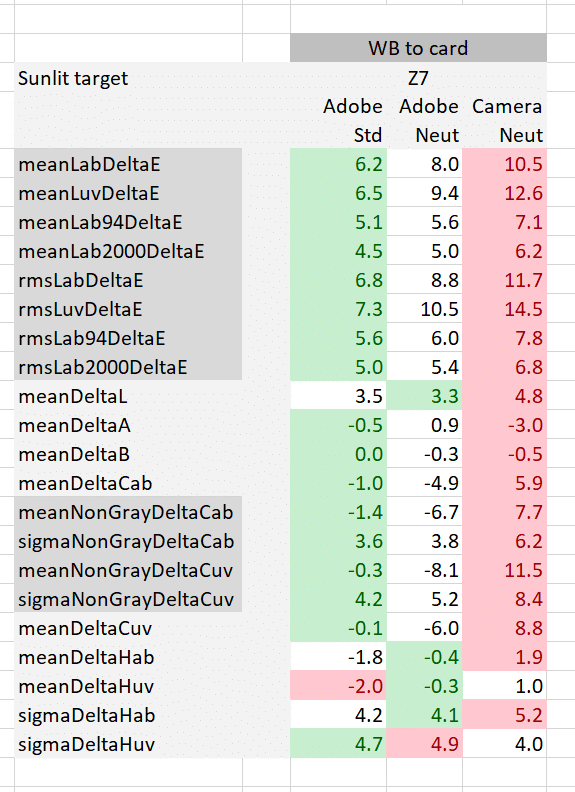
When you import a Z7 file into Lightroom (Lr), the default profile is Camera Standard, not Adobe Color, which is Lr’s usual go-to choice. Here’s a comparison of how Camera Standard stacks up against Adobe Standard and Adobe Neutral for accuracy (sorry for the mislabeling: the last column is Camera Standard:
The first eight rows are the total color errors measured with four different criteria: CIELab DeltaE, CIELuv DeltaE, and Lab DeltaE1994 and DeltaE2000. If you want to focus on one of those, use DeltaE2000. The top four rows are the average errors for all 24 patches of the Macbeth color checker chart. The next four rows are the square root of the means of the squares of the errors, and penalize big errors more than the simple average.
The first three rows in the next (lighter gray) group are the average errors in each of the CIELab axes. The last row in that group is the mean errors in chroma. Negative numbers are less chromatic than perfect, and positive numbers are more chromatic. The next group of four is the same thing but leaving out the 6 gray patches in the Macbeth chart.
The last group has five members. The first one is the same metric as the last measure in the light gray group above it, but using CIELuv as the basis for the measurements rather than CIELab. Then we have the average hue angle errors in both Lab and Luv, and their standard deviations (aka sigmas).
A perfect result would have all values zero.
White balance was set to the third gray patch from the left. The least accurate results for each three-camera series are highlighted in red, and the most accurate in green.
Analysis: Camera Standard is definitely less accurate than either of the other two profiles. It is more saturated.
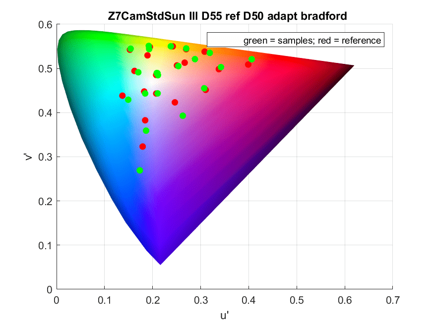
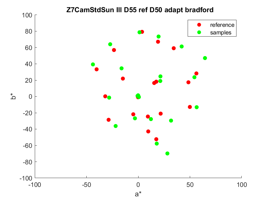
Let’s look at u’v’ chromaticity and CIELab chromaticity.
In order to see how it compares to Adobe Standard with respect to the chromaticities of the individual patches in CIELab, look at this:
Adobe Standard is represented by the squares, Camera Neutral by the diamonds, and the target colors by the circles. The increased saturation is obvious. The Caucasian skin tones are moved a fair amount in the orange direction. Skies are more saturated and risk purple tinges.
As a general starting place, I think that Camera Standard is probably inferior to Adobe Standard for advanced photographers.


David Fuller says
I See the you’ve answered my previous question here. Thank you!