This is post fourteen in a series about my experiences in publishing a book. The series starts here.
Earlier in this series, I’ve reported on mapping the images for the book into the rather small GRACoL 2006 Coated color space used by the printer. Today, Brooks Jensen taught me a new-to-me tool for gamut mapping. It’s far from perfect, but it certainly has its place in the process. I’ll explain it to you.
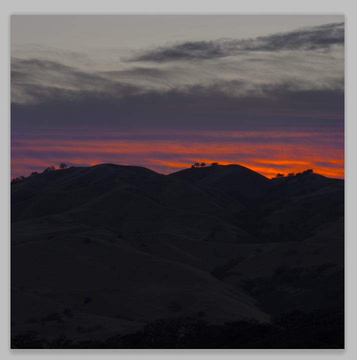
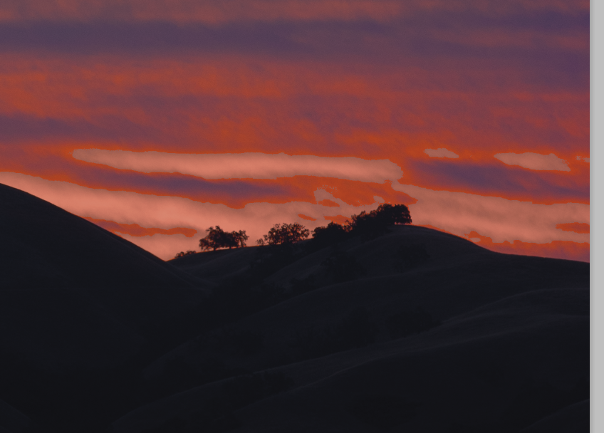
Let’s start with this image of this morning’s sunrise, which has been tweaked so that parts of it are way out of the GRACoL 2006 Coated gamut:
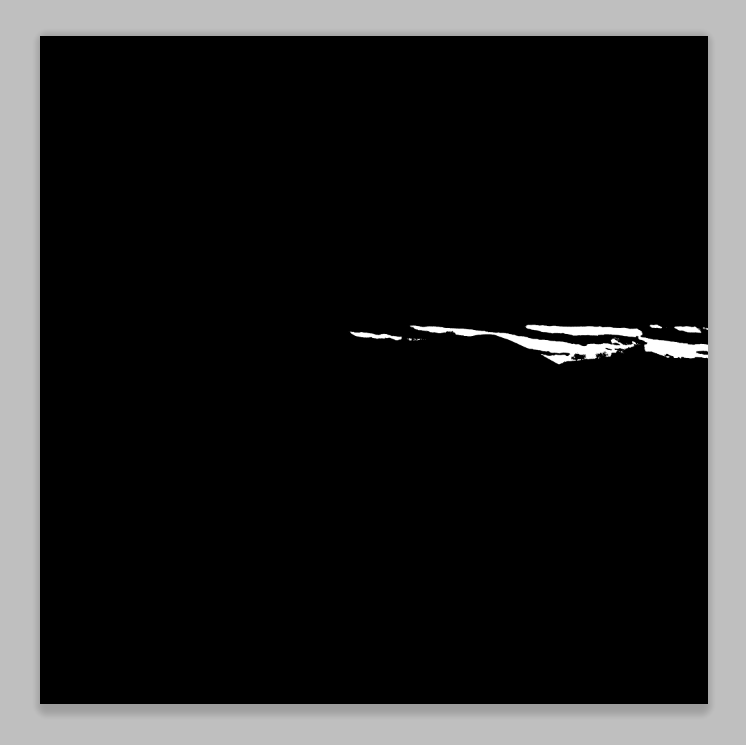
If you turn on the gamut alarm, you see in gray the parts of the image that are out of gamut (OOG):

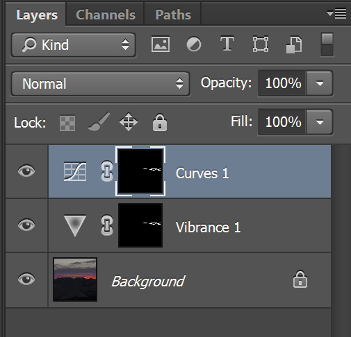
Newer versions of Photoshop (Ps) — I’m sorry, but I can’t tell you which versions — have a tool for selecting the OOG colors. You click through Selection>Color Range>Out of Gamut:

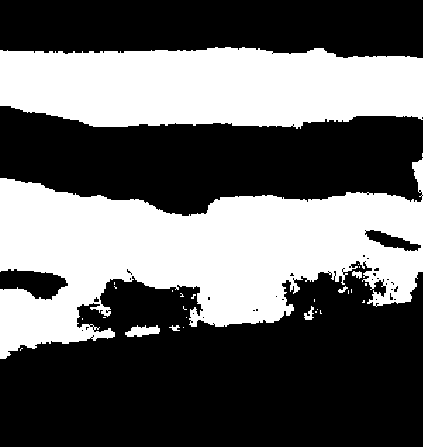
If you say OK, you get a selection like this:
The good news is that we’ve selected all the OOG colors with a pretty simple set of actions. The bad news is that it’s a binary selection. If a color is a little bit OOG, it’s selected 100%. If a color is waaay OOG, it’s selected 100%.
You can see this clearly if I zoom in:
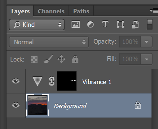
What I’d really like is to have a selection that is grayscale, with slightly OOG colors being barely selected, and far OOG colors being strongly selected. I’ll show you why. If we create a vibrance adjustment layer and desaturate through the selection just enough to silence teh gamut warning, like this:
We get parts of the image that were slightly OOG and next to parts of the image that were barely within gamut less saturated than them:
Admittedly, what I did was fairly ham-fisted, but, in order to prevent these kinds of chroma reversals, we’d need to make the edge of the OOG selection fuzzy. That would work pretty well if the relationship between how far OOG of in gamut a color is varies linearly with position in the image, but how often does that happen?
It get’s worse if I notice that the saturation change I made lightened the affected colors and compensate for it with a curves adjustment layer:
Now we get this:
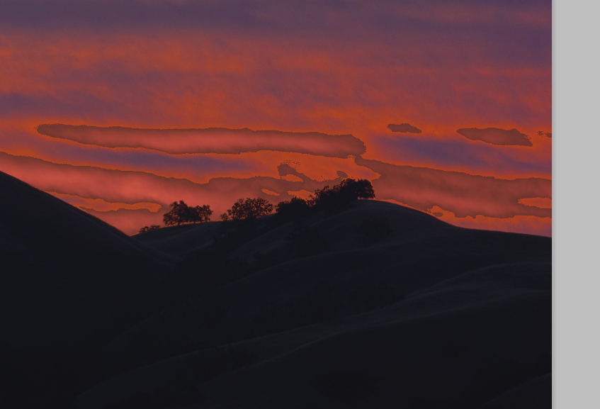
Ugh. Fuzzing up the mask would probably have helped if I’d planned to do this in the first place.
I shouldn’t look a gift horse, or even a subscription-rented horse, in the mouth. This will be a useful took, just not as useful as it could be.
Unless you’re a color geek, you should stop reading right here.
OK, the civilians are gone, right? I’m gonna get to the issue that you probably noticed above. I said I wanted a grayscale mask that got “whiter” the further OOG a color is, but I didn’t define a scalar measure for describing how far OOG a color is.
Turns out, there are choices. Let’s assume the color distance metric that we’re going to work with is CIEL*a*b*, which is one of the Ps native color spaces. One measure might be the Euclidean distance to the nearest point on the gamut envelope. Another might be the distance to the envelope if the hue angle is held invariant. Or we could have two measures: one the two-dimensional distance to the gamut envelope if hue angle and luminance are held constant, and the other the one-dimensional luminance distance to the envelope if chromaticity is held constant.
Depending on your gamut mapping strategy, each would have its uses.
My thoughts might be incorrect but nevetheless. Obviously you do not want to “mechanically” reduce the vibrance of the whole image in order that it fits the given gamut. From the other side, any work with the above selection is not adequate because inside it you can not exceed the levels on its borders while the realistic reproduction assumes that. So, we need some algorithm that would:
i) do some kind of chroma compression in the required areas;
ii) ensure smooth transition from the altered areas to the unaltered without chroma reversal.
Last reqirement can be obeyed only if you compress chroma also in some areas outside the selection. Which way exactly is the subject of the art.