This is post ten in a series about my experiences in publishing a book. The series starts here.
Before I obsess too much over mapping the gamut of the Staccato images to Coated GRACoL 2006, I needed to get an idea of how much trouble I was in. It’s one thing to look at the compressed gamut images on a monitor, and quite another to see them on a piece of paper.
I wrote out TIFF copies of all of the candidate images from Lightroom in ProPhoto RGB. In Photoshop, I created an action to convert the images to Coated GRACoL 2006 with a relative colorimetric Intent, then back to ProPhoto RGB.
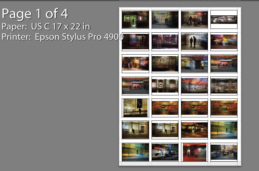
I ran the action on all the TIFFs, then imported the newly gamut-limited images back into Lightroom. I created a 4×7 image template and printed all of the images on four sheets of C-sized Exhibition Fiber paper:
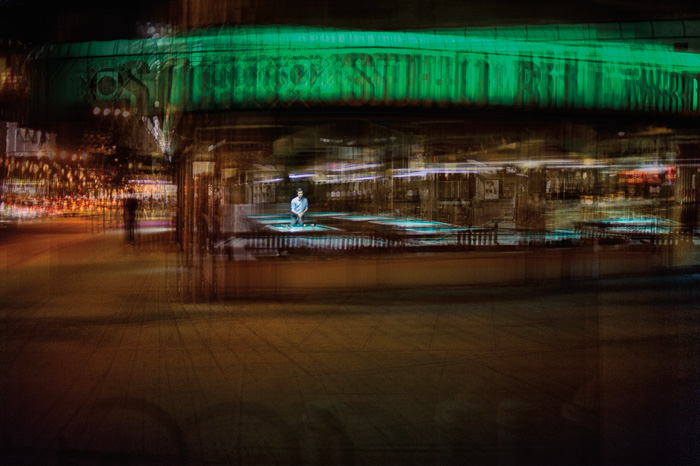
Then I took a good look. I was surprised how good almost all the images looked, and by how effective was the intervention on the massage parlor image that I reported on in the last post. I’d some another similar luminance mapping change to this image:
It really helped, too.
My next step is to pore over the proof sheets for a while, and mark the images that will need some more color mapping.
I’m glad I did this early proofing. It gives me a lot of confidence that I can make this project an esthetic success.


[…] I previously reported on gang hard proofing. Yesterday, Jerry asked me for the final copies of each of the images for the book. I had previously identified seven images for which the standard Adobe gamut mapping with relative colorimetric intent were not acceptable. I turned on Lightroom’s soft proofing feature and set the output medium to Coated GRACoL 2006 (ISO 12647-2:2004). I created virtual copies of the seven images. I made corrections with the adjustment brush, and exported the images to .psd files in ProPhoto RGB. […]