Around the turn of the 20th century, Karl Pearson, an English mathematician and statistician, invented the histogram as a way of presenting data. Originally, the histogram was a kind of bar chart, with the x-axis divided into intervals — now called buckets or bins — and a bar for each bin indicating how many items in the data set are in that bin. The histogram was originally conceived for use with continuous data, but the concept works quite well with discrete data.
The histogram has become a standard tool for evaluating photographic images. It’s used to evaluate exposure before the shot with most mirrorless cameras, after the shot in the field, when developing raw images, and when editing all images. Your camera almost certainly can display histograms. RawDigger and Fast Raw Viewer display histograms. Lightroom and Adobe Camera Raw (ACR) display them. So does Photoshop. But all these histograms are not created equal. In this post, I’m going to take a deep dive into the possibilities for creating histograms, tell you which programs display them in which ways, and give you some ideas for interpreting them.
Let’s start out with a non-photographic example. Let’s say I’ve got a six-sided die. It’s a fair die, which means that, when I roll it, each of the six sides has a probability of 1/6 of ending up on top. I roll the die 100 times, and write down which number came up for each roll. So now I’ve got 100 numbers. I could display them in a histogram that looks like this:
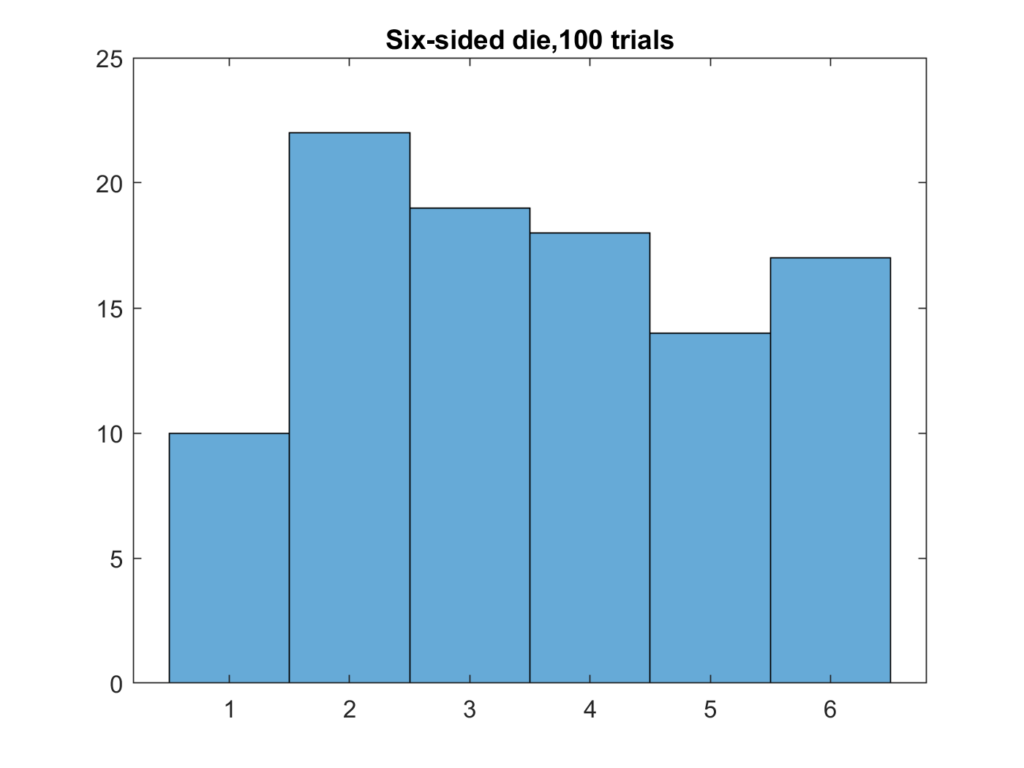
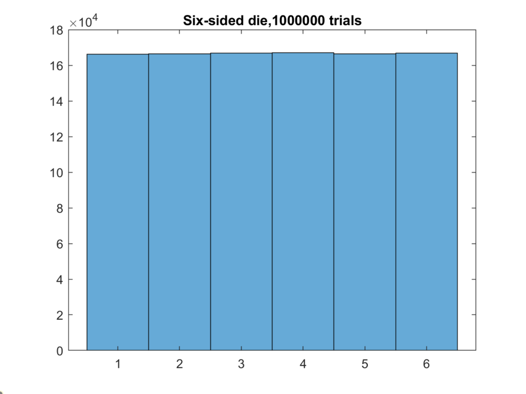
There’s a bin for each possibility, and they are arrayed along the x-axis. The heigh of the bars is proportional to the count of how many times that number came up. I got the data by simulating the rolls. If I roll the die a million times, the results begin to look a lot like the predicted result.
Now let’s consider this Fujifilm test image:
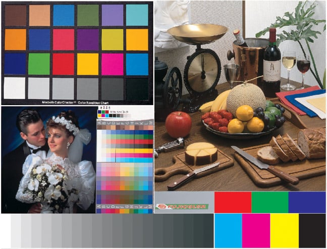
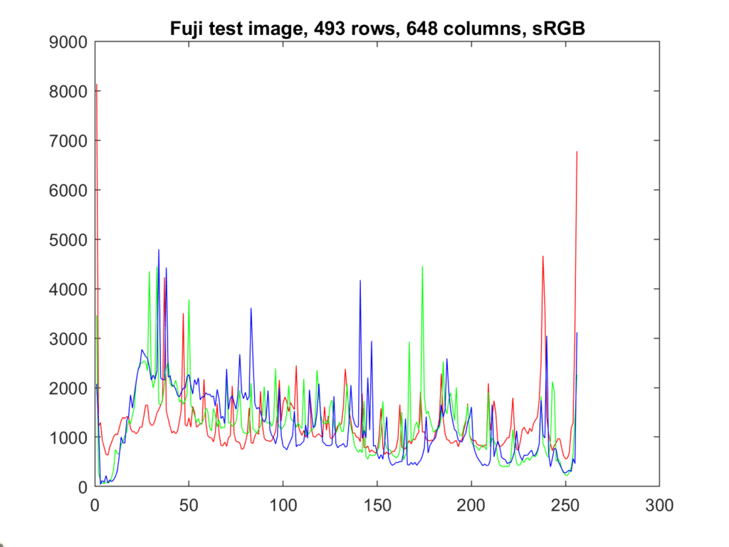
This version is an sRGB image. It’s in JPEG format, with 8 bits of precision per color plane.
Here is a common way to display that histogram.
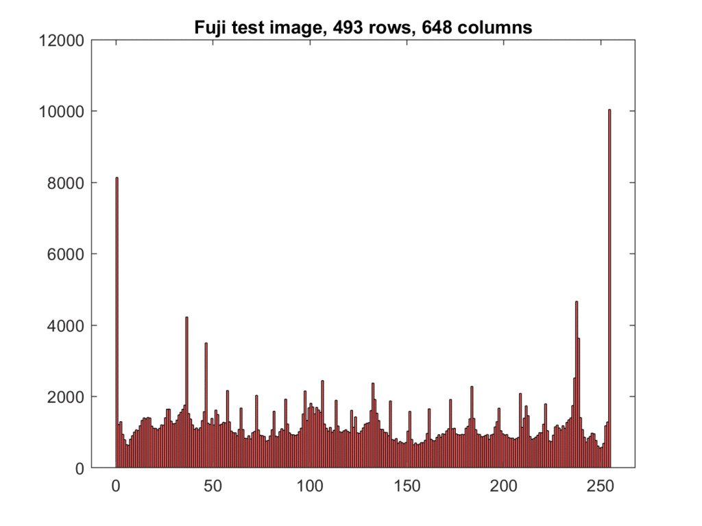
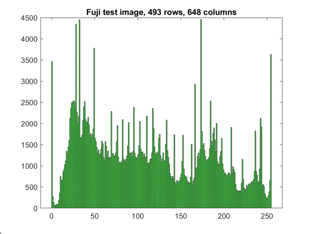
There are spikes at both ends of all three channels. This is an indication that the gamut of the color space has been exceeded by the image. In this case, the original was a CIELab image that had colors in it that were outside of the sRGB gamut. This was converted to sRGB using relative intent, which maps out of gamut colors to the periphery of the gamut and creates those spikes.
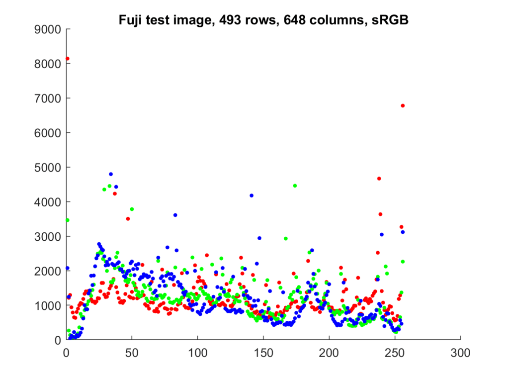
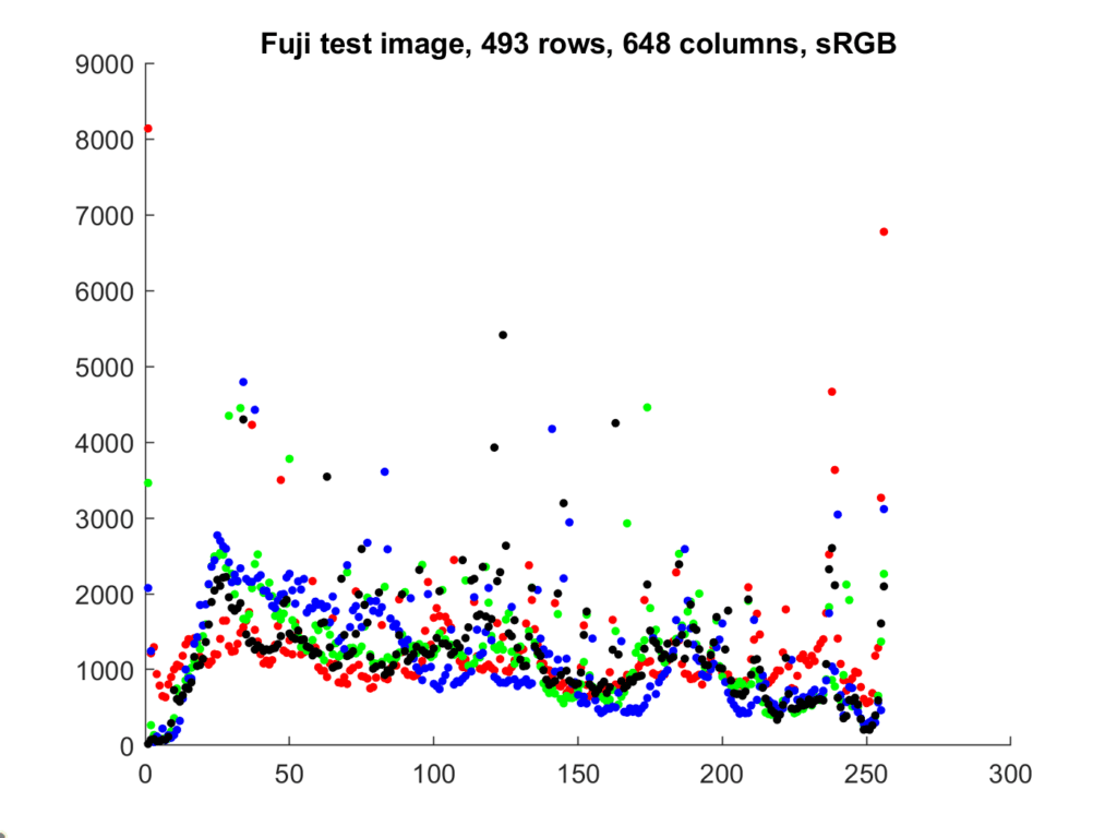
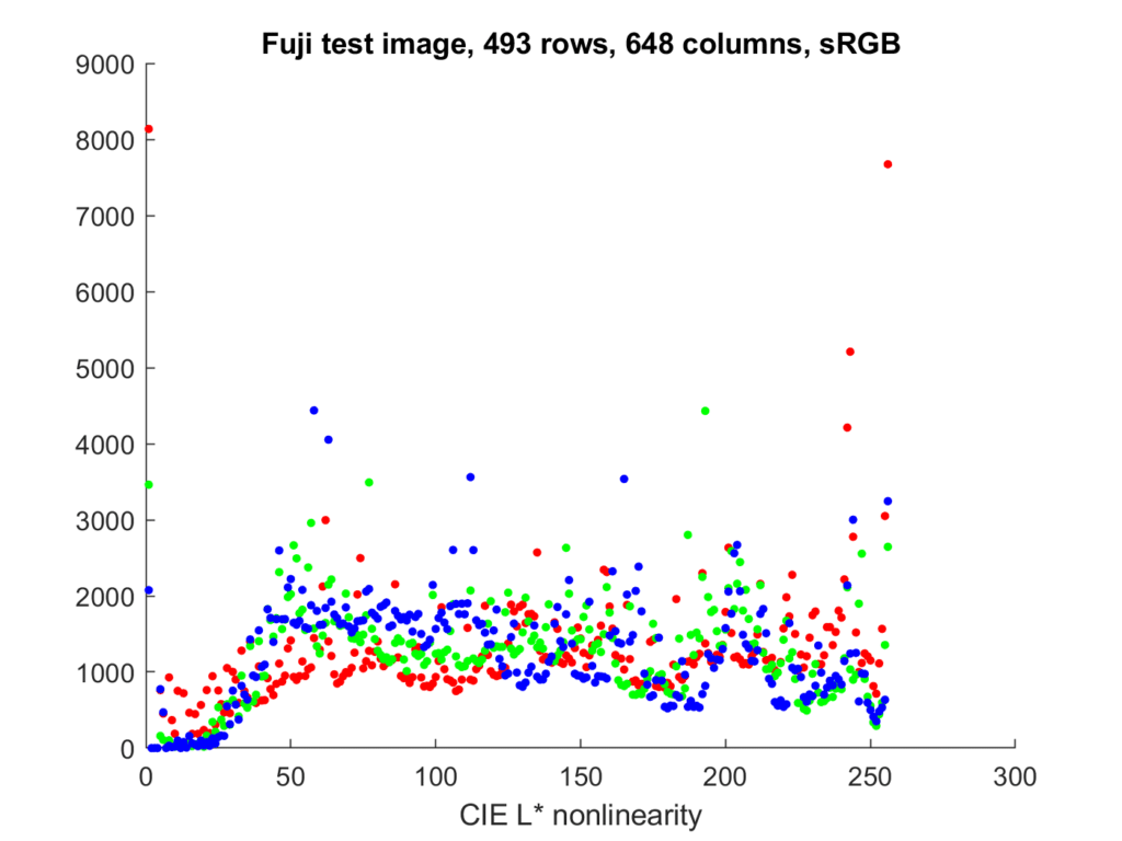
It’s convenient to plot all three color planes on the same graph, but a bar chart isn’t a good way to do that. A scatter plot is better:
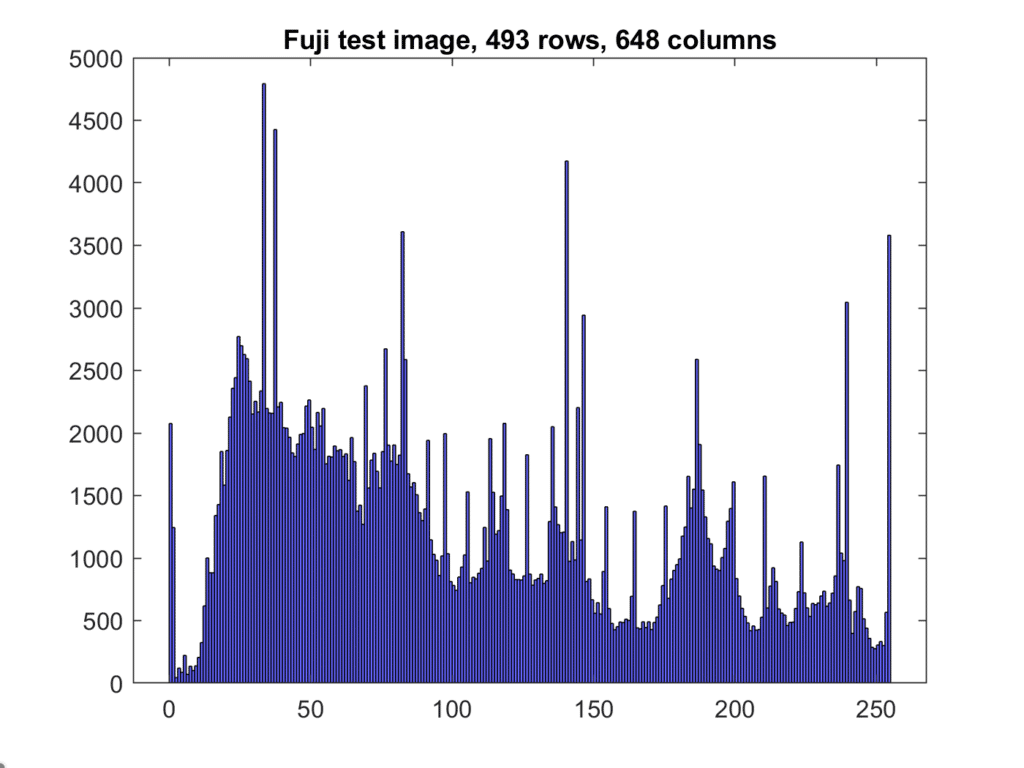
Changing the color space changes the histogram:
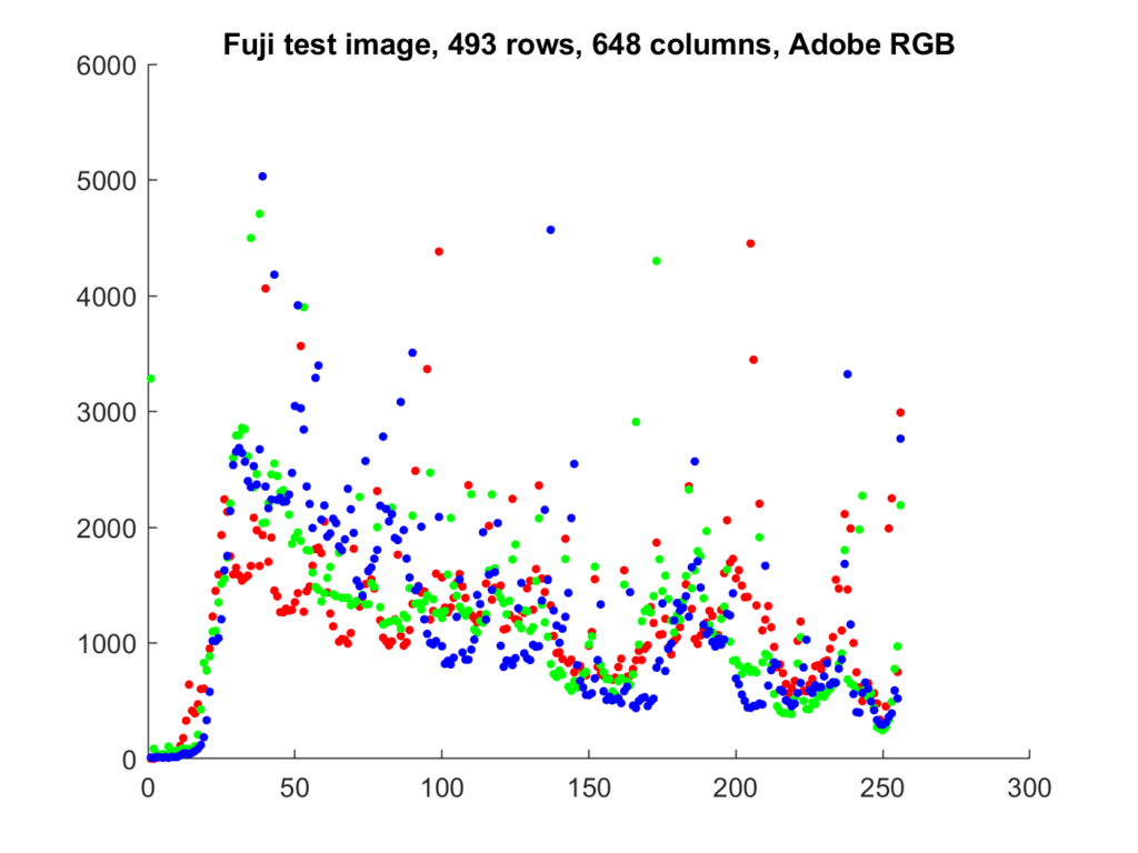
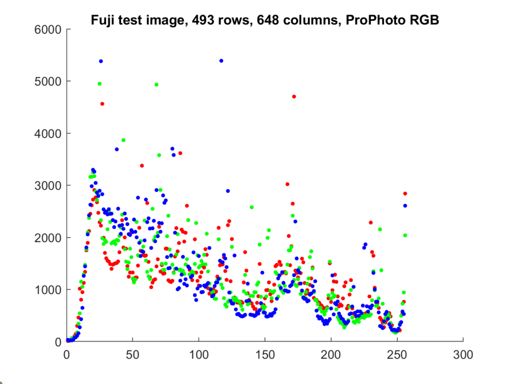
All the colors that are within the sRGB gamut are within the ProPhoto RGB gamut, but the PP RGB gamut is much bigger, so there is no clipping on the low side. The Adobe RGB gamut is somewhat larger, so there is almost no clipping on the low side there, too.
Photoshop, Lightroom, and Adobe Camera Raw all use various forms of line plots:
I find the scatter plots more useful, but I don’t see them in the image editors that I use. One of the issues with the line plots is that the results for one color plane can obscure the results for other ones.
At the risk of making the scatter plot confusing, since sRGB is a colorimetric representation, we can add luminance dots in black:
So far, we have been taking the image color spaces and using them as is. That means the y-axis is linear with the number of pixels in each bucket, and the x-axis has the nonlinearity of the color space of the image (gamma 2.2 with a straight line section near the origin for sRGB, gamma 2.2 for Adobe RGB, and gamma 1.8 for Pro Photo RGB).
Sometimes we see raw files analyzed with a linear x-axis. Let’s see what that looks like with the sRGB image:
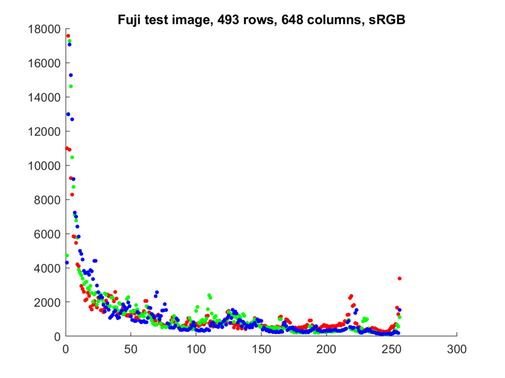
I had to dither the linear image so that there weren’t a lot of buckets with zero values. The data has been shifted to the left. This is not a very useful display for most purposes.
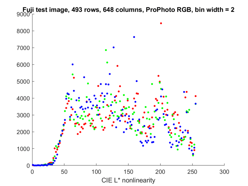
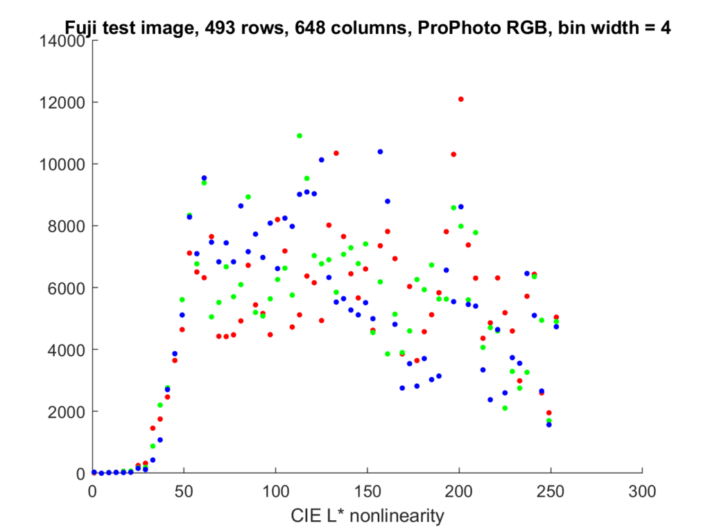
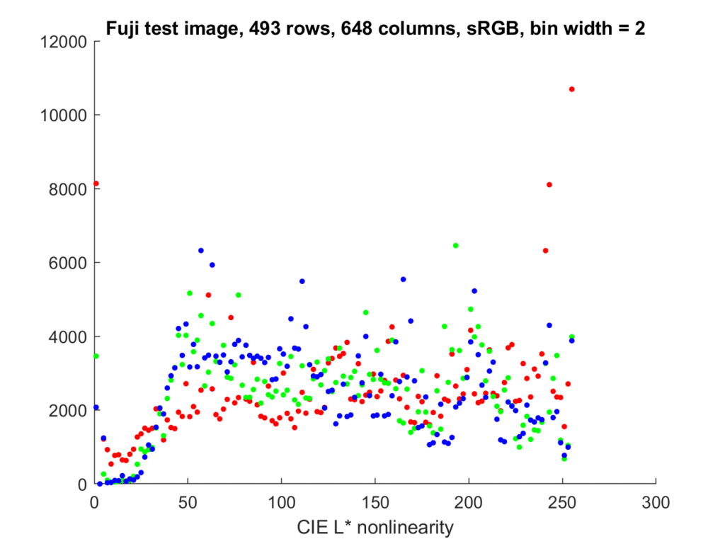
A more useful x-axis, but not one that I’ve ever seen people use, is the CIE L* nonlinearity, which is a gamma of 3 with a straight lime segment near the origin:
Again, the image has been dithered to keep some buckets from being empty. The advantage of this x-axis is that it is more-or-less perceptually uniform. That means that equal small steps along the x-axis correspond to roughly equal visual differences.
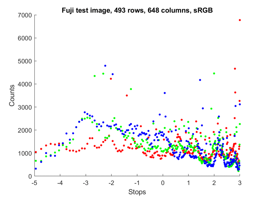
Another x-axis nonlinearity take its inspiration from photography, not human vision:

This compresses the right side of the plot even more. Likewise, the left side of the plat is expanded more than the CIE L* plot. The reference full scale is 8 stops. One problem with the log scale is that the zero bucket is not plottable, since it is an infinite number of stops below full scale.
RawDigger makes the reference 12.5% gray. When you make that change, the graph looks like this:
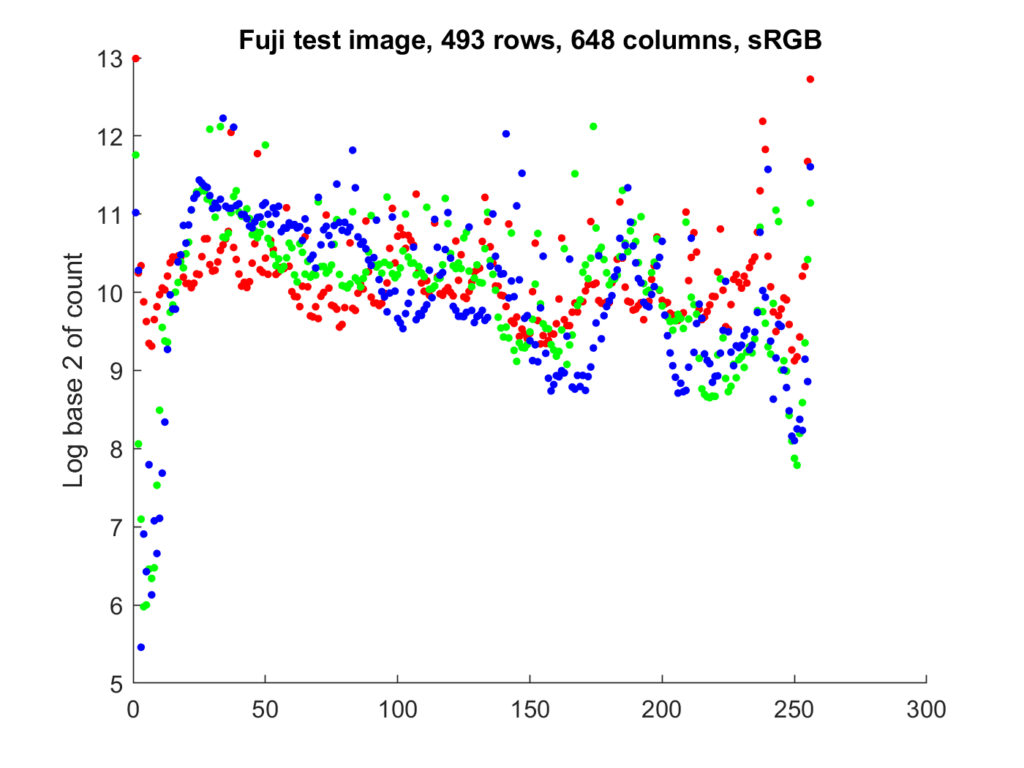
We can also have a logarithmic y-axis. This allows greater visibility to low bucket counts, at a cost of less to high ones.
The different options for displaying both axes can be combined arbitrarily, which yields a bewildering number of choices.
Now let’s look at the way that histograms from that image are displayed in various editors.
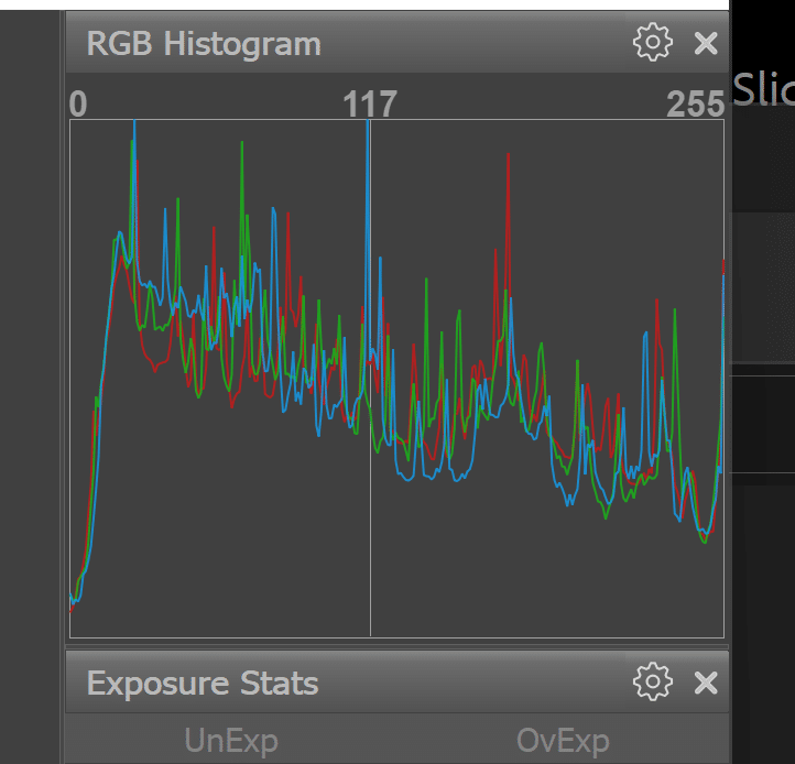
In Lightroom:

Lightroom uses a weird presentation for its histograms. The color space is Pro Photo RGB, and the vertical axis is linear, but the horizontal axis is the sRGB tone curve.
Compare the above to a straight Pro Photo RGB presentation:
Notice that Lightroom hides the peaks at the far right of the histogram. Not a good thing, in my opinion.
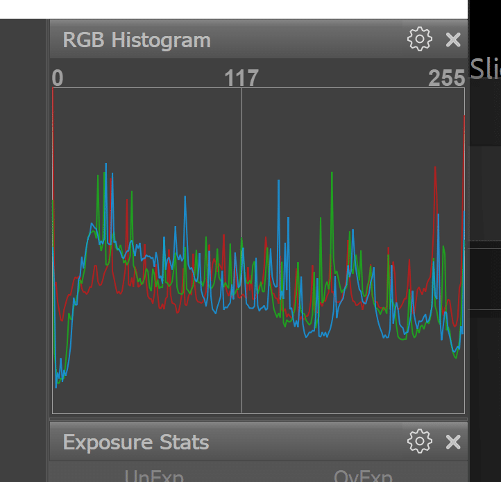
If we export the image in Pro Photo RGB to Photoshop:

Now we can see the peaks on the right.
Looking at the image in sRGB in Photoshop:
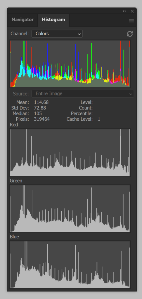
If you look carefully, you can see the gamut clipping on the right as well as the left.
Fast Raw Viewer with default settings and Prophoto RGB:
Compare that to this:
FRV is using a bin size greater than 1, ignoring the really high peaks, or is using a nonlinear y-axis. Let’s try increasing the bin width and see what happens:
That’s closer.
sRGB:

If you made it this far, congratulations. Hopefully you have a better understanding of the various forms that photographic histograms can take. Next post, I’ll talk about how to read histograms, and how they can help in various photographic situations.
Thanks for posting these. Hope your recovery continues.