• site home
  • blog home
  • galleries
  • contact
  • underwater
  • the bleeding edge

the last word

Photography meets digital computer technology. Photography wins -- most of the time.

You are here: Home / The Last Word / In image editing, the surround matters

In image editing, the surround matters

September 4, 2016 JimK 3 Comments

Much has been made of the absolute brightness of the display used for image editing. A common cause of having your prints come out too dark is having your display too bright. This is now fairly well understood by many, but new people entering the digital photography arena often encounter it, especially now that average monitor brightness is much higher than it was in the CRT, or even the florescent-backlit LCD, days.

The issue of the surround gets relatively less press, but is at least as important. What’s the surround? It’s the border around the image, which plays a large role in the state of adaptation of your eye, and the appearance of colors. Let’s look at the same image with three surrounds (to get the full effect, enlarge the images below so that they fill up the whole screen of your display):

_D505634-Edit B

_D505634-Edit G

_D505634-Edit W

The image with the light surround looks darker, doesn’t it? And the changes in lightness aren’t the same all across the tone curve.

It’s easier to see with a Macbeth chart:

_D505634-Macbeth B

_D505634-Macbeth G

_D505634-Macbeth W

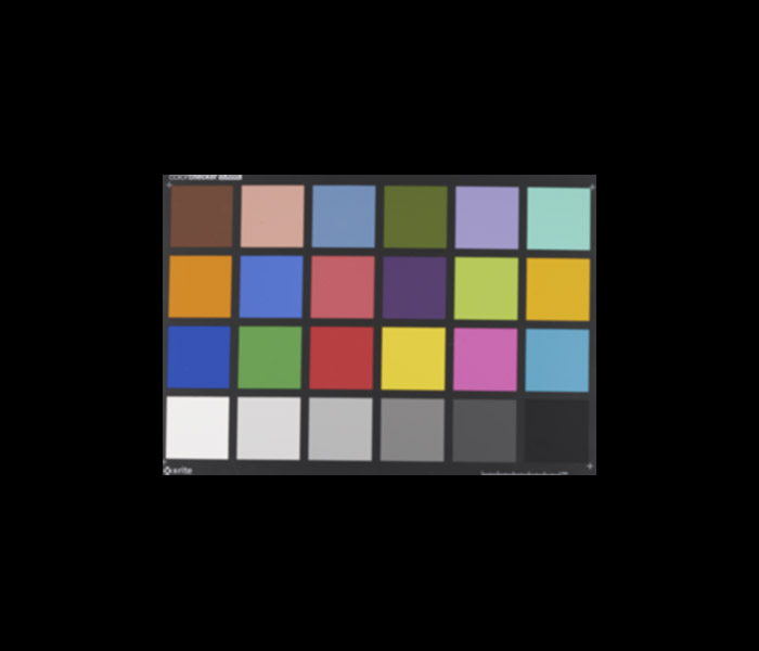
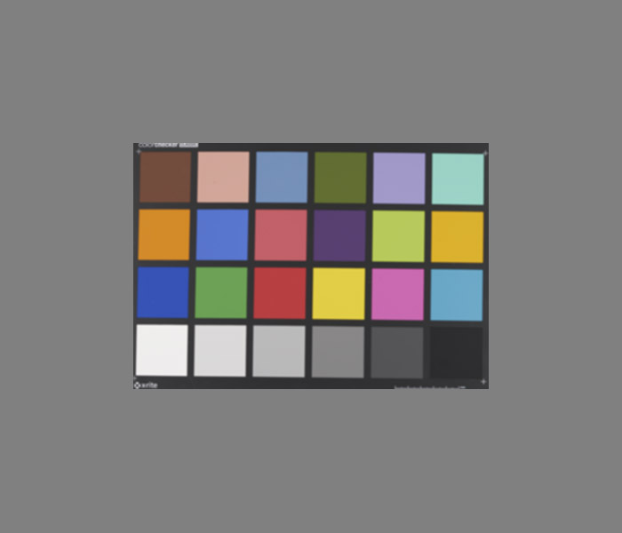
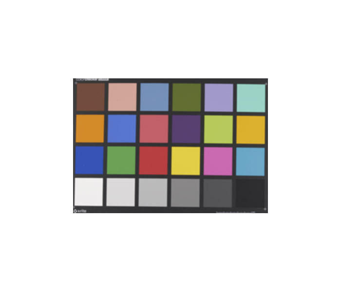
The greatest differences are seen in the darkest parts of the image.

In the film world, the expectation was that prints would be viewed with a white surround, and slides with a dark surround. The designers of the films dealt with this by raising the gamma of transparency film so that it was about 1.5, as opposed to the gamma of approximately unity for the negative/print system.  That ssemed to help, until you wanted to make a print from a slide, and then the added contrast in the slide was a problem.

There are differences in the highlights, too. With a black surround, you can read the white point of the image as the brightest near-neutral tone in the image. But if you take that image and show it with a white surround, it’ll be pretty obvious if a tone in the image that is meant to read as white isn’t really as bright as the image white point.  You can see that clearly in the Macbeth chart images, where the lower left square looks white in the image with the black surround, but light gray in the image with the gray surround.

Changing the color of the surround creates similar effects. You want the surround neutral. If the editing color space is and RGB space, that means R=G=B.

Assuming that you’re going to view your prints with a white surround, editing them with a dark surround can make them look too dark when you print them.

Up next: room lighting levels.

The Last Word

← Some event photography In image editing, the room illumination matters →

Comments

  1. Lynn Allan says

    September 4, 2016 at 5:48 pm

    Interesting. Thanks.

    When I print, it is usually smaller … 4×6″ and 8.5×11″ as give-away event-mementos. Essentially none are border-less … but rather have a moderate white border.

    My calibrated monitor is in a dim room, so it would in effect have a “dark surround”.

    I haven’t had that much confidence that I get the relative darkness/lightness of people prints right, so I’ll use the 4×6″ prints as “proofs” before printing larger 8.5×11″ prints.

    I also find that the ACR/LR histogram is helpful to see whether the print has good dynamic range from deep blacks to nearly blown highlights … and some blown highlights are allowed depending on the content.

    I should use “soft-proofing” more often … mea culpa.

    And hope your recovery is going well … from medical problems and nearby fires.

    Reply
  2. Graham Byrnes says

    September 6, 2016 at 6:01 am

    Actually, no, I don’t notice any difference in the photo. But maybe I’m persuaded not to notice the difference because you’ve told me I should? perception is a funny beast.
    For the MacBeth chart, I see a difference in the lower left square between white and grey backgrounds, but not between grey and black. For the lower-right, it’s the opposite.
    What I have noticed as a near universal effect is that some sort of border makes almost any photo look better. It seems that for me 25-30mm is enough on A3+, and 15-18mm on A4… beyond that the marginal improvement is very slight, but the difference between borderless and a 25mm border is huge.

    Reply

Trackbacks

  1. In image editing, the room illumination matters | The Last Word says:
    September 6, 2016 at 8:48 am

    […] In image editing, the surround matters […]

    Reply

Leave a Reply Cancel reply

Your email address will not be published. Required fields are marked *

May 2025
S M T W T F S
 123
45678910
11121314151617
18192021222324
25262728293031
« Apr    

Articles

  • About
    • Patents and papers about color
    • Who am I?
  • How to…
    • Backing up photographic images
    • How to change email providers
    • How to shoot slanted edge images for me
  • Lens screening testing
    • Equipment and Software
    • Examples
      • Bad and OK 200-600 at 600
      • Excellent 180-400 zoom
      • Fair 14-30mm zoom
      • Good 100-200 mm MF zoom
      • Good 100-400 zoom
      • Good 100mm lens on P1 P45+
      • Good 120mm MF lens
      • Good 18mm FF lens
      • Good 24-105 mm FF lens
      • Good 24-70 FF zoom
      • Good 35 mm FF lens
      • Good 35-70 MF lens
      • Good 60 mm lens on IQ3-100
      • Good 63 mm MF lens
      • Good 65 mm FF lens
      • Good 85 mm FF lens
      • Good and bad 25mm FF lenses
      • Good zoom at 24 mm
      • Marginal 18mm lens
      • Marginal 35mm FF lens
      • Mildly problematic 55 mm FF lens
      • OK 16-35mm zoom
      • OK 60mm lens on P1 P45+
      • OK Sony 600mm f/4
      • Pretty good 16-35 FF zoom
      • Pretty good 90mm FF lens
      • Problematic 400 mm FF lens
      • Tilted 20 mm f/1.8 FF lens
      • Tilted 30 mm MF lens
      • Tilted 50 mm FF lens
      • Two 15mm FF lenses
    • Found a problem – now what?
    • Goals for this test
    • Minimum target distances
      • MFT
      • APS-C
      • Full frame
      • Small medium format
    • Printable Siemens Star targets
    • Target size on sensor
      • MFT
      • APS-C
      • Full frame
      • Small medium format
    • Test instructions — postproduction
    • Test instructions — reading the images
    • Test instructions – capture
    • Theory of the test
    • What’s wrong with conventional lens screening?
  • Previsualization heresy
  • Privacy Policy
  • Recommended photographic web sites
  • Using in-camera histograms for ETTR
    • Acknowledgments
    • Why ETTR?
    • Normal in-camera histograms
    • Image processing for in-camera histograms
    • Making the in-camera histogram closely represent the raw histogram
    • Shortcuts to UniWB
    • Preparing for monitor-based UniWB
    • A one-step UniWB procedure
    • The math behind the one-step method
    • Iteration using Newton’s Method

Category List

Recent Comments

  • bob lozano on The 16-Bit Fallacy: Why More Isn’t Always Better in Medium Format Cameras
  • JimK on Goldilocks and the three flashes
  • DC Wedding Photographer on Goldilocks and the three flashes
  • Wedding Photographer in DC on The 16-Bit Fallacy: Why More Isn’t Always Better in Medium Format Cameras
  • JimK on Fujifilm GFX 100S II precision
  • Renjie Zhu on Fujifilm GFX 100S II precision
  • JimK on Fuji 20-35/4 landscape field curvature at 23mm vs 23/4 GF
  • Ivo de Man on Fuji 20-35/4 landscape field curvature at 23mm vs 23/4 GF
  • JimK on Fuji 20-35/4 landscape field curvature at 23mm vs 23/4 GF
  • JimK on Fuji 20-35/4 landscape field curvature at 23mm vs 23/4 GF

Archives

Copyright © 2025 · Daily Dish Pro On Genesis Framework · WordPress · Log in

Unless otherwise noted, all images copyright Jim Kasson.