Today I’m posting a set of images similar to yesterday’s, but with a different resampling ratio. In today’s test images, the resolution of the target before resampling was 145 pixels per inch. As before, the test image was resampled to 360 pixels per inch before printing.
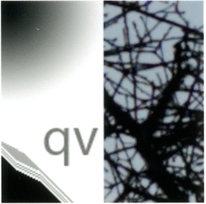
The first image is from Lightroom 4 with no sharpening:
Lightroom 4 produces a generally soft image, but has very few artifacts. The softness is seen in the branches of the natural image on the right, in the text of the artificial image, and also in the way that the 45° slope line pairs are barely resolved.
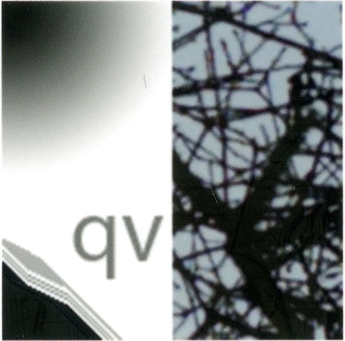
The next one is also from Lightroom 4, but uses the standard sharpening:
When sharpening is added to the Lightroom 4 processing, the branches crisp up somewhat, as do the letters, there is better separation of the 45° lines. However, an artifact is introduced: the horizontal stair steps in the 30° line pair are over emphasized. There’s some false detail in the gradient.
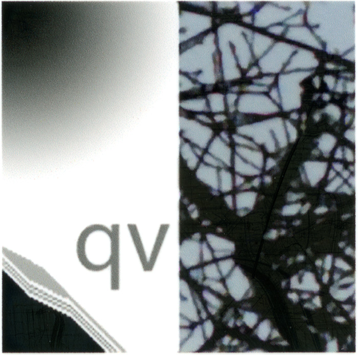
Next we have bicubic smoother performed by Photoshop:
There’s not much to choose between the bicubic smoother resampling and Lightroom 4 with no sharpening.
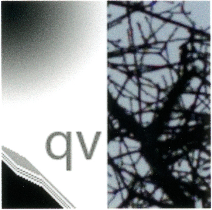
And finally, Perfect Resize, using the default settings:
There is substantial improvement in the Perfect Resize resampling over the other three. The letters are definitely crisper, and there’s better separation between the lines. The branches are nicely defined without introducing mottling in the sky or in the gradient.
I think the differences between Perfect Resize and the others are more evident in this set of images than in yesterday’s examples. I have found that PR’s advantages are more evident as the resampling ration increases. As before, I would expect Qimage to produce similar results to those of Perfect Resize.


Leave a Reply