• site home
  • blog home
  • galleries
  • contact
  • underwater
  • the bleeding edge

the last word

Photography meets digital computer technology. Photography wins -- most of the time.

You are here: Home / The Last Word / Photon Transfer Curves: a unifying tool for analyzing sensor noise

Photon Transfer Curves: a unifying tool for analyzing sensor noise

May 12, 2025 JimK Leave a Comment

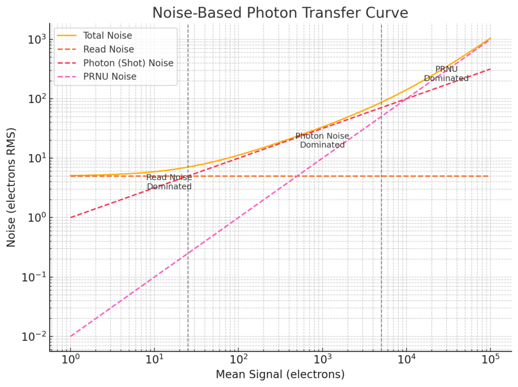
The Photon Transfer Curve (PTC), popularized by James Janesick in Photon Transfer, is a powerful tool for characterizing image sensors. It relates mean signal level to signal variance, capturing the behavior of multiple noise sources across the full dynamic range.

The Basic Idea

Plot the variance of the pixel output against the mean signal level — typically on a log-log scale — from a sequence of uniformly illuminated exposures at increasing brightness.

  • X-axis: Mean signal (electrons or DN)
  • Y-axis: Signal variance (electrons² or DN²)

This plot reveals distinct noise regimes, each dominated by different sources:

Three Key Regions on the PTC

Read Noise–Dominated Region (low signal)

  • Variance is approximately constant.
  • Reflects read noise: amplifier, ADC, kTC, thermal.
  • Slope of less than unity on a log-log plot.

Photon Noise–Dominated Region (mid signal)

Variance increases linearly with signal.

  • Follows: variance = mean
  • Slope of 1 on log-log plot (since log(variance) = log(mean)).

PRNU-Dominated Region (high signal)

  • Variance increases quadratically with signal.
  • Follows: variance = σ_PRNU² × mean²
  • Slope of 2 on log-log plot.

The Model Equation

The total signal variance σ²_total as a function of mean signal S can be modeled as:

σ²(S) = σ_read² + S + (σ_PRNU × S)²
= σ_read² + S + σ_PRNU² × S²

Where:

  • σ_read is the RMS read noise (in electrons)
  • S is the mean signal in electrons
  • σ_PRNU is the fractional PRNU (e.g., 0.01 for 1%)

Each term dominates at a different mean signal level.

How to Measure a PTC

Capture flat-field pairs at increasing exposure levels.

For each pair:

  • Compute the mean signal in a central ROI.
  • Compute the variance of the pixel differences, divided by 2.
  • Plot variance vs. mean.

Use dark frames or very short exposures to estimate read noise, and long bright exposures to estimate PRNU.

Why PTCs Matter

  • Offer a visual, quantitative summary of sensor performance.
  • Help isolate noise sources for modeling or calibration.
  • Allow conversion gain (e⁻/DN) to be measured from the slope in the photon-noise region.
  • Essential for validating linearity, dynamic range, and flat-fielding performance.

You can also present PTC data as plots of signal to noise ratio versus mean signal level.

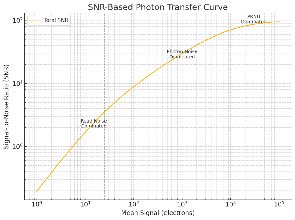
Plotting SNR vs. Mean Signal

An alternative and, at least to me, more intuitive form of the Photon Transfer Curve plots the Signal-to-Noise Ratio (SNR) against the mean signal level.

X-axis: Mean signal (in electrons)

Y-axis: SNR = mean / standard deviation

This plot directly illustrates how well a signal stands out from noise across the sensor’s dynamic range.

Expected SNR Behavior

Using the same model for total variance:

σ²_total = σ_read² + S + σ_PRNU² × S²

The SNR is:

SNR(S) = S / sqrt(σ_read² + S + σ_PRNU² × S²)

This expression transitions through three regimes:

  1. Read Noise–Limited (Low Signal)

SNR ≈ S / σ_read
Linear growth with signal.

  1. Photon Shot Noise–Limited (Mid Signal)

SNR ≈ sqrt(S)
Square root growth — this is the fundamental quantum limit.

  1. PRNU-Limited (High Signal)

SNR ≈ 1 / σ_PRNU
SNR saturates — increasing exposure yields no benefit once PRNU dominates.

This asymptotic ceiling represents the maximum attainable SNR without correcting for PRNU.

Advantages of the SNR Variant

  • More directly aligned with perceptual quality and dynamic range.
  • Shows clearly where further exposure stops yielding SNR benefit.
  • Useful for comparing different sensors or signal processing pipelines.

The Photon Transfer Curve is a bridge between theory and measurement. By identifying the regimes where different noise sources dominate, it enables sensor designers and users to understand, calibrate, and optimize their imaging systems.


The Last Word

← Choosing a Target for Photon Transfer Curve (PTC) Analysis Read Noise in CMOS Sensors: dual conversion gain →

Leave a Reply Cancel reply

Your email address will not be published. Required fields are marked *

May 2025
S M T W T F S
 123
45678910
11121314151617
18192021222324
25262728293031
« Apr    

Articles

  • About
    • Patents and papers about color
    • Who am I?
  • How to…
    • Backing up photographic images
    • How to change email providers
    • How to shoot slanted edge images for me
  • Lens screening testing
    • Equipment and Software
    • Examples
      • Bad and OK 200-600 at 600
      • Excellent 180-400 zoom
      • Fair 14-30mm zoom
      • Good 100-200 mm MF zoom
      • Good 100-400 zoom
      • Good 100mm lens on P1 P45+
      • Good 120mm MF lens
      • Good 18mm FF lens
      • Good 24-105 mm FF lens
      • Good 24-70 FF zoom
      • Good 35 mm FF lens
      • Good 35-70 MF lens
      • Good 60 mm lens on IQ3-100
      • Good 63 mm MF lens
      • Good 65 mm FF lens
      • Good 85 mm FF lens
      • Good and bad 25mm FF lenses
      • Good zoom at 24 mm
      • Marginal 18mm lens
      • Marginal 35mm FF lens
      • Mildly problematic 55 mm FF lens
      • OK 16-35mm zoom
      • OK 60mm lens on P1 P45+
      • OK Sony 600mm f/4
      • Pretty good 16-35 FF zoom
      • Pretty good 90mm FF lens
      • Problematic 400 mm FF lens
      • Tilted 20 mm f/1.8 FF lens
      • Tilted 30 mm MF lens
      • Tilted 50 mm FF lens
      • Two 15mm FF lenses
    • Found a problem – now what?
    • Goals for this test
    • Minimum target distances
      • MFT
      • APS-C
      • Full frame
      • Small medium format
    • Printable Siemens Star targets
    • Target size on sensor
      • MFT
      • APS-C
      • Full frame
      • Small medium format
    • Test instructions — postproduction
    • Test instructions — reading the images
    • Test instructions – capture
    • Theory of the test
    • What’s wrong with conventional lens screening?
  • Previsualization heresy
  • Privacy Policy
  • Recommended photographic web sites
  • Using in-camera histograms for ETTR
    • Acknowledgments
    • Why ETTR?
    • Normal in-camera histograms
    • Image processing for in-camera histograms
    • Making the in-camera histogram closely represent the raw histogram
    • Shortcuts to UniWB
    • Preparing for monitor-based UniWB
    • A one-step UniWB procedure
    • The math behind the one-step method
    • Iteration using Newton’s Method

Category List

Recent Comments

  • Mike MacDonald on Your photograph looks like a painting?
  • Mike MacDonald on Your photograph looks like a painting?
  • bob lozano on The 16-Bit Fallacy: Why More Isn’t Always Better in Medium Format Cameras
  • JimK on Goldilocks and the three flashes
  • DC Wedding Photographer on Goldilocks and the three flashes
  • Wedding Photographer in DC on The 16-Bit Fallacy: Why More Isn’t Always Better in Medium Format Cameras
  • JimK on Fujifilm GFX 100S II precision
  • Renjie Zhu on Fujifilm GFX 100S II precision
  • JimK on Fuji 20-35/4 landscape field curvature at 23mm vs 23/4 GF
  • Ivo de Man on Fuji 20-35/4 landscape field curvature at 23mm vs 23/4 GF

Archives

Copyright © 2025 · Daily Dish Pro On Genesis Framework · WordPress · Log in

Unless otherwise noted, all images copyright Jim Kasson.