This is one in a series of posts on the Nikon Z9. You should be able to find all the posts about that camera in the Category List on the right sidebar, below the Articles widget. There’s a drop-down menu there that you can use to get to all the posts in this series; just look for “Z9”.
Is ISOlessness a word? I don’t know, but the noun and the related adjective “ISOless” describe a state of affairs where the read noise of a camera remains virtually the same over a range of ISO settings, so that only the exposure defines the noise in the captured image, and the ISO setting plays almost no part. I’ve been working with ISOless cameras for more than a decade, and haven’t in all that time come up with a way to characterize them that truly satisfies me. What I think would be best is a simple display of the effect of deliberate “underexposure” over a range of ISO settings that shows the effect on visible image noise versus the signal level.
Today, I may have come up with such a presentation. It’s not perfect. A perfect way of handling this would be to present the results as a scalar, and have all ISO settings included in the same graphic. But ISOlessness varies with the shadow luminance that the photographer feels is significant. Also, the scalar metrics that I’ve seen obscure the nature of what’s happening, and the balance between photon noise and read noise.
So here’s my new way of looking at things:
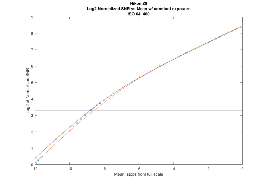
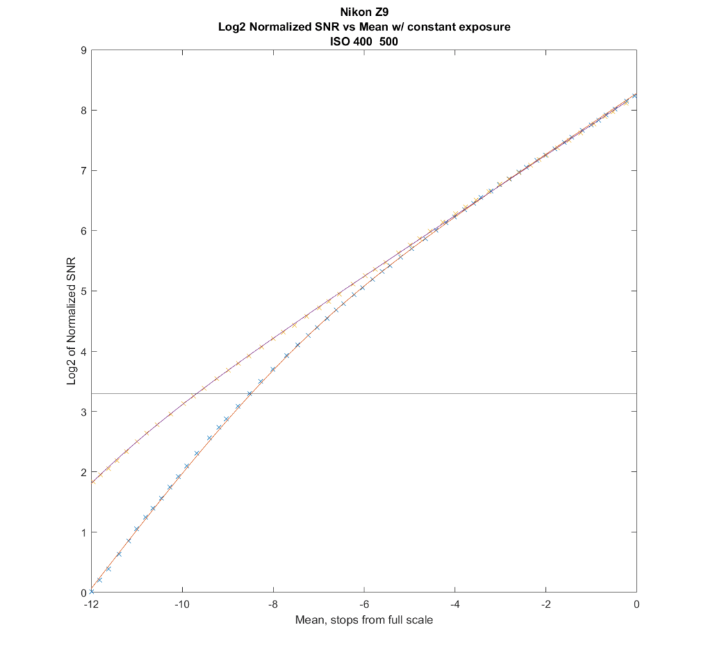
The vertical axis is the signal to noise ratio (SNR) of the green channels of the raw files normalized to a 1600-pixel-high print. When people talk about noise in an image, they are almost always talking about signal to noise ratio, not the level of the noise. In highlight areas — unless there’s clipping — the image has the most amount of noise. But it doesn’t look like that, because the signal level is so high. The reason for the normalization is to make the results consistent with my other shadow noise curves, and also to allow cameras of different resolutions to be fairly compared. The vertical axis is logarithmic, and converted to stops, which is the way most photographers think about light ratios. Higher is better here. The horizontal black line shows the threshold that Bill Claff uses to measure photographic dynamic range (PDR). So you can read off the curves about that the PDRs for the two ISOs are about 8.5 stops for ISO 64 and about 8.7 stops for ISO 400.
The horizontal axis is also logarithmic and marked off in stops, and it is how far down the mean signal level is from full scale for the highest ISO value in the graph. The curves for all the other ISOs are calculated at the same exposure as the highest ISO gets; in this case that ISO is 400. You can see for the brightest five stops in the image, the curves are right on top of each other; it doesn’t make any difference if you shoot at ISO 400 with an ETTR exposure, or you use that same exposure at ISO 64 (you’ll have to boost a lot more in post with ISO 64 though).
The data comes from photon transfer curve (PTC) analysis that I’ve performed on the Z9. The crosses are the measured values, and the lines are the modeled results.
The curves on the right side of the above graph are straight lines with a slope of 1/2. That means that the noise is dominated by photon noise. On the left side of the graph, the curves droop down as read noise becomes more significant.
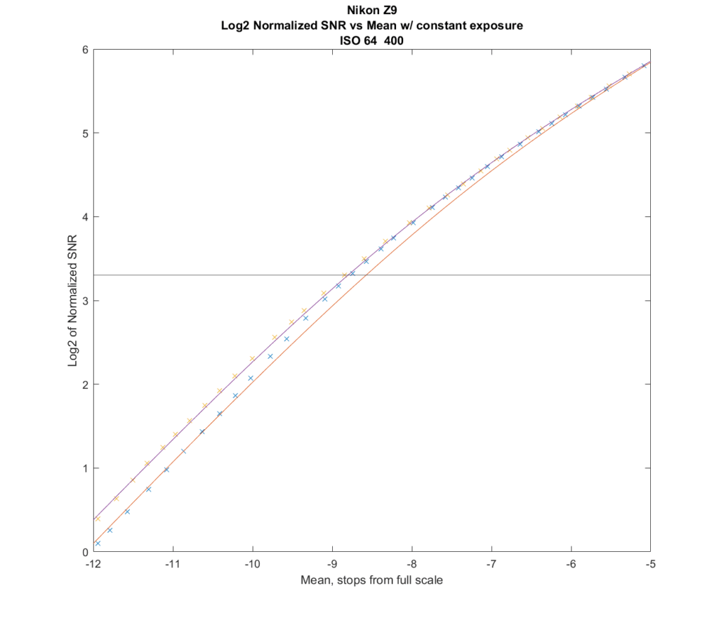
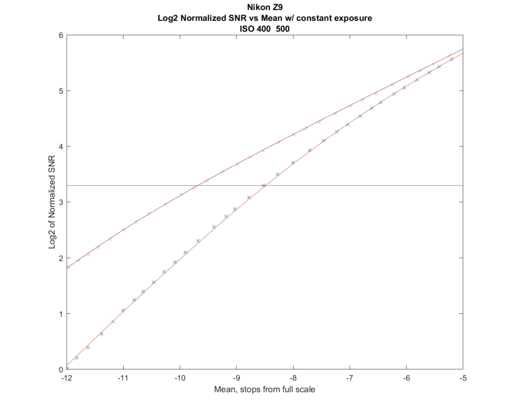
We can see what’s going on in the shadows a bit better if we zoom in so the highest mean values are five stops down:
The xs are the actual data from the camera tests, and the lines are curves fit to the data. At ISO 64, there is something going on in the Z9 in the brighter part of its range that is causing the modeling to differ significantly from the data. So in this case, I suggest looking at the xs. They show very little difference between the SNRs of the ISO 64 and ISO 400 settings all the way down to the threshold that defines Bill Claff’s photographic dynamic range. Below that, the Z9 is worse at IOS 64 than at ISO 400.
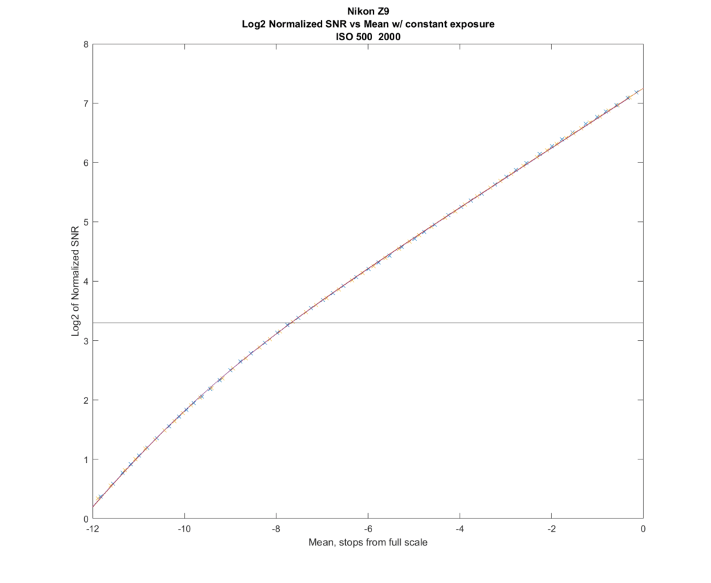
Looking at ISO 500 and 2000, the curves are right on top of each other.
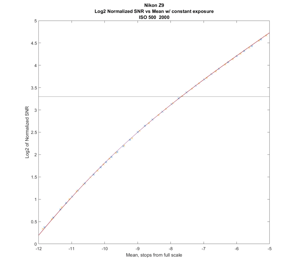
That’s true even zoomed in:
So, for raw files, from ISO 500 on up, if your raw developer of choice behaves well, you can get the same result by leaving the camera at ISO 500 and pushing in post as from increasing the ISO setting in the camera. You’ll get additional highlight protection by doing that, but your JPEG preview image will get dark. I do this a lot, but usually I avoid more than a three-stop push in post.
But here’s a situation where the camera is not ISOless at all — the transition from ISO 400 to ISO 500.
Zoomed in:
You can see that by 8 or 9 stops down from clipping at ISO 2000, that ISO 500 has a significant advantage.
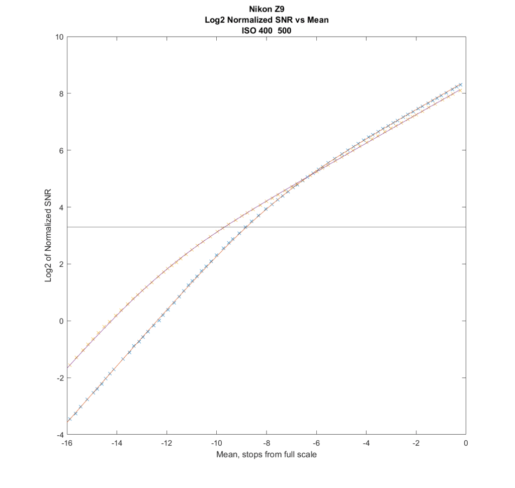
Let’s compare the above set of curves to the case where each shot receives an ETTR exposure:
ISO 400 results in a slightly better result in the brighter tones, because the 1/3 stop extra exposure it gets for ETTR give a slightly better SNR in the region where photon noise dominates. But in the shadows, even with the extra exposure for IOS 400, the ISO 500 shots will win.
Jack Hogan says
Nice way to show ISO invariance Jim!
Christer Almqvist says
Very interesting reading. And a post where I understand the technical details.
My end product is b&w pictures and I always underexpose somewhat in order to avoid burned out highlights. Yes, the jpeg screen gets a bit dark, as do the jpegs, but I use the RAW files and process them in Capture 1. My first processing step is batch exposure adjustment.
The increased shutter speed is a positive side effect of this underexposure (as it was defined in film days).
Barry says
is that because the camera uses a different convertor (if that’s the proper name) at ISO500 to that of the ISO’s from 64 to 400?
JimK says
Kind of. At ISO 500 the capacitance of the places where the electrons released by the photodiodes are stored. This means that fewer electrons are required for the same voltage. This increase in what’s called “conversion gain” (volts/electrons) reduces the input -referred read noise.