Half of me would like to drop this in-camera histogram calibration project, since I’ve gotten it to the point where it works better for me than the Guillermo Luijk’s process, and is good enough for my use with iterations on the final step, but I’ve started down this road and I’m not going to quit now. I know it’s been geeky and technical so far, but that’s about to get a lot worse. Many of you may want to avert your eyes and start reading again when I post the conclusions.
The first thing I need to do is to track down and learn how to manage the things that impair the repeatability of the process. So that’s what this post is about.
One big repeatability problem is the fact that my current process calls for photographs of the monitor from two different positions: one for the images of the grid and one for the single-color images that are white balance reference image candidates. I have made changes to the target to allow all the images to be made from the same position. The first thing I did was make the grid smaller in the target image, so that the test images can include the whole grid when necessary, and include only a solid color when the top layer is turned on. The second thing I did was change the aspect ratio of the entire image and of all the grid components to be the same as the aspect ratio of the camera undergoing calibration. This minimizes the reduced signal-to-noise ratio that comes from making the grid a smaller part of the test images.
In what follows, a D4 with a 135mm lens made the images from a fixed position close to, but not exactly, an-axis with the monitor center. I don’t expect users to exactly position the camera on-axis, and I wanted to see some of the off-axis effects. Exposure was manual and constant. ISO was 200.
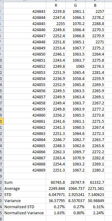
I next investigated the repeatability of supposedly-identical images of the monitor. This test measures the result of minute-by-minute monitor variations, as well as camera shutter speed and f-stop variations. I set up the test image for a solid color, set the intervalometer to 2 minutes, and made a one hour long series of images. Oops, forgot about the monitor power saver. I set the timer on that to 2 hours, and repeated the set of images. The results are presented below. They look pretty tight to me.
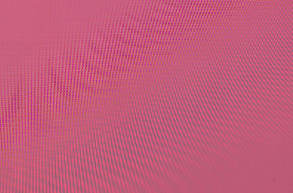
I looked at whether the amount of defocusing made a difference to average RGB values in the raw file. When the image is in focus, there is often prominent moiré pattern visible. For those of you who enjoy this kind of thing, the moire is the result of the sampling frequency of the camera (4928 samples per image width) beating against third harmonic of the pixel pitch of the monitor (about 1700 samples per image width). There is also a false moire visible in the Rawdigger image window, caused by the subsampling of the image to fit the display window beating against the actual sampling in the camera. You can tell it’s false moire because it changes as you change the size of the main Rawdigger window. All that beating can get pretty ugly. Here’s a particularly spectacular example:
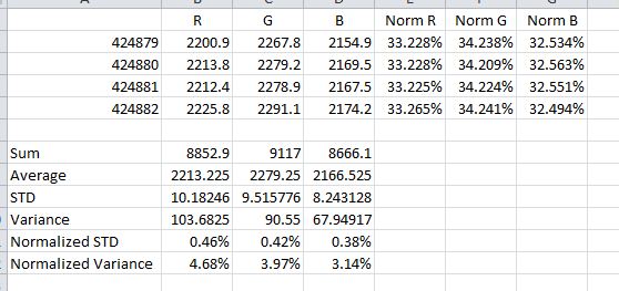
Does the real beating hurt the accuracy of the average readings? It turns out there is a mild brightening of the image as it is defocused; that brightening affects all three primaries more or less equally, as evidenced by the values for each primary normalized to the sum of the primaries. The in focus image is at the top, and defocusing increases as you go down the list of files.
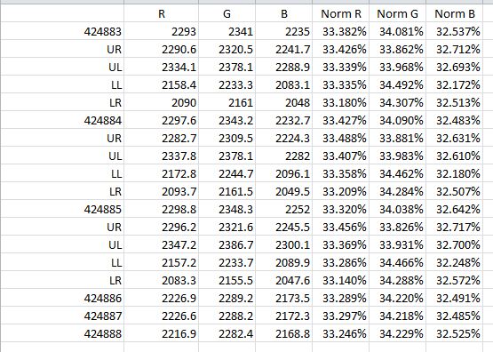
The next area to attack is color shifts that vary with position on the screen. I created a grid of identical colors, photographed it, and compared the center to the four corners. I used modest defocussing for this series of images. I made three images of each situation. Here’s the data for each of the six exposures, with the first three being the grid and the last three being the solid blocks:
When each positional area is averaged over the three exposures, and that is normalized to the average of the solid-color exposures, some positional color shift becomes evident:


Leave a Reply