This is one in a series of posts on the Nikon Z6 and Z7. You should be able to find all the posts about that camera in the Category List on the right sidebar, below the Articles widget. There’s a drop-down menu there that you can use to get to all the posts in this series; just look for “Nikon Z6/7”.
A few posts ago, I did an informal, no-numbers comparison of the Nikon 50mm f/1.8 S and the Sigma 50 mm f/1.4 ART with both lenses on the Nikon Z7. I had some reader interest in a similar comparison between the 50 mm S lens and the Zeiss Otus 55 mm f/1.4 and the Sony/Zeiss (Zony) 55 mm f/1.8. The Zony can’t be used on the Zx cameras, so I mounted it on a Sony a7RIII.
Here’s the scene, with all three lenses set at f/1.8:
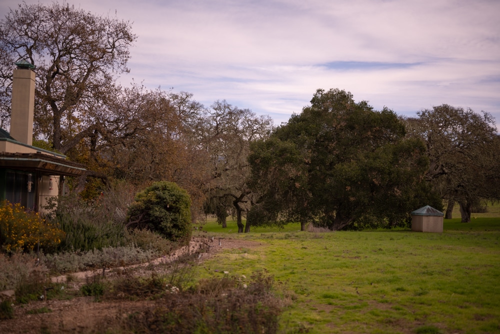
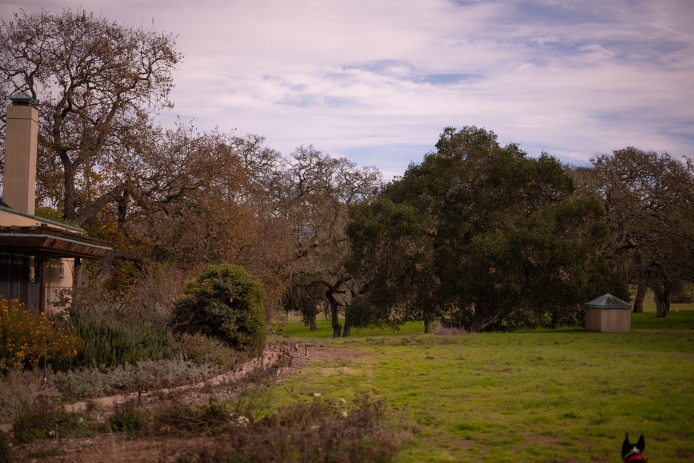
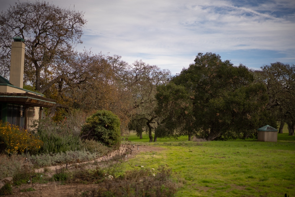
The color balance of the Sony image is quite different, even though all three were developed in Lightroom with the Adobe Color profile, and the white balance set to Cloudy.
I used ISO 64 for the Z7 and ISO 100 for the a7RIII, and put the camera on a set of solid RRS carbon fiber legs, with an Arca Swiss C1 on top. I focused in the center for the images that formed the basis for the center crops, and in the upper left for the ones that got cropped that way. Hence, focus curvature is nulled out. I made three sets of images at each setting, and picked the best one — that was hard because they were all about the same. I developed the images in Lightroom, and thus I can’t turn off all lens corrections. I did turn off all the corrections, including vignetting, in the camera. The Lr default sharpening was overly aggressive, so this is what I used:
Because Lr does some sharpening behind the scenes, it is not guaranteed that all three sets of images have the same amount of sharpening. In fact, it appears that the Otus has less. So sharpness assessments of these images comes with an asterisk.
Now I’m going to show you some highly magnified crops. If you’ve seen my explanation of them before, just jump to the images. If not, I need to spend some time telling you how to interpret them. They’re at roughly 250% magnification, enlarged to 700 pixels high on export from Lightroom; the magnification of the Sony images being slightly higher to compensate for the small difference in reolution between the a7rIII and the Z7. If you just want a rough idea of the differences, just look at the images as displayed in-line in the posts. However, if you wish to compare these images in detail, you should view these images by clicking on them to see the source files, then set your browser for 100% zooming. Even better, download them and make Photoshop stacks.
No matter what you do, these crops are all going to look horrible. I’m blowing them up so much so that they will represent the original file after JPEG’s discrete cosine transform has had its way with them. If you want to get a good idea of what the images would look like printed, get far away from your monitor. No, farther than that. Put a bunch of the images up on the screen and back up until the best one starts to look good. Then look at the others. There’s another reason why these images won’t look like the best thing the camera/lens combination can deliver. They’re demosaiced with Lightroom. Lightroom is not awful, but for a particular image, there are usually better raw processors. I use Lr because it’s a de facto standard, because I know it well, and because it’s got good tools for dealing with groups of images.
Here’s how to use these highly-magnified crops. The dimensions of the Z7 sensor is 8256×5504 pixels. If we make a full-frame print from the Z7 on a printer with 360 pixels per inch native driver-level resolution, like the Epson inkjet printers, we’ll end up with a 23×15 inch (58×39 cm) print. The 318×246 pixel crop you’re looking at will end up 0.8333×0.6833 inches (2.12×1.74 cm). Let’s imagine that you or your viewers are critical, and will look at the 22×15 inch print from about 18 inches (conventional wisdom is that the distance would be a little greater than that, or 28 inches (the diagonal), but you did buy a high-resolution camera for a reason, didn’t you?).
The next step is dependent on your monitor pitch, which you may or may not know. Turns out, you don’t have to know it. Just take the 253% crops and view then at 1:1. How high are they? Get out your ruler and measure, or just guess. Let’s say they are 6 inches high. 6 inches is about 7 times 0.8333, so in order to view the crops the way they’d look from 18 inches on the print is to view them from 7 times as far away, or 10.5 feet.
Everything here scales proportionately. If the image on your screen is bigger than 6 inches, increase your viewing distance by the ratio of your image height to 6 inches. If you think your viewers are going to almost get their nose to that print and look at it from six inches, divide that 10.5 feet by 3, and look at the image on the monitor from three and a half feet away.
I made a series of crops of the center of the field, but I’m not going to show them to you, since they look so similar. I’m just going to show you the upper left corner.
At f/1.8:

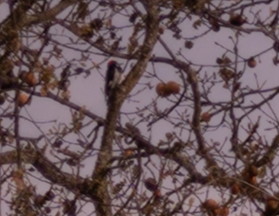
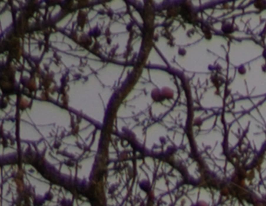
There is a loser in this particular triplet: the Zony. Purple fringing abounds, and it’s just not as sharp as either of the other two lenses. The absolute sharpness is not bad at all, though; it’s just that the competition is so good. I’m having a hard time choosing between the Nikon S and the Otus image for sharpness. That is high praise for the Nikon lens. The Nikkor has just a bit of LoCA visible, though, and the Otus looks very clean.
At f/2.8:

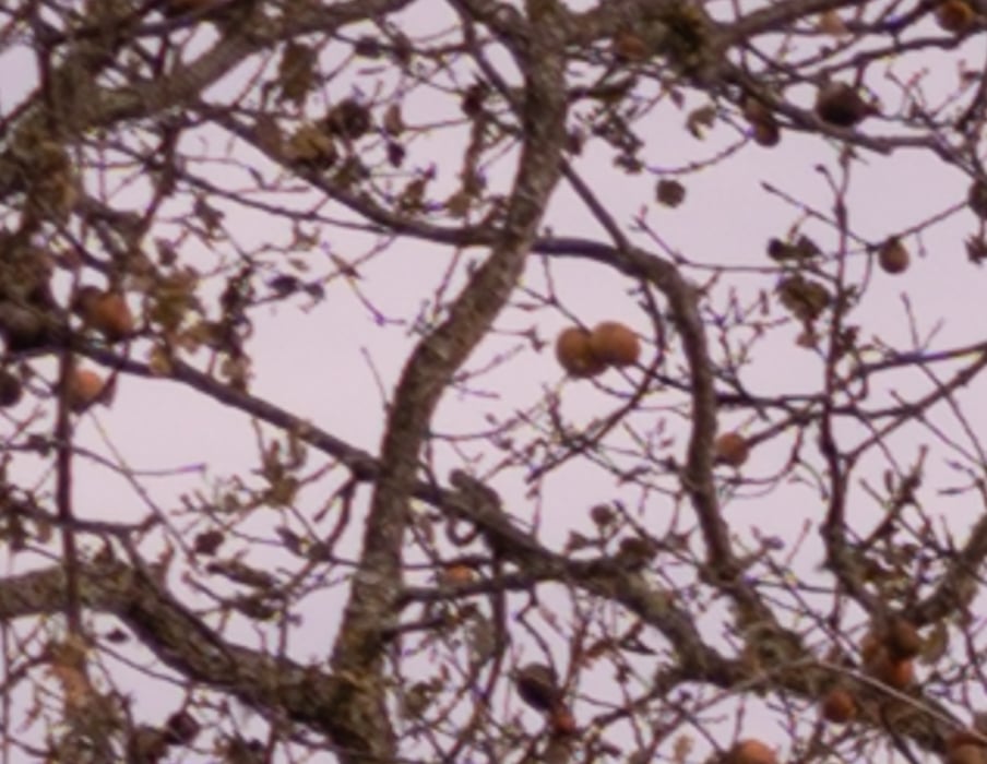
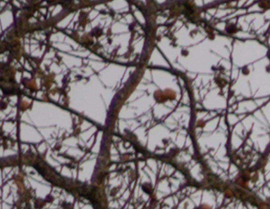
Again, the Zony lags. Again, the biggest difference between the Otus and the Nikkor is the low LoCA of the Otus.
f/4:
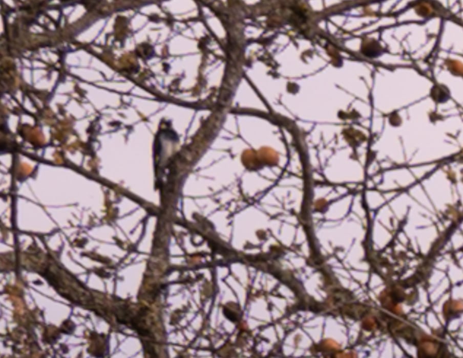
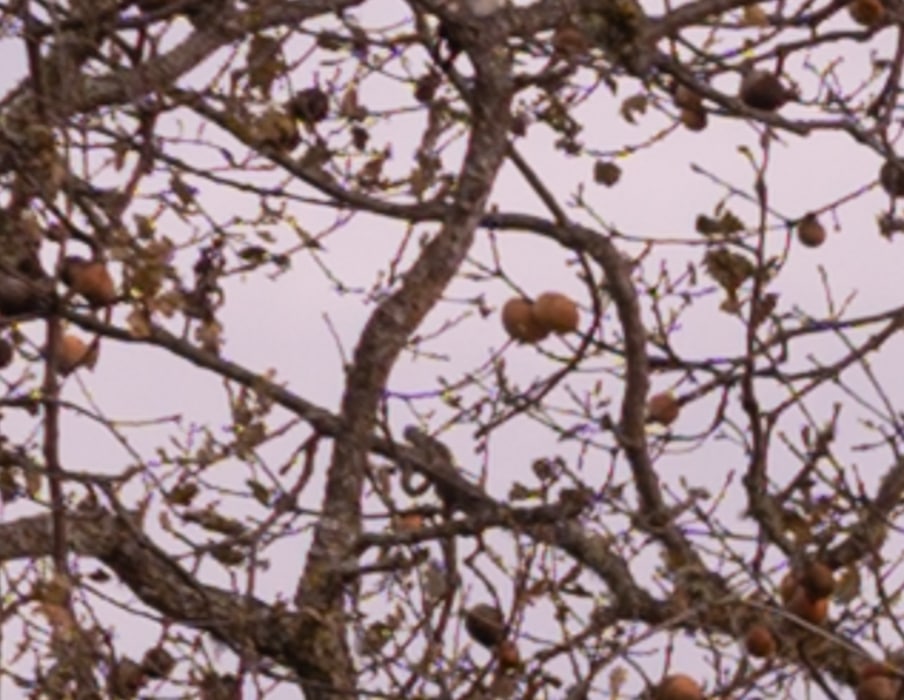
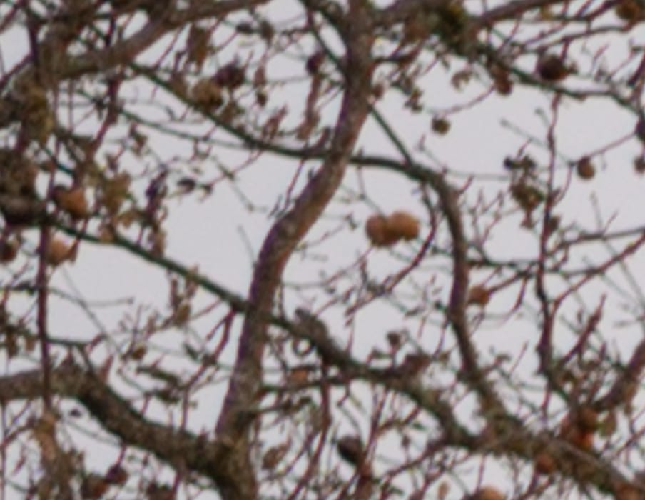
I would have expected the Zony to have crisped up a bit more by now. The 50S is looking really good. The Otus is looking even better.
f/5.6
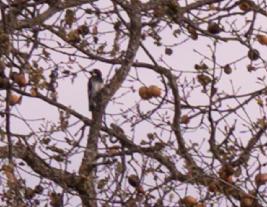

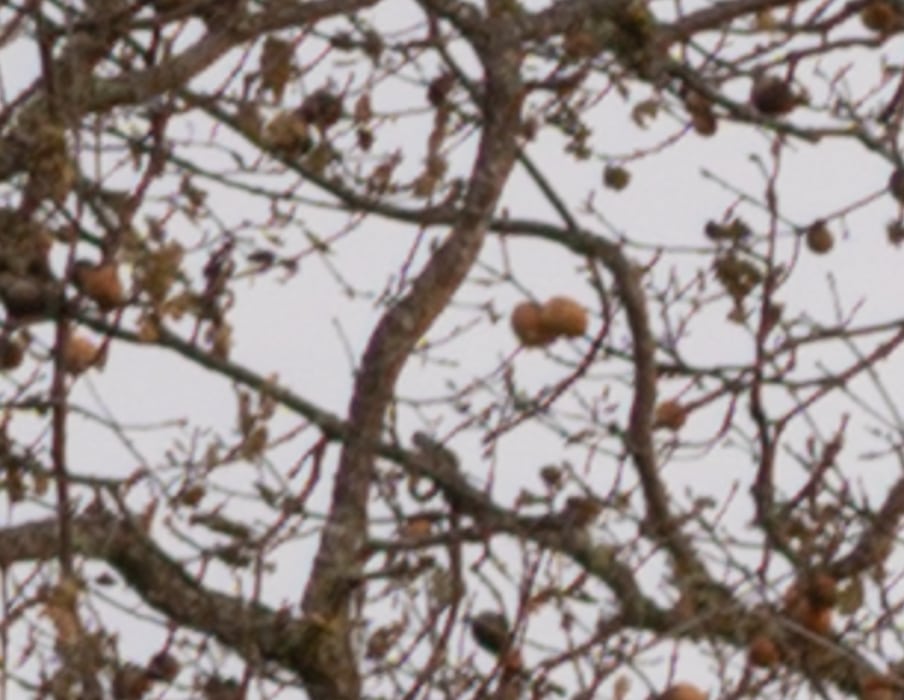
Now the Zony has come into its own. The Nikkor S is almost as clean as the Otus.
Let’s dig a little deeper. The above represents what you’re going to see in Lightroom. But what if you want to look at the characteristics of the lenses themselves, uncorrected by the raw developer? I developed the three f/1.8 images in Raw Therapee using the Neutral profile, which does no sharpening or lens correction at all. Then I tweaked the exposure in Lr. Here’s how that came out:
The 50S looks a hair sharper than the Otus, which leads the Zony. The Nikkor appears to be almost as well-corrected for chromatic aberration as the Otus. LoCA is the Zony’s big issue, and it shows here.
Now we’ll look at those three images with Raw Therapee’s default development:

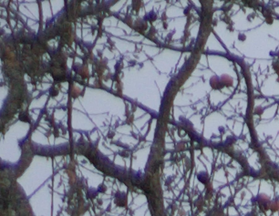
All of the captures are improved, but Raw Therapee’s software magic can’t compensate for the Zony’s chromatic aberration. The lovely character (or lack of it) of the Otus is apparent, but the Nikkor is, amazingly enough, right in there.
There is no loser here. All the lenses are quite good. The Nikkor is obviously the price-performer, stealing that title away from the Zony in what is not a close call.
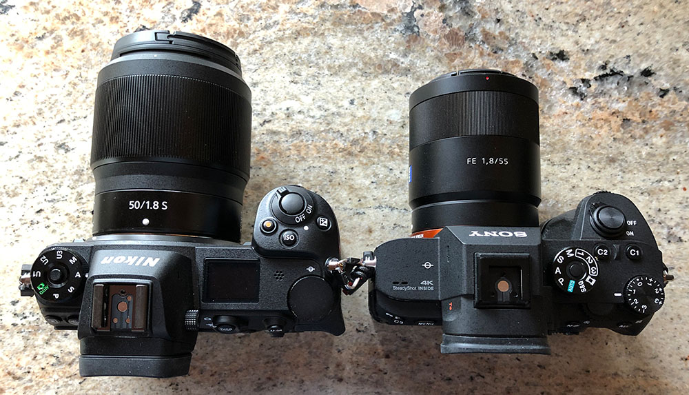
Incidentally, the Zony is quite a bit smaller than the 50S:

Interesting comparison. I did expect a bit better performance with the Zony.
Jim I had higher expectaitons form your blog. Showing out of focus images….sorry. You lost me.
There are single pixel details in those images. Did you read this:
They’re at roughly 250% magnification, enlarged to 700 pixels high on export from Lightroom; the magnification of the Sony images being slightly higher to compensate for the small difference in reolution between the a7rIII and the Z7. If you just want a rough idea of the differences, just look at the images as displayed in-line in the posts. However, if you wish to compare these images in detail, you should view these images by clicking on them to see the source files, then set your browser for 100% zooming. Even better, download them and make Photoshop stacks.
No matter what you do, these crops are all going to look horrible. I’m blowing them up so much so that they will represent the original file after JPEG’s discrete cosine transform has had its way with them. If you want to get a good idea of what the images would look like printed, get far away from your monitor. No, farther than that. Put a bunch of the images up on the screen and back up until the best one starts to look good. Then look at the others. There’s another reason why these images won’t look like the best thing the camera/lens combination can deliver. They’re demosaiced with Lightroom. Lightroom is not awful, but for a particular image, there are usually better raw processors. I use Lr because it’s a de facto standard, because I know it well, and because it’s got good tools for dealing with groups of images.
Here’s how to use these highly-magnified crops. The dimensions of the Z7 sensor is 8256×5504 pixels. If we make a full-frame print from the Z7 on a printer with 360 pixels per inch native driver-level resolution, like the Epson inkjet printers, we’ll end up with a 23×15 inch (58×39 cm) print. The 318×246 pixel crop you’re looking at will end up 0.8333×0.6833 inches (2.12×1.74 cm). Let’s imagine that you or your viewers are critical, and will look at the 22×15 inch print from about 18 inches (conventional wisdom is that the distance would be a little greater than that, or 28 inches (the diagonal), but you did buy a high-resolution camera for a reason, didn’t you?).
The next step is dependent on your monitor pitch, which you may or may not know. Turns out, you don’t have to know it. Just take the 253% crops and view then at 1:1. How high are they? Get out your ruler and measure, or just guess. Let’s say they are 6 inches high. 6 inches is about 7 times 0.8333, so in order to view the crops the way they’d look from 18 inches on the print is to view them from 7 times as far away, or 10.5 feet.
Everything here scales proportionately. If the image on your screen is bigger than 6 inches, increase your viewing distance by the ratio of your image height to 6 inches. If you think your viewers are going to almost get their nose to that print and look at it from six inches, divide that 10.5 feet by 3, and look at the image on the monitor from three and a half feet away.
Thank you Jim, 50S is impressive. My S collection is growing
Ed
Interesting how LR adjusts the playing field (I wouldn’t say levels…)
The 50/S is limited by coma. The 50/Otus is limited by oblique spherical. You can tell because the 50/S has a directional haze, while the 50/Otus has a non-directional haze that knocks off more contrast.
Happy Holidays!
Thanks for that, Brandon, and the best of the season to you.
I had the Sony Z 1.8 for a about a month before selling it due to the CA – Replaced with the Sony Z 1.4 instead and results are significantly improved in all areas. Do you have one available to add to the mix?
Enjoy the holidays.
I don’t have the 50/1.4 FE lens. Sorry.
Please feel free to ignore posters like Kiril who don’t offer something constructive in their feedback.
I very much appreciate the excellent work that you freely share with us. I have learned a lot from your blog.
I must rant a bit. It’s nice that Nikon produces a good non-macro AF normal lens for once, maybe they are ready to compete with the likes of Sigma and Tokina! Of course this happens when I’ve switched brands, but Nikon had decades to do it.
Getting that off my chest, the results from the new 50/1.8 look good and the price quite reasonable if the overall package works. However I quite like the Sony 55: the images look good, and handling and size are both very good. For precision work I use the Voigtländer Apo-Lanthar 65. One thing that Nikon hopefully makes Sony do is getting the Sony 55 to be more reasonably priced and reducing sample variation.
Jim does the other side show the same results? These are the opposite of the results we’re getting, regarding sharpness. Both our Nikon Z and Sony 55 lenses show equal sharpness on either side, but the Sony is a tad sharper. Agree with LoCA results.
Wonder how much copy variation has a role here in these results.
The 50/1.8S lens is slightly tilted:
https://blog.kasson.com/lens-screening-testing/examples/tilted-50-mm-ff-lens/
I don’t have Siemens star results for my copy of the Zony 55, but here’s another test of it:
https://blog.kasson.com/gfx-50s/zony-55-on-a7rii-fuji-63-on-gfx-50s/
I did the same test with 55 Otus versus the 50 1.8S on my Z7. Similar findings. 50S was sharper but more clinical imo. The Otus has more character, but my goodness I haven’t had an AF 50mm lens before (seriously, and I’ve been shooting over 50 years!) and it’s just wonderful on the Z7.