There are many metrics for how well focused an image is. It is axiomatic among surgeons that, if there are many ways to perform a procedure, none of them are very good. So it is with deciding what’s in focus.
This fine analysis doesn’t serve to inform practical photography, except for focusing wide angle lenses near the sides and corners, and dealing with focus curvature. But it goes to show that modern lenses are complicated beasts, and our usual working assumption that there is a flat plane of focus is only an approximation.
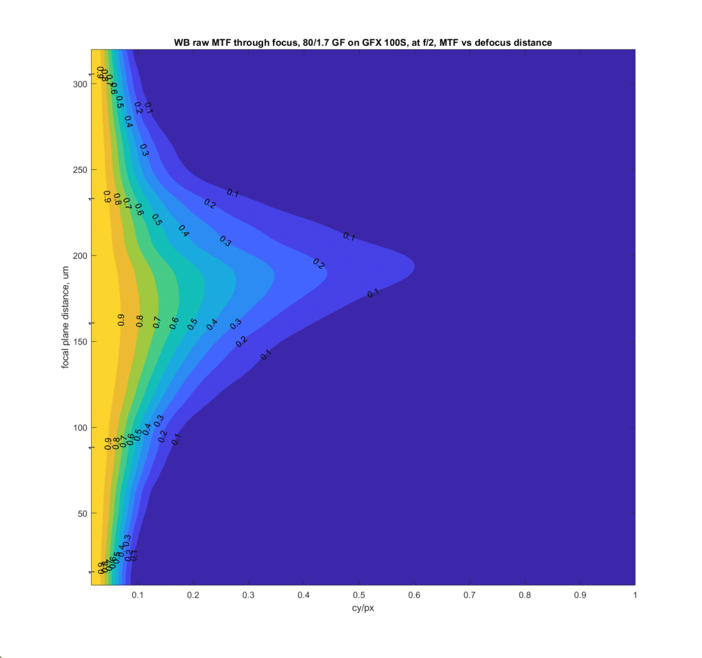
In some cases, the point of best focus can depend on the contrast of the subject. Consider this plot from my previous post:
The horizontal axis is spatial frequency in cycles per pixel. Half a cycle per pixel is the Nyquist frequency, which is the highest spatial frequency the camera can properly capture. The vertical axis is the position of the plane of focus on the sensor side of the lens, or, as the cognoscenti like to say, in the image field. The starting position is arbitrary, and the units are micrometers. For the bottom part of the graph, the camera is front-focused, and for the top part, it’s back-focused. The contours are modulation transfer contrast levels, from 0.1 (MTF10) through 0.9 (MTF90). MTF10 is 10% contrast.
Let’s define the point of best focus as the focal plane distance where the MTF is the highest. Sounds simple, right? But look at the chart above. As the contrast decreases, the focal plane drifts backwards over about 20 um.
If you stop then lens down a bit, the weirdness goes away.

Leave a Reply