In previous work for a project about observer metameric errors in digital cameras, I built a program that, given a target color and a set of sample reflectance spectra, will:
- Using principal component analysis, find a set of basis functions for the sample set
- Assuming the set is lit with a particular illuminant (I used D50 for the data I’m presenting here), find as many spectra as you specify by combining the basis functions.
- All of the spectra will resolve to the same color for a CIE 1931 2-degre observer. They are therefore metamers.
- I set the boundary conditions to exclude spectra with over 100% or less than 0% reflectance.
I published some results here.
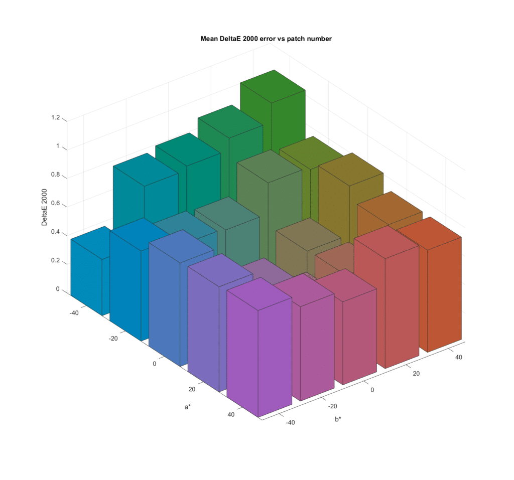
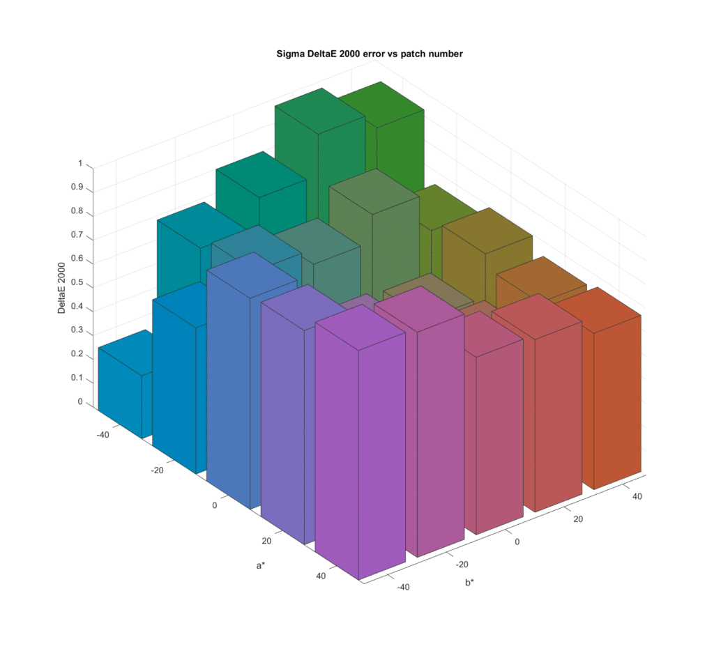
In this post, I explore the results of using a larger number of metamer sets. I generated 25 such sets, all with L* of 50, with a* starting at -40 and increasing in steps of 20 to 40, and b* covering the same range. I tested with all 43 simulated cameras, which gave me a lot of data. In this post, I’ll plot the average of the mean CIELab DeltaE 2000 errors across all the cameras, for all the colors in the metamer sets. I’ll also show you the average of the standard deviations (sigmas) of the CIELab DeltaE 2000 errors across all the cameras. That is an indicator of observer metameric error, since for the standard observer that I used all the metamers in a set are the same color, and the sigma of the CIELab DeltaE 2000 errors would be zero.
The mean DE2K first;
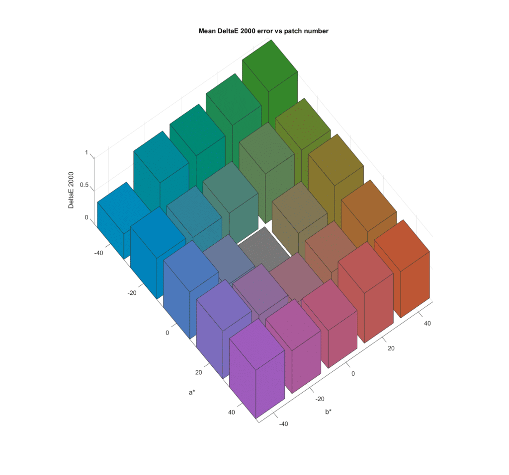
There is some variation in color accuracy with chroma, with the greens being the worst. It looks like the grey axis metamer set produces much lower errors. Let’s look at the same data from a different angle:
You can see that in general, the more chromatic the color the greater the error.
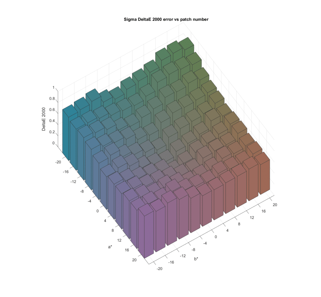
Now we’ll look at the standard deviations:
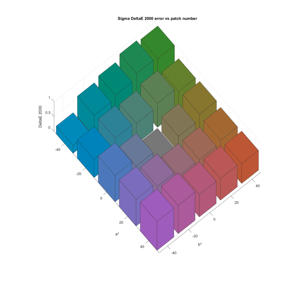
As we saw in the earlier tests, the spectra that produce the least accurate results suffer from the most observer metameric error.
Looking down from the top:
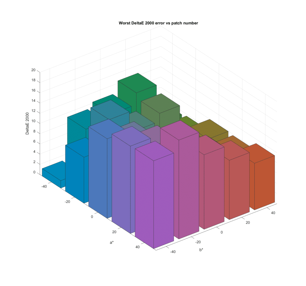
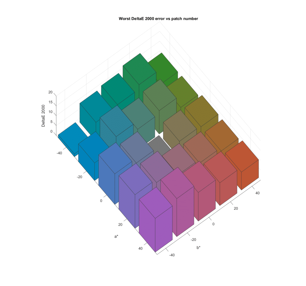
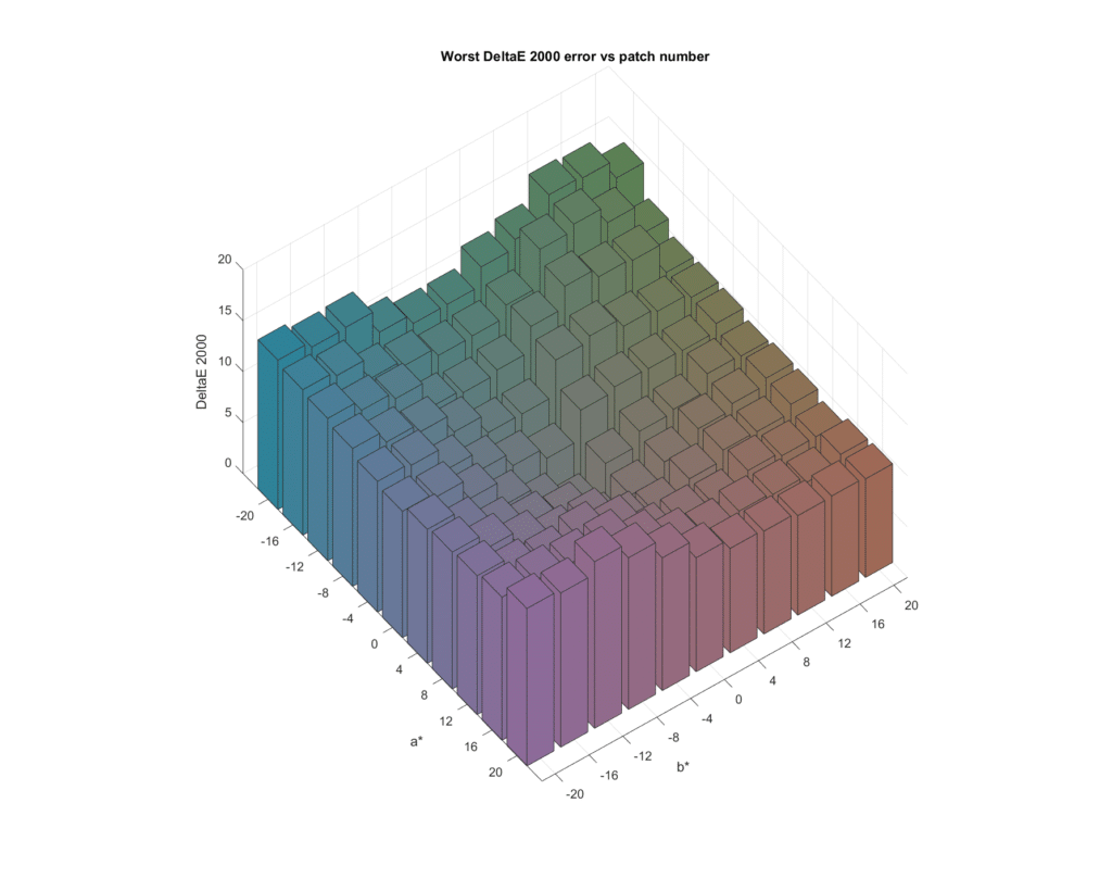
Now we’ll look at the mean of the worst results across all 43 cameras:
I don’t find that particularly informative, but I include it for completeness. It does show that the worst case errors can be quite large.
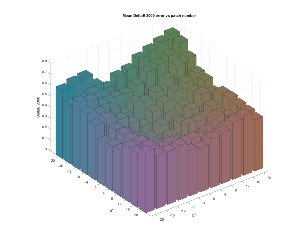
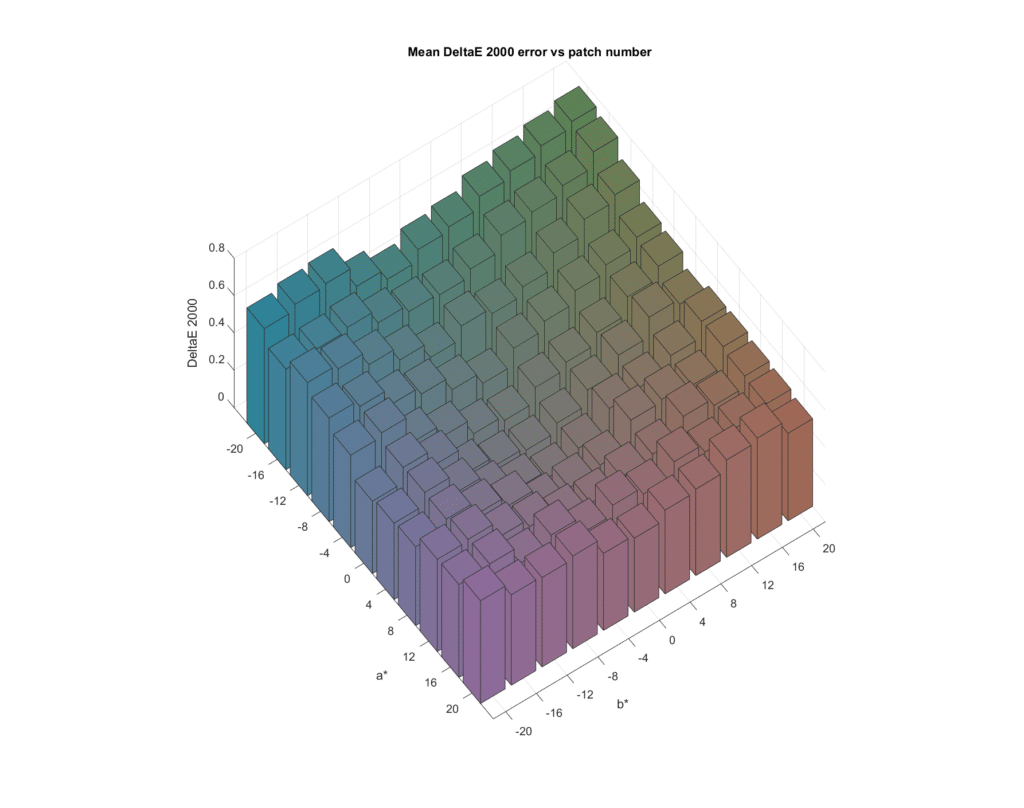
Here are some more finely spaced charts near the gray axis.
Leave a Reply