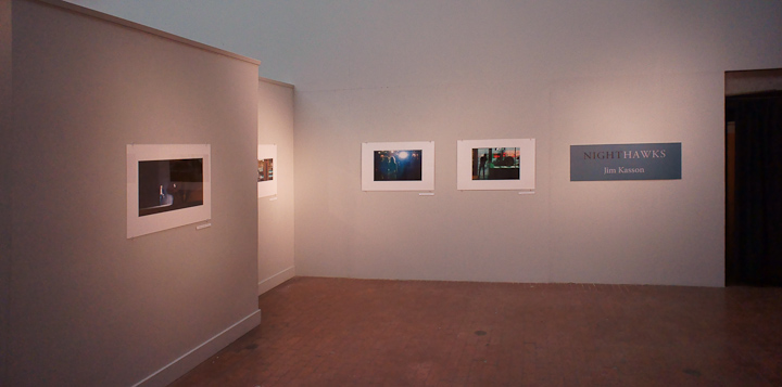
Eric Bosler, exhibition curator.
Mailing labels
Mailing labels Once the postcards arrived, mailing labels moved to the top of my list. I have several sources of addresses: Outlook contacts in two profiles, and several Excel spreadsheets. There are duplicate names. I have physical addresses for some people, e-mail addresses for others, and both for many. I would like to minimize the… [Read More]
The postcards arrive
Yesterday, the big brown truck showed up with two boxes. The smaller one held the envelopes, and the larger one contained 500 exhibition announcements. I ripped into the big box and pulled out a sample; it was gorgeous. Modern has certainly upped its game since the last time I used them. They always did good… [Read More]
A guru writes about multicore programming
A guru speaks on multicore programming About 2 ½ years ago I wrote a fairly pessimistic post about the utility of multicore chips. I read this morning in the July issue of IEEE Spectrum an article by David Patterson a famed computer researcher at UC Berkeley on the same subject. His conclusions are approximately the… [Read More]
Proofing the postcard
Proofing the postcard I got back the proof from Modern. It was done on an inkjet printer, not an offset press, so the level approving is not perfect, but it is actual size and approximates the densities of the final postcard. The layout looked good. The color looked good. The copy was fine. However, the… [Read More]
- « Previous Page
- 1
- …
- 362
- 363
- 364
- 365
- 366
- …
- 382
- Next Page »
