This is part of a series about my experiences in publishing a book. The series starts here.
Well, I now have what many photographers fervently want — and, maybe, dread — a garage full of books. Yesterday I took a good long look at the final product of some 18 months of work. Today, I’ll share what I found with you all.
I ordered 1000 books, 50 of which were to be shipped in slipcases with a portfolio into which two actual inkjet prints could be inserted. I’ll go through details of one of the boxed books, since the 950 unboxed books are just like the book inside the slipcase.
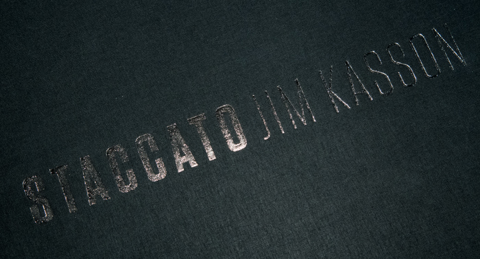
Here’s the slipcase with the book and the folder inside. You can see the embossed, metallic-foil-filled printing on the front of the slipcase:
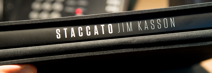
Here’s what the case looks like from the open end. Since there’s a title on the spine of the book and the book’s dust jacket, there’s no need for embossed lettering on the side of the slipcase opposite the opening:
Here’s a couple of closer looks at the embossing, The embossing on the spine and cover of the books themselves is similar:
Here is the book out of the slipcase with the portfolio folder on top of it:
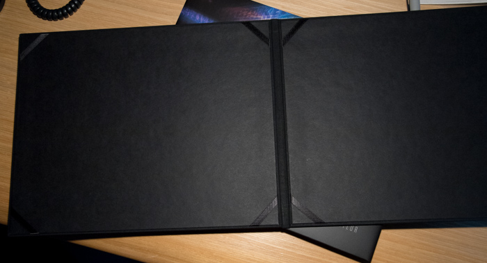
Opening up the folder reveals the corners to hold the prints in place:
The book has a French fold dustcover, which means the top and bottom portoins are folded over so that there’s no paper edge visible when the book is closed. When you peel back the dustcover, you can see the way it’s folded. Also note the die-cut corners that keep the edges of the dustcover from catching on things:
Here’s a closer look at the die-cut corners:
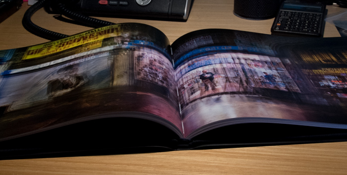
If you have been reading this saga about getting a book published all along, you will recall that there are several images that span the gutter of the book, and that page flatness has been something that has accounted for a lot of my attention, and caused a great deal of angst.
Here’s what the book looks like when you just open it up to the middle of a signature. This book had never been opened before I took this picture, and I did not try to flatten that pages before I made the exposure:
If you press the pages down, you can see the threading:
A closer look:
I wonder if it was a good idea to have the images that span the gutter appear at the center of the signatures.
If you look at a gutter-spanning image that’s not at the center of a signature, here’s what you see:
A closer look:
The pages are not laying anywhere near as flat as I hoped they would. There’s a reason for that:
You’ll note that the internal spine of the book is not bending upwards as it should. In fact, it is almost flat. This is not the way that I expected it to be. In fact, it is exactly the situation that Jerry and I worked so hard to avoid. It is also completey different from the way the internal spine worked in the sample bound book. That one worked fine.
Is it just a bad sample? Sadly, no. I have looked at half a dozen books, and they are all substantially the same.
What went wrong? I will investigate and report back, but I suspect that I’ll never know.


Bummer.
I recall a book by Dan Margulis (“Professional Photoshop”) where an ongoing topic was the difficulty of dealing with commercial printers.
The color management protocol that I touched on earlier aside, Hemlock has done things just the way I’d have wanted them to. And I understand why they want to do the color management the way they do. So I’ve got no beef with the printer.
The issue of the page flatness is one of binding, and the communications channel (me to designer to printer to binder) has not been the best. Still, Hemlock went the extra mile and set up a teleconference with representatives from all four constituencies to hash out the page flatness issue several months ago.
The most frustrating thing for me is that I know Roswell could have bound my book the way I wanted it bound. They proved that with the binding test copy.
Jim
Looks wonderful otherwise…
It does indeed. The glue in the binding aside, I think that Roswell did a great job binding the book, and the construction of the slipcases and portfolio folder is top-notch. Everything lines up perfectly, there’s no glue that seeped out, etc. And the binding glue that made the inner spines too stiff is perfect in another way: there is absolutely no glue leakage through the stitching holes.
Jim
Roswell is local to me … you want me to go rough ’em up a bit for you?
All joking aside, the book otherwise looks quite nice … congratulations!
Let me be clear about Roswell. Except for the page flatness issue, which I’m not sure they ever fully understood, I couldn’t have asked for better service or a higher-quality product.
Jim