• site home
  • blog home
  • galleries
  • contact
  • underwater
  • the bleeding edge

the last word

Photography meets digital computer technology. Photography wins -- most of the time.

You are here: Home / The Last Word / A book report — lessons learned

A book report — lessons learned

November 14, 2016 JimK 2 Comments

This is part of a series about my experiences in publishing a book. The series starts here.

A few things I would like to have been able to tell my younger self when I (he?) was starting out on this project.

Unless you’re going to design it yourself, don’t sequence your own book. The reason is the design and the sequencing are so intertwined that forcing the designer into a predetermined order will tie their hands and foreclose creative and beautiful layouts. I was surprised and pleased at the way that Jerry sequenced the images. I would never have done it that way, and the book is better for it. I’m not saying you should ship off a bunch of files and stand back. I told Jerry which images I considered the most important, and they were featured.

Full bleeds can be great.

Fountains, Ballagio Hotel, Las Vegas, 2010, Original

As a rule, full bleeds get no respect among photographers. I think the reason is that the page shape is unlikely to be the shape of the image, and cropping an image from its original shape will produce something bad. I can see that, but that‘s not at all the way things worked out for me. After we had settled on a page size, I picked a set of images that I thought might work in that shape, and set out to crop them. I failed on some, but on most I succeeded, and in one case, I liked the full bleed shape much better than the original one.

Fountains, Ballagio Hotel, Las Vegas, 2010, Cropped for full bleed


Note that I am not saying that you ought to let anyone else crop your images. The thought of that makes my blood run cold.

A designer can help you, but in the end, it’s all on your shoulders.

This might be different if you go with somebody like Brooks Jensen, who is providing something close to a turn-key book service, but I’m talking about using a design firm. Actually, since this is a sample space of one, I’m talking about using one particular design firm. But I expect that my experience generalizes somewhat.

Woman and Hot Dog Bendor, Rockefeller Center, NYC, Original
Woman and Hot Dog Vendor, Rockefeller Center, NYC, Original

I thought at the outset that Jerry would tell me what all the choices were, I’d make them with some coaching as to the implications, and that would be that. And that’s the way most of it went.

Woman and Hot Dog Bendor, Rockefeller Center, NYC, Cropped for full bleed
Woman and Hot Dog Vendor, Rockefeller Center, NYC, Cropped for full bleed

However, the issue with the ISBN crystallized that for me. Jerry thought I didn’t want an ISBN since I said I wasn’t expecting to sell the books, and I assumed that he was going to get one, even though it said in the (long, and read only once 18 months ago) contract that the ISBN was my responsibility. I wanted an ISBN so that libraries and museums would have a way to identify the book. Even if it was my responsibility to get one, I’d like to have been prompted, so that it could be printed in the book. I may still get one, but  I’ll have to apply it to the books with stickers, and, since 600 of the books have already been distributed, and this didn’t come up until the books were shrink-wrapped, they won’t all have ISBN’s.

The issue with the page flatness is another example of this. I’ve made my peace with the way the binding of the book came out after finding that the spine curved pretty much the way I wanted it to after the book had been handled a while (or, as Jerry pointed out, if you broke it in the way you were taught in grade school), I was disappointed that no one could say how the binding would actually turn out, and in the end I had to just roll the dice.

No matter what you think you have worked out with the designer, the design can get away from you. This may end up being a good thing, but it’s something to pay attention to going in.

Here’s an example.

Jerry was originally going to lay out the book so that it would fit Brook Jensen’s standard printing and binding process. When I got the layout from Jerry, Brooks said that if the book were printed his way, I wouldn’t like the result. I already knew that we needed a spot color, and Brooks had said he could modify things to get that in, but there was a big surprise – at least to me. Jerry had super-rich facing black pages between the various sections of the book. It was a beautiful look. But Brooks said that, without varnish, the inked pages would act like sandpaper rubbing against each other. Jerry agrees, and suggested an over coat. That meant we couldn’t use the press that Brooks had planned on using.  That meant the costs went up a lot. Jerry also had introduced some special paper at the beginning of the book. All that meant that the book had strayed so far from Brooks’ model that he thought (and I agreed) that I should just go directly to Hemlock.

Hostess, Ocean Drive Restaurant, Miami Beach, 2012, Original

It all turned out well, in many ways. I got a beautiful book. I love the look of the black pages between the sections. As long as we were doing aqueous coatings, we could do them over each image, allowing us to us a duller paper.  

Hostess, Ocean Drive Restaurant, Miami Beach, 2012, Cropped for full bleed

It turned out to be a better book than staying with the plan.

It also turned out to be a much more expensive book than staying with the plan.

Anybody who has ever built a house will see a pattern here.


The Last Word

← Vello/Commlite F-to-E adapter battery drain More slit scan experiments — blending space and time →

Comments

  1. Gunnar Sjödin says

    November 17, 2016 at 3:33 am

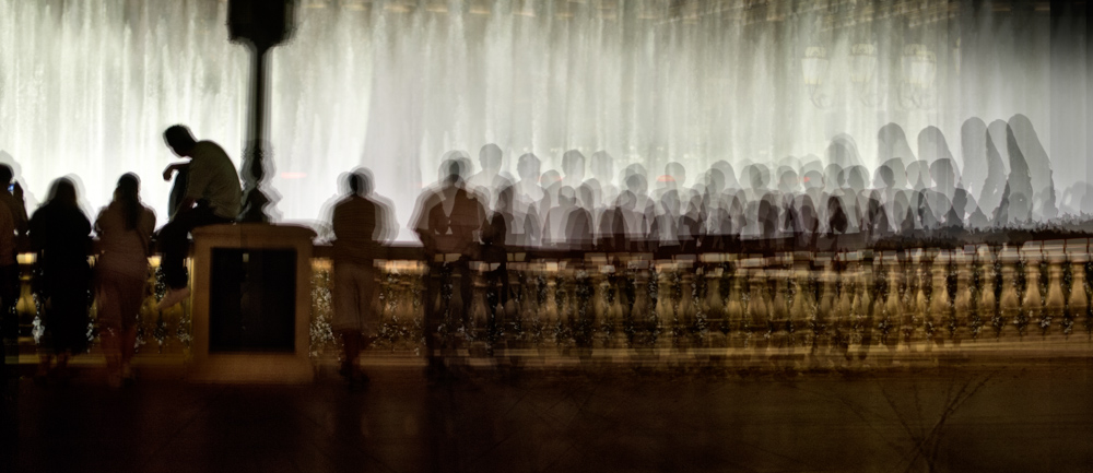
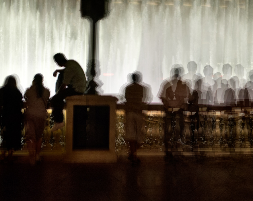
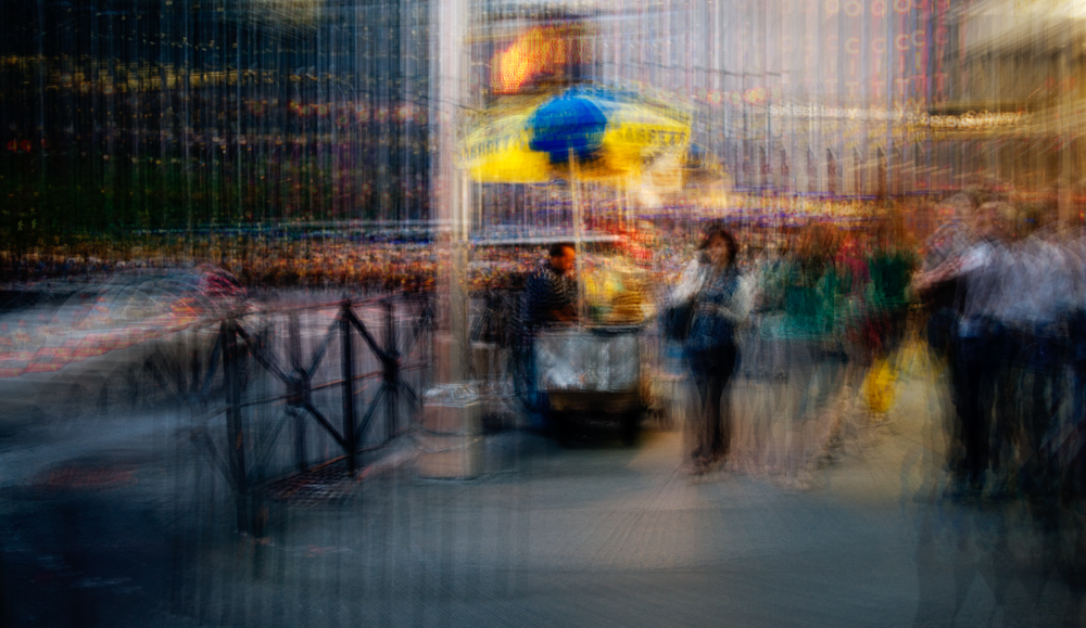
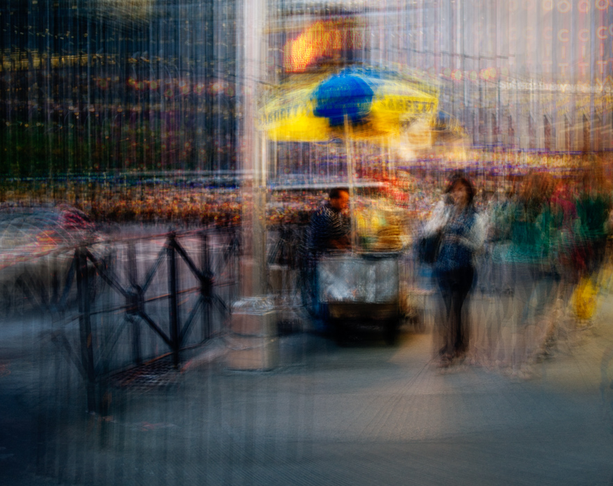
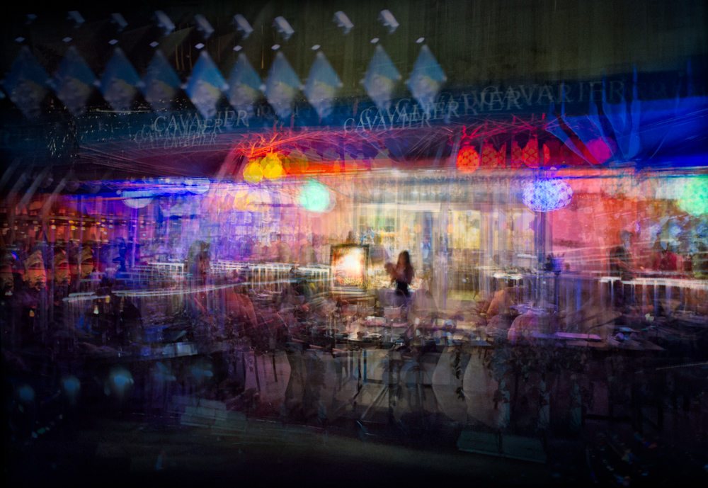
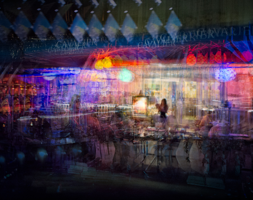
    The photos shown in this post are so interesting, beautiful and original! I like them a lot!
    As a fan I wonder if it is possible to get to know something about the work flow in the creation of these pictures, or is it an artistic secret?

    Reply
    • Jim says

      November 17, 2016 at 9:14 am

      From the artist’s statement here:

      http://www.kasson.com/gallery/staccato/

      This series is an outgrowth of Nighthawks, with much the same subject matter but a different interpretation. Instead of a making single exposure per final image using motion blur and panning to isolate the subjects and control sharpness, in the Staccato series I take many sharp images from slightly different positions and incorporate them into a single composite image, aligning the elements that I wish to be sharp and letting the others fall where they may. This approach allows more precise control over the important elements of the image, as well as producing more interesting patterns in the areas that were just broad blurs in the Nighthawks series.

      Does that explain it sufficiently?

      Jim

      Reply

Leave a Reply Cancel reply

Your email address will not be published. Required fields are marked *

May 2025
S M T W T F S
 123
45678910
11121314151617
18192021222324
25262728293031
« Apr    

Articles

  • About
    • Patents and papers about color
    • Who am I?
  • How to…
    • Backing up photographic images
    • How to change email providers
    • How to shoot slanted edge images for me
  • Lens screening testing
    • Equipment and Software
    • Examples
      • Bad and OK 200-600 at 600
      • Excellent 180-400 zoom
      • Fair 14-30mm zoom
      • Good 100-200 mm MF zoom
      • Good 100-400 zoom
      • Good 100mm lens on P1 P45+
      • Good 120mm MF lens
      • Good 18mm FF lens
      • Good 24-105 mm FF lens
      • Good 24-70 FF zoom
      • Good 35 mm FF lens
      • Good 35-70 MF lens
      • Good 60 mm lens on IQ3-100
      • Good 63 mm MF lens
      • Good 65 mm FF lens
      • Good 85 mm FF lens
      • Good and bad 25mm FF lenses
      • Good zoom at 24 mm
      • Marginal 18mm lens
      • Marginal 35mm FF lens
      • Mildly problematic 55 mm FF lens
      • OK 16-35mm zoom
      • OK 60mm lens on P1 P45+
      • OK Sony 600mm f/4
      • Pretty good 16-35 FF zoom
      • Pretty good 90mm FF lens
      • Problematic 400 mm FF lens
      • Tilted 20 mm f/1.8 FF lens
      • Tilted 30 mm MF lens
      • Tilted 50 mm FF lens
      • Two 15mm FF lenses
    • Found a problem – now what?
    • Goals for this test
    • Minimum target distances
      • MFT
      • APS-C
      • Full frame
      • Small medium format
    • Printable Siemens Star targets
    • Target size on sensor
      • MFT
      • APS-C
      • Full frame
      • Small medium format
    • Test instructions — postproduction
    • Test instructions — reading the images
    • Test instructions – capture
    • Theory of the test
    • What’s wrong with conventional lens screening?
  • Previsualization heresy
  • Privacy Policy
  • Recommended photographic web sites
  • Using in-camera histograms for ETTR
    • Acknowledgments
    • Why ETTR?
    • Normal in-camera histograms
    • Image processing for in-camera histograms
    • Making the in-camera histogram closely represent the raw histogram
    • Shortcuts to UniWB
    • Preparing for monitor-based UniWB
    • A one-step UniWB procedure
    • The math behind the one-step method
    • Iteration using Newton’s Method

Category List

Recent Comments

  • JimK on Goldilocks and the three flashes
  • DC Wedding Photographer on Goldilocks and the three flashes
  • Wedding Photographer in DC on The 16-Bit Fallacy: Why More Isn’t Always Better in Medium Format Cameras
  • JimK on Fujifilm GFX 100S II precision
  • Renjie Zhu on Fujifilm GFX 100S II precision
  • JimK on Fuji 20-35/4 landscape field curvature at 23mm vs 23/4 GF
  • Ivo de Man on Fuji 20-35/4 landscape field curvature at 23mm vs 23/4 GF
  • JimK on Fuji 20-35/4 landscape field curvature at 23mm vs 23/4 GF
  • JimK on Fuji 20-35/4 landscape field curvature at 23mm vs 23/4 GF
  • Ivo de Man on Fuji 20-35/4 landscape field curvature at 23mm vs 23/4 GF

Archives

Copyright © 2025 · Daily Dish Pro On Genesis Framework · WordPress · Log in

Unless otherwise noted, all images copyright Jim Kasson.