Kate Murphy recently wrote a New York Times article called, “Things to Consider When Buying a Monitor”. You can find it here.
In the column, Murphy says, “…so you really have to make this decision on your own and that means you have to dive into the specs. Don’t glaze over. It’s not really that hard.” She then goes on to demonstrate that it’s harder than she thinks, by making the following statement:
Sometimes manufacturers will indicate a display has an “sRGB” color gamut, which means the display is capable of about 75 percent of NTSC. “AdobeRGB” color gamut allows around 92 percent of NTSC. If the specs indicate a color gamut exceeding 100 percent of NTSC, the colors will go beyond what you see in the real world — excellent for anyone who is into psychedelic animation.
Murphy conflates three mistakes here. The first is performing the gamut size comparisons in a color space that is not perceptually uniform, and therefore gives answers inappropriate for human vision. The second is assuming that gamuts of the same size (volume, area) can display the same colors. The third is assuming that there aren’t real-world colors that exceed the NTSC gamut. Put them together, and a photographer could think that there’s no reason to have a monitor that can produce colors outside the NTSC gamut.
Let me be clear. A monitor with Adobe (1998) RGB primaries, or one with the canonical 1953 NTSC primaries, can’t show you all the colors your camera can capture. If you have a decent printer, it can’t show you all the colors the printer can print. All else being equal, you want your monitor to have the biggest gamut you can get.
That’s the take home lesson. If you don’t care about the technicalities, you can stop right here. If you do, or if you are from Missouri, read on.
Let’s deal with the color space first. The proper color space for comparing RGB displays is uv chromaticity space. It has the advantage of being a two-dimensional space, since it ignores the luminance (roughly the same as brightness), and it at least makes a stab at being perceptually uniform (equal distances on the diagram correspond to equal subjective color differences). Those of you who have heard me argue passionately for not using a chromaticity space to compare printers, or monitors to printers, may be surprised to hear my advocate such a space for display comparisons. The reason I do so is that the three dimensional gamut of a three color additive display is much simpler than that of a printer; you can look at the chromaticity diagram and predict exactly what the three dimensional gamut will look like.
Why not use the much more common xy chromaticity space? Because large differences in the values of some colors in that space (notably in the greens) correspond to small differences in perceived color, while small differences in some colors (like blues and magentas) in xy correspond to large perceived differences. There are errors in perceptual uniformity in uv space, too, but they are much smaller.
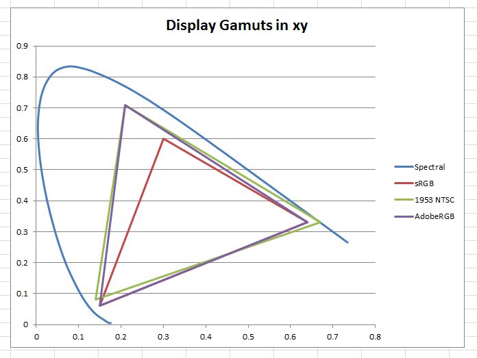
Here are the gamuts of the three display primaries that Murphy mentioned in xy chromaticity space:
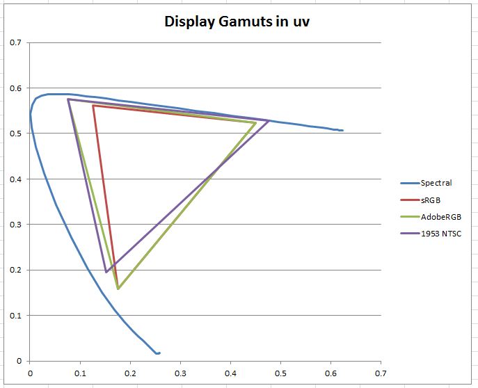
And here they are in uv chromaticity space:
What appears in xy to be a huge difference in the greens between sRGB and the other two spaces is shown to be smaller in uv. What appears in xy to be a small difference in the blues between sRGB and the other two spaces is shown to be larger in uv. The area of the sRBG gamut is 63% of Adobe RBG when measured in xy, but 84% as measured by uv.
Note also that sRGB, while much smaller than NTSC, can display some blues that NTSC can’t.
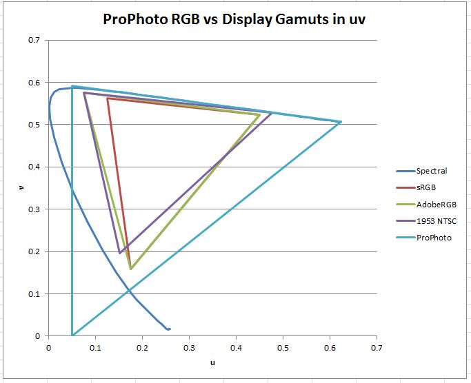
I think the easiest way to deal with the issue of whether there are real-world photographic colors that can’t be displayed in any of the three spaces plotted thus far is to add a fourth “display” to the diagram. I put “display” in quotes because the color space I’m going to add is ProPhoto RGB, which was intended as a color interchange space, and not a display space, and has two primaries that are not physically realizable. The green primary is somewhat outside the spectral boundary that defines colors that we can see, and the blue primary is wildly out.
Kodak, ProPhoto RGB’s corporate inventor, claims that its gamut contains 90% of the possible surface colors, and probably all of the real-world surface colors. Surfaces reflect some portion of the light that falls upon them creating surface colors. You can see from the diagram that there are visible blues and magentas, as well as some cyans, that ProPhoto RGB can’t encode, and thus that our thought-experiment ProPhoto RGB display can’t reproduce. Kodak says, and I have no reason to doubt them, that in the real world only self-luminous objects produce those colors.
Maybe Kodak was being conservative when they came up with ProPhoto RGB, and you don’t really need that big a space for photography (you certainly don’t need the non-visible colors). On the other hand, the gamut of ProPhoto RGB is so much bigger than that of any monitor we can buy now or are likely to be able to purchase in the future, that it’s highly unlikely that we photographers will not be able to use the capabilities of the widest gamut monitors we can get our hands on.


I thought your analysis was excellent. However, you write it as though it’s a rebuttal to something I wrote. I have never written an article called “Things to Consider When Buying a Monitor.”
The article you’re responding to was written by somebody else entirely–somebody named Kate Murphy. Would you consider updating your post?
David,
Boy is my face red! I got the link in an email that usually contains your weekly update. Upon looking at it now, I see that it says that you’re on vacation. I will change the post, and I apologize.
Jim