When you look closely at most oil paintings, you can see the brushstrokes, and thus the hand of the artist in the work. Many watercolorists leave the edges of their paintings ragged, putting down color where the scene demands it, but feeling no compunction to fill the entire rectangle with paint. Both elevate the work and deepen my relationship with it, reminding me that it’s not just a creation that sprang to life by itself, that there was a physical process involved, that there was craft as well as artistry, and that there was a real flesh-and-blood person who did the work to make the work.
Many platinum and palladium printers cut the overlay mats large enough that you can see the brushstrokes made when the emulsion was laid down. Sometimes that doesn’t work with the image, but most of the time it does, and I like the effect.
It was fashionable in the 80s for photographers to file out their negative carriers so that the edges of the exposed image were visible in the print. I myself did that with Hasselblad negs for a while, and it’s incorporated in the Alone in a Crowd series. I think it worked with some images, but eventually became overdone, then sank to cliche status, proving that in art it’s easy to have too much of a good thing.
The same thing happened with Polaroid 55 P/N film, which produced a usually-thrown-away positive and a negative that was embedded in a distinctive looking matrix, with irregular edges where the developer gel didn’t spread evenly. Photographers started printing so you could see all that, which was probably the last thing the Polaroid engineers had in mind when they created it in the first place. That practice too followed the arc from fresh innovation to de rigueur to tired going-through-the-motions cliche.
In the time before a new way to celebrate the process becomes a rote, mechanical, operation, I think it’s great. I love to celebrate the process behind the art and incorporate that celebration into the art.
Along those lines, I’ve have a few questions on why I show the edges of the original photographs in the current, at-this-point-nameless series that I’m doing of stitched panos of trees in infrared. Here’s an example, exposed yesterday afternoon:
![[Group 29]-_DSC0355__DSC0365-11 images_0000-Edit](https://blog.kasson.com/wp-content/uploads/2015/02/Group-29-_DSC0355__DSC0365-11-images_0000-Edit.jpg)
I didn’t always do this with panos. I still don’t do it with tripod-exposed panos — the borders aren’t interesting. But I started doing it with handheld panos a few years back. I’d recently purchased a Sony NEX-5, which had a shutter mode option called Sweep Panorama. To use this feature, you held the shutter down while swinging the camera through an arc. The camera took a bunch of pictures at a high shutter speed, and stitched them all together to produce a lowish resolution JPEG file.
I played with the NEX-5 Sweep Panorama a while, and soon tired of it. The in-camera stitching wasn’t very good, and the files were too small for serious use. I did amuse myself in trying to get it to make interesting stitching errors, but even that soon grew old. But I’d learned something; I now knew that you didn’t have to hold the camera still to make each exposure in a pano.
Armed with my new-found realization, I set my D4 to continuous shutter mode, and dialed the frame rate to 10 fps. I figured out how to twist the camera approximately around the right point in the lens, and I made pictures like this:

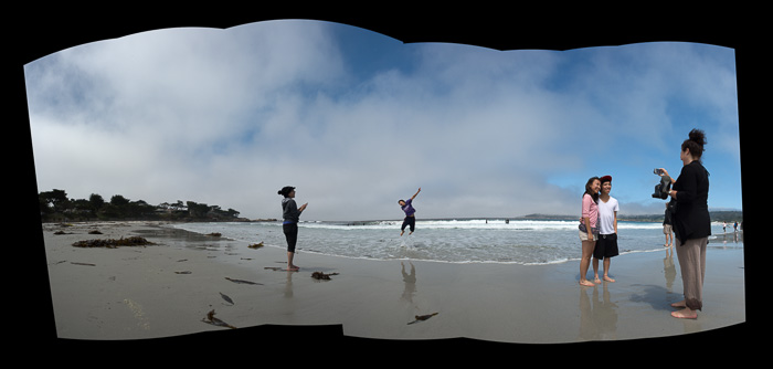
![[Group 1]-_DSC3850__DSC3857-8 images](https://blog.kasson.com/wp-content/uploads/2015/02/Group-1-_DSC3850__DSC3857-8-images.jpg)
It was a revelation that, if you shot fast enough, you could make good panos even if your subjects were in motion. Early on, it was apparent to me that the happenstance outlines of the frame not only added visual interest, but united the process I used to make the images with the way I presented them. I never looked back.
Thus, when I started the handheld infrared images of the trees, I never really considered any other way to handle the stitched images. In fact, almost from day one of the series — maybe three weeks ago — I’ve been thinking about what the final borders will look like as I make the exposures. I’ll never be able to perfectly predict how it will turn out, and I would be disappointed if I could, but, as the saying goes, the more I practice the luckier I get.
![[Group 19]-_DSC0275__DSC0280-6 images_0002-Edit](https://blog.kasson.com/wp-content/uploads/2015/02/Group-19-_DSC0275__DSC0280-6-images_0002-Edit.jpg)
Now I’ve got a new set of decisions to make. I shoot into the sun a lot, and sometimes I get artifacts as the sunlight bounces off internal pieces of the lens. I’ve been throwing those pictures out, but now I’m not so sure. Maybe it’s another way to celebrate the process. And maybe, now that there’s so much border, it should be white.
![[Group 10]-_DSC0176__DSC0193-18 images_0000](https://blog.kasson.com/wp-content/uploads/2015/02/Group-10-_DSC0176__DSC0193-18-images_0000.jpg)
What do you all think?
{Edit: the following was added on 6/30/15]
Today I went to Ted Orland’s web site looking for a link to some of his Holga pictures. While I was there, I noticed this series. It dawned on me that, somewhere in my subconscious, Ted’s stitched Holga images must have helped me move in the direction that I’ve explained above. I’m little embarrassed, especially since I own one of his images from this series (it is currently awaiting rotation onto one of my walls, since I have more photographs than wall space).
Anyway, credit where credit is due. Thank you, Ted.
And, to circle back around to the idea of celebrating the process, doesn’t Ted’s panorama series do that marvelously?
The B&W IR photos remind me of ‘raw’ Mars rover panoramic images, such as some here that haven’t been quite cleaned up: http://mars.nasa.gov/mer/gallery/panoramas/opportunity/2014.html
What would rover images look like if we were to visit other planets where there was more than just a relatively flat horizon? Maybe they would share some similarities with your images?
It’s always been my feeling that large white borders usually make B&W images feel heavier, and with these uneven borders, the image feels like an object sitting on a sheet of paper. The black bordered images feel the opposite. Lighter, more dimensional and that I’m looking through a portal at a scene on the other side. Difficult to decide, as I think both can work, but I’m leaning towards black.
I remember filing out my enlarger’s neg carriers too… I never outgrew that fad, printing that way until I gave up analog in ~2003. But I would often use the easel to mask the black edge for just a pen-line like effect. An aspect of the thick, irregular black borders that I liked was how it insulated the image from the stark white of the paper. It acted as a buffer/transition and a frame through which to view the image.
As for the multiple lens flares: I think it’s cool. I’d definitely go after this effect more. The two flare strings are interesting because you’d never normally see this. Three and more might be overdoing it, but the only way to know, is to try.
Interesting. I’ve made a number of handheld panos using Autopano, but I’ve always brought them into Lr to crop the edges and/or used Content Aware Fill to fill in little bits, but I’ve never considered keeping them in their rough state. May have to play with that!
Mike.