This is the 21st in a series of posts on color reproduction. The series starts here.
I’ve spent most the last week writing Matlab code to automate the Macbeth chart measurements that I came up with earlier, and also adding some new ones. My goal here is to provide numeric and visual measures of how a particular illuminant/camera/camera profile/raw developer combination render colors. I’m starting with the colors on the Macbeth ColorChecker.
My quest to contribute to this problem stemmed from a seemingly -endless, and to my way of thinking, completely fruitless, series of Internet debates about which camera, or which profile, or which raw developer produced “the best color”. Participants would wax lyrical, using terminology similar to that of wine reviewers, arguments would ensue, tempers would rise, and no hint of resolution even appeared on the distant horizon.
Let me be clear about one thing. The problem I’m trying to solve is not necessarily to find a metric by which we can state objectively that one combination of camera, illuminant, profile and raw developer produces better color than another such combination.
I figured that wine reviewers had an excuse, in that the dimensions of smell are at least in the thousands, but, neglecting spatial effects, with the dimensions of color being three and the dimensions of the visible spectrum being 31 (with 10 nm sampling), that there ought to be a way to bring some clarity to the discussion with some objective measurements. Ideally, I could develop a set of measures that would facilitate discussion of the precise differences among illuminant/camera/camera profile/raw developer combinations.
Note that I’m not trying to sort out the problem of which one of the four parts of the combination are responsible for which characteristics. Thinking about tacking that issue makes my head hurt. I think the best we’re going to do is change one thing at a time and look at what changes in the sample images.
Let me show you some of what I’ve got now. It takes about 10 seconds of computer time to produce all that you’ll see in this post and a lot more, which is a whole lot better than the way I was doing the work before, which would have required several hours to do the same thing.
For my example, I’m using an Image made by a Sony a7RII of the Macbeth chart under 3200K illuminant supplied by a pair of Westcott LED panels, and converted to Adobe RGB by Lightroom using the Adobe Standard profile with default settings except that the image was white balanced to the third gray patch from the left. Thus Lr did the adaptation to the D65 white point of Adobe RGB, using a proprietary method.
The reference was a simulation of the Macbeth chart which was lit by a 3200K black body radiator. The Macbeth spectral curves are the ones supplied in the color science toolkit for Matlab that I used. This toolkit is called optprop, was written by Jerker Wågberg, and I highly recommend it.
Many of you may be thinking that there are more accurate illuminant/camera/camera profile/raw developer combinations than the one I’ve chosen. I’m sure you’re right about that. But remember that my goal here is to find useful measures of the departures from perfection of such measures, not produce pictures which are colorimetrically accurate. I stipulate that accurate color is not the goal for most of photography; pleasing color is. So it really doesn’t matter what I choose for the examples to follow, as long as I don’t pick something ridiculously perfect or grotesquely off.
First off, let me present a bunch of overall scalar measures. These are the usual suspects, plus a couple of wild cards, and I’m now thinking they will have their prime utility, if there’s any at all, as ways to graphically compare illuminant/camera/camera profile/raw developer sets.
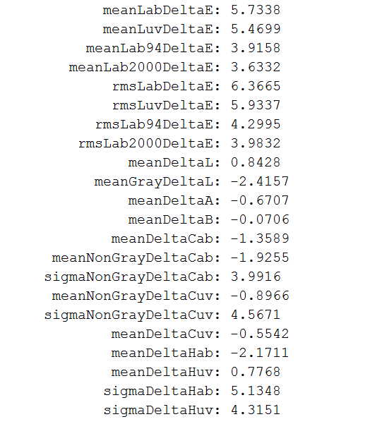
If the measures are not obvious from the variable names that I’ve chosen, take a look at some descriptions here. If they look pretty familiar, but you can’t quite figure out the details, here’s a crib sheet.
- Lab is CIEL*a*b*, Luv is CIEL*u*v*,
- Mean is the same a average; unless otherwise specified, it applies to all 24 patches.
- Sigma is the same as standard deviation.
- RMS stands for root mean square, and is a measure that weights outliers more than averaging.
- Delta means Euclidean distance for vector quantities, and arithmetic difference for scalars.
- Cab and Cuv are measures of chroma in their respective color spaces.
- DeltaCab and DeltaCuv are chromatic distances, which ignore luminance differences.
- Hab and Huv are hue angles, and they are converted from their natural radians to degrees to make them more approachable for some.
Which of these, if any, are useful to you?
Now, let’s move on to the graphical part of the metrics. Since more photographers are familiar with Lab than Luv, I’ll ignore all the Luv measures, but I do generate Luv metrics that correspond with the Lab ones.
The first graph is a measure of how far off the color each patch is from a colorimetric capture. As I mentioned earlier, for this example, the reference and the test target were both illuminated in roughly the same 3200K light, which is not a standard way of doing the comparison; I think it’s a fairer one.
I plotted this graph using CIE Delta E, but I have similar ones using Delta E 94 and Delta E 2000.

Now let’s look at a traditional way to examine chromaticity errors, a 2D scatter plot in Lab.

Now, if you can figure out which green dot goes with which red one, you can see in what direction the chromatic parts of the colors are off, but you can’t tell anything about luminance errors. The gray axis points for both the reference (I’m going to change the misleading word “target” in the header to “reference”).
Another thing we can look at is just luminance errors:

Right away we can see that most of the gray axis Delta E errors are due to a luminance nonlinearity.
We can get a better handle on that nonlinearity by plotting the actual luminance values against the reference ones:

Probably I should pin the lower bounds for both the vertical and horizontal axes at zero, You can see that the dark values are darker than linear, and there’s a shoulder at the upper end of the curve, like film. The combination of these two effects is to increase midtone contrast, which is almost certainly a deliberate choice on Adobe’s part. As an aside, I am indebted to a DPR member for pointing out that this nonlinearity is done is a non-colorimetric way.
Now let’s look at the chomaticity errors by patch, ignoring the luminance ones again.

We can see that almost all the errors along the gray axis are in luminance, and the result of the nonlinearity we looked at above.
One way of looking at chromaticity is in polar coordinates, with chroma being the radius and hue the angle:
Here are the chroma errors:

Lower bars mean the actual results are less chromatic than they should be; higher bars mean the actual results are more chromatic than they should be,
Here are the hue angle errors, which the gray patches zeroed out, since their chroma error is so low:

It’s surprising to me how far off the blue and orange patches are. We can see from the scatter plot above that the blue is shifted towards cyan, and the orange towards red. The blue shift is probably to avoid the dreaded purple sky problem.
Well, that’s it for today. I’ll be doing similar tests for other profiles, and we’ll see if these metrics help us describe how they’re different from one another.
Comments and suggestions are solicited.
I take it back… Refreshed the page and they are OK. Must have been a cache problem…
Michael, I always appreciate it when people find things wrong on the site, so thanks. Keep up the correcting, and don’t worry about wearing out your welcome if a few are false alarms.
Jim
Jim,
I really appreciate your efforts. For me, the most important aspect is to find out to which extent colour differences depend on the sensor and colour profiles respectively.
Unfortunately, there is a problem with your scientific approach, namely that nobody really cares. Repeating previous millennium myths is so more interesting than things measurable.
I would guess that CFA design matters a bit, at least if we want to have a sensor that delivers good colour with a simple matrix multiplication.
Best regards
Erik
I don’t think we’re going to get to accurate color with only three color planes.
However, one of the points of my post is that accurate color is not necessarily pleasing color, and vice versa. I think there are probably lots of ways to get pleasing color with three planes, but the definition of pleasing will vary with the photographer and the situation.
Jim
> that accurate color is not necessarily pleasing color
you are not implying that we, humans, suffer daily by looking around with naked eyes and seeing “accurate” color, are you ? do you hate what you see with your eyes ?
I meant accurate from a colorimetric perspective. We view photographs under different circumstances than they were exposed. Correcting for different viewing conditions often requires deviating from colorimetric accuracy. The intent of the photographer may require that as well.
As an example that I think we can all agree upon, consider the adaptive state (from a color constancy perspective) of the viewer. An absolute colorimetric rendering of a subject photographed under 3200K light would look bad viewed on a D65 display or printed on a page viewed under D50. So we mess with the colorimetric data to sort of fix that.
There are lots of similar viewing condition differences that don’t get fixed semi-automatically, though. Absolute illumination level and surround are examples.
Jim