Let’s take a break from the technical minutia and spend at least one post on a photographic issue that’s important – or should be important – no matter what you think of the a7R’s shutter.
Brooks Jensen just posted a rumination on photographic quality. Rather than summarize Brooks’ post, I suggest you read it – it’s short – and come back here if you’re intrigued.
Brooks’ is making the distinction between photographic quality and photographic content, so he’s leaving most of what’s important in photography out of the equation – “there’s nothing worse than a sharp picture of a fuzzy concept” – but the points he raises merit contemplation by any photographer.
Brooks acknowledges that there’s no one answer to the question, “How do you define photographic quality?” He invites you to think about what your answer is. I thought, and failed to come up with an answer. Then I realized that, for me, photographic quality is entirely contextual.
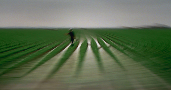
When I was working on This Green, Growing Land, an important photographic quality was smoothness of tone. Most of the images in the series were exposed with film, and I spent a lot of time processing images to remove film grain, which was evident in the scans (in spite of using the finest grain film I could find) since the images were so diffuse and blurry. Another important quality was subtle, subdued color. The color palette for the series was inspired by a pastel that my wife had recently purchased. I thought it fit the thrust of what I was trying to say, and, being so different from the actual colors of the subject matter, helped me accomplish one of my goals, which was to get people to look at the work, rather than looking through it. The color palette of the series was inextricably intertwined with the matte paper it was printed on. I cringe when I see these images on the web; for me, they just don’t work there.
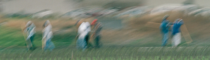
Perhaps the dominant quality of the series was selective sharpness. Well, “sharpness” may be overstating the matter; there’s nothing in any of these pictures that’s Group f/64 sharp. I used motion blur to direct the viewer’s attention where I wanted it, in much the same way as I’ve used depth of field or lack of it in other contexts. Because I was making the images at a slow shutter speed from a moving vehicle, I had great ability in the way I did my panning to control what was sharp(ish) and what was not, and I used that as my main tool for designing the images.
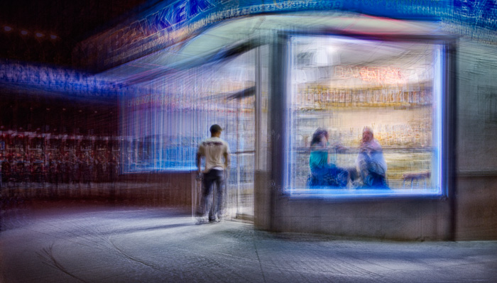
In Staccato, it was important to convey the electric feel of night in the city, and subtle color wasn’t desirable; it would have wrecked the feel of the images. The images had a jangly quality that was created by overlaying many sharp photographs, and smoothness of tone was neither possible nor appropriate. I used motion to direct the viewer’s attention like I did in This Green, Growing Land, but sharpness wasn’t my tool, it was chaos; the less-important areas were filled with disorganized bits and pieces of the subject. An important photographic quality became vibrant, realistic color. Realistic is perhaps the wrong word, since only a self-luminous image could reproduce the effect of neon lights, but as close to realistic as I could get with ink on paper without looking garish. That meant that the matte paper that worked for This Green. Growing Land was out, and Exhibition Fiber was in. Another quality was stimulating, pleasing texture. The jumbled areas of the images were sometimes remarkable in their patterns and colors, and sometimes a muddled mess. The former got printed; the latter reworked or thrown in the bit bucket.
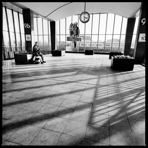
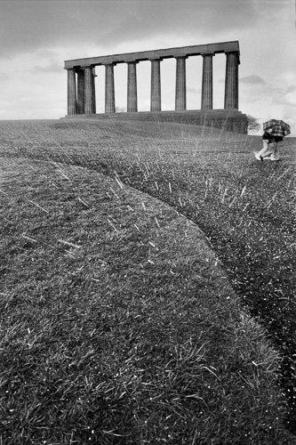
In Alone in a Crowd, I dealt with loneliness, isolation and architecture in more-or-less traditional-looking black and white prints. Motion blur was prominent in most images, emphasizing the transience of the experience. Most of the original scene lighting was extremely high contrast that in some cases was nearly unphotographable. Nevertheless, a traditional photographic quality, convincing detail in the lightest and darkest parts of the image, became something that I continually strove for, and often achieved, even in the darkroom. It was easier when I brought the images into the computer. Lots of detail and smooth tone structure were important, so I used medium-format equipment. It was also important to have a carefully deigned composition. Front to back sharpness (except for the people in motion), another classic photographic quality metric, was also a value, so I used a tripod for all but the last set of images. Since there was an architectural component to the series, control of perspective was important. About midway through the series I changed equipment to produce better quality along that axis, abandoning my Hasselblad in favor of an Arca Swiss 6×7 folding monorail view camera. I made images for this series for eight years.
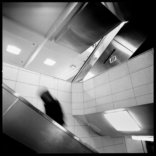
Because I suffer from photographic ADHD, I can’t stay in the same groove for that long, and the style of the series took some twists and turns. Towards the end, I was working a lot in Grand Central Station in NYC. It was possible to get permission to use a tripod there, but there was a fair amount of bureaucratic hurdle jumping involved; I couldn’t just walk in and set up. For that reason, I started to work handheld. That simple decision brought about a host of quality consequences. I needed fast lenses, and that drove me to 35mm cameras. I needed fast film, and I alternated between TMax 400, and Tmax 3200. The former had noticeable grain structure, and the latter verged on golf-ball sized grain. I could have fought all those things, but I embraced them, and with them came new photographic qualities: a raw, immediate look, and disorienting perspective. The compositions no longer looked designed, even though they sometimes were; that esthetic didn’t play with the new direction the series was going. Instead, the images took on a decisive moment look, as if all the elements had arranged themselves in front of my camera and all I had to do was press the shutter.
I could go on about the other series in the gallery, but I think you get the idea. For me, the photographic qualities that are important in a work or a series are the ones that best serve the needs of the content, not the ones that are habitual and comfortable for the photographer.
Leave a Reply