
The folks at Lirpa Labs, the research arm of Sloof Lirpa, made a big announcement today. It’s a first for the company, which has previously developed standalone products. Lirpa will be providing firmware upgrades for Sony, Canon, Nikon, Leica, Hasselblad, and Fujifilm cameras. The Lirpa firmware will add entirely new artificial intelligence capabilities to those… [Read More]
Circles of confusion, and circles of the confused
When some folks who have been full frame camera users move to medium format cameras, they suffer from confusion about depth of field (DOF). When this confusion spreads to a group of people they become a circle of the confused (CotC). This post is intended to reduce the size of the CotC. Depth of field… [Read More]
Resolution and sharpness are often the short poles in the photographic tent
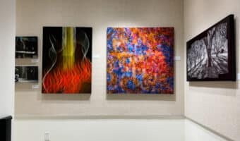
On Friday, I hung an exhibition. 35 prints, with sizes ranging from 8×20 to 40×40 inches. Kind of a retrospective, with images from Alone in a Crowd, This Green, Growing Land, Nighthawks, Staccato, Los Robles, some street images, and two others, including one from my newest series, Ft. Ord Graffiti. All of the… [Read More]
Nikon 135 Plena OOF PSFs

There are two pieces to bokeh. The first is what things look like when they are well out of focus (OOF), and the second is how the transition from OOF to in-focus happens. The second is complicated, but the first is very simple. What you see when part of the image is well OOF is… [Read More]
Diminishing returns in photography
In many fields of endeavor and enjoyment as you spend more and more money, you get a smaller and smaller perceptual improvement per dollar. You can buy a decent bottle of wine for 20 bucks. Picked carefully, you can serve it to knowledgeable friends and get few complaints. You could could spring for a 40-dollar… [Read More]
- 1
- 2
- 3
- …
- 560
- Next Page »